Unlock a world of possibilities! Login now and discover the exclusive benefits awaiting you.
- Qlik Community
- :
- All Forums
- :
- QlikView App Dev
- :
- Dimension causing multiple lines?
Options
- Subscribe to RSS Feed
- Mark Topic as New
- Mark Topic as Read
- Float this Topic for Current User
- Bookmark
- Subscribe
- Mute
- Printer Friendly Page
Turn on suggestions
Auto-suggest helps you quickly narrow down your search results by suggesting possible matches as you type.
Showing results for
Specialist II
2016-11-15
05:15 PM
- Mark as New
- Bookmark
- Subscribe
- Mute
- Subscribe to RSS Feed
- Permalink
- Report Inappropriate Content
Dimension causing multiple lines?
Hopefully this is simple...
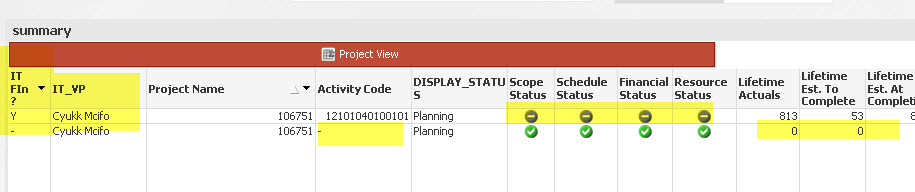
Select REQ_ID = 106751.
I had to add a dimension to my chart for IS_IT_FIN_MANAGED. What I noticed is that when the IT_VP field is added to the chart as well, I end up with two lines for each project. I would only expect one line here with the green status icons and the associated numbers...
Essentially the two lines should be merged together on the IS_IT_FIN_MANAGED = y, Activity Code is populated, Status icons are green and numbers are present for the expressions. How do I need to modify my chart to do this?
436 Views
1 Reply
Specialist II
2016-11-16
11:28 AM
Author
- Mark as New
- Bookmark
- Subscribe
- Mute
- Subscribe to RSS Feed
- Permalink
- Report Inappropriate Content
Is it the join?
382 Views