Unlock a world of possibilities! Login now and discover the exclusive benefits awaiting you.
- Qlik Community
- :
- All Forums
- :
- QlikView App Dev
- :
- Dimension visualization in chart
- Subscribe to RSS Feed
- Mark Topic as New
- Mark Topic as Read
- Float this Topic for Current User
- Bookmark
- Subscribe
- Mute
- Printer Friendly Page
- Mark as New
- Bookmark
- Subscribe
- Mute
- Subscribe to RSS Feed
- Permalink
- Report Inappropriate Content
Dimension visualization in chart
I have a table like this:
ProductID, Color, Value
1, Red, 10
2, Red, 20
3, Blue, 30
4, Green, 20
ecc.
I need to visualize top x Product by Value, but instead of ProductId description, I need to visualize the Color.
Example of top 3:
Blue, 30
Green, 20
Red, 20
Thanks in advance
Andrea
- Tags:
- customized dimension
- Mark as New
- Bookmark
- Subscribe
- Mute
- Subscribe to RSS Feed
- Permalink
- Report Inappropriate Content
Caletti,
There are a few ways I can think of to do this. Here are a couple ways:
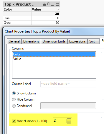
1. Max Number:
You can set the max number of a straight table (if that is your desired visualization) with the Max Number box checked. As long as you have the table sorted accordingly it should show you the top color's.
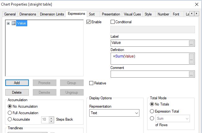
Expression for the above chart is MAX(Value).
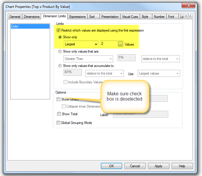
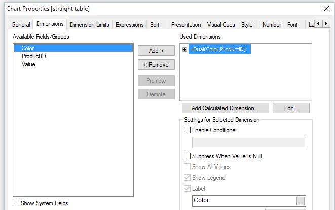
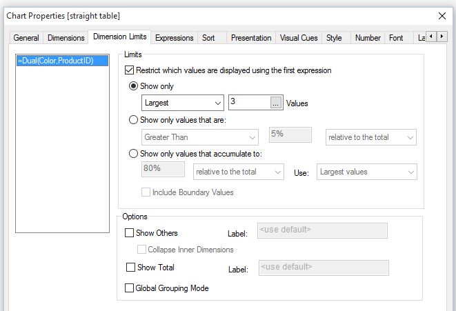
2. Dimension Limits
You can use dimension limits to also achieve the same results. This can be used in multiple chart types:
3. Using the rank function:
You can also use the rank function and an if statement in your expression. Please see Qlikview help for the rank function:
rank( [total] expression [, mode [, format]] )
Evaluates expression, compares the result with the result on the
other rows within the current column segment and returns the ranking
of the current row within the segment. For image charts the current
column segment is defined as it appears in the chart's straight
table equivalent.
Is "x" a static number or can this value change? If it changes - then you will instead need to introduce a variable that sets these limits.
Thanks,
Camile
- Mark as New
- Bookmark
- Subscribe
- Mute
- Subscribe to RSS Feed
- Permalink
- Report Inappropriate Content
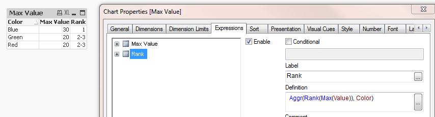
Hi Caletti,
You can use Rank() with Aggr():
Hope this helps.
Thanks
- Mark as New
- Bookmark
- Subscribe
- Mute
- Subscribe to RSS Feed
- Permalink
- Report Inappropriate Content
the easiest and most simple is to use dimension limits
- Mark as New
- Bookmark
- Subscribe
- Mute
- Subscribe to RSS Feed
- Permalink
- Report Inappropriate Content
- Mark as New
- Bookmark
- Subscribe
- Mute
- Subscribe to RSS Feed
- Permalink
- Report Inappropriate Content
Hi,
another solution could be:
hope this helps
regards
Marco
- Mark as New
- Bookmark
- Subscribe
- Mute
- Subscribe to RSS Feed
- Permalink
- Report Inappropriate Content
Hi Marco,
thanks for the useful advices.
I think this is the simpler and faster solution to implement for my case.
Andrea
- Mark as New
- Bookmark
- Subscribe
- Mute
- Subscribe to RSS Feed
- Permalink
- Report Inappropriate Content
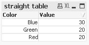
Straight table:
Dimension: Color
Measure: Aggr(Max(value),Color)