Unlock a world of possibilities! Login now and discover the exclusive benefits awaiting you.
- Qlik Community
- :
- All Forums
- :
- QlikView App Dev
- :
- Re: Display Expression as % and counts as values o...
- Subscribe to RSS Feed
- Mark Topic as New
- Mark Topic as Read
- Float this Topic for Current User
- Bookmark
- Subscribe
- Mute
- Printer Friendly Page
- Mark as New
- Bookmark
- Subscribe
- Mute
- Subscribe to RSS Feed
- Permalink
- Report Inappropriate Content
Display Expression as % and counts as values on data point
Hi all
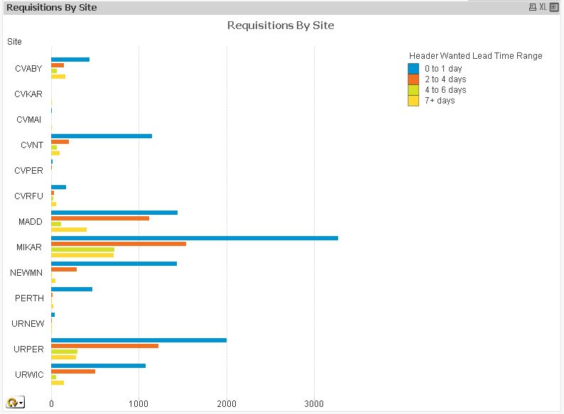
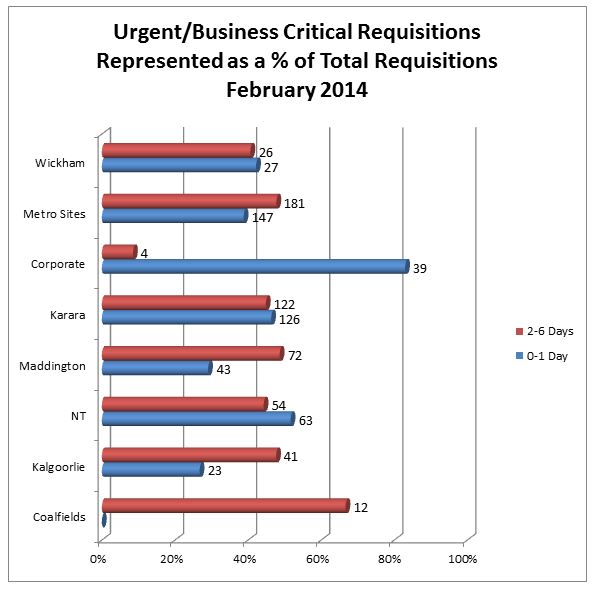
Can someone please help me with my chart? Below is a screen shot of my chart which basically displays correctly except that I want the dimension Axes to show as a percentage. I have added a screenshot further below of how it looks in Word.
If you look at the Word version and we look at site wickham the chart tells us that 26 of their requisitions were required in 2-6 days which equates to just under 40% and they also had 27 of their requisitions were required in 0-1 days and the percentage of that was just over 40%
I hope my request makes some sense. Any help would be greatly appreciated.
- Tags:
- new_to_qlikview
Accepted Solutions
- Mark as New
- Bookmark
- Subscribe
- Mute
- Subscribe to RSS Feed
- Permalink
- Report Inappropriate Content
Please find attached......and plaese reply to correct comment so that other can find the same 
- Mark as New
- Bookmark
- Subscribe
- Mute
- Subscribe to RSS Feed
- Permalink
- Report Inappropriate Content
post your sample and please explain what you want
- Mark as New
- Bookmark
- Subscribe
- Mute
- Subscribe to RSS Feed
- Permalink
- Report Inappropriate Content
Hi,
Create a bar chart with two expression:
- One for Count
- Second for %
For count expression, unckech "Bar" under "Display Option" and check "Value on data point" on expression Tab.
Hope it help you.
Regards
Ankur
- Mark as New
- Bookmark
- Subscribe
- Mute
- Subscribe to RSS Feed
- Permalink
- Report Inappropriate Content
Hello
I have attached qvw file. Basically I want the axis data to show like the word version of the chart.
cheers
- Mark as New
- Bookmark
- Subscribe
- Mute
- Subscribe to RSS Feed
- Permalink
- Report Inappropriate Content
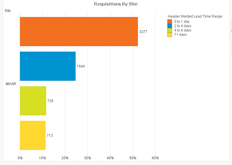
see this
- Mark as New
- Bookmark
- Subscribe
- Mute
- Subscribe to RSS Feed
- Permalink
- Report Inappropriate Content
Please find attached
- Mark as New
- Bookmark
- Subscribe
- Mute
- Subscribe to RSS Feed
- Permalink
- Report Inappropriate Content
Chris,
Avoid posting your qvw with original data in it .
It to be always avoided.
To get out of this just do one thing create a sample file either by INLINE table or just export a section of data in in excel
and then reload the file with the excel file with hiding information like ID ,Name ,Account details etc
- Mark as New
- Bookmark
- Subscribe
- Mute
- Subscribe to RSS Feed
- Permalink
- Report Inappropriate Content
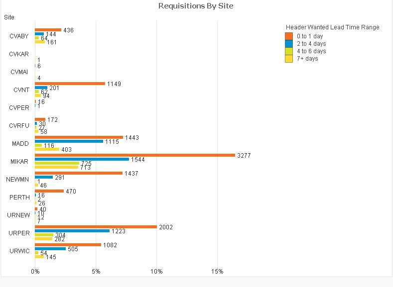
Thanks for this. When selecting one site only I get the exact data I require. But when selecting more that one site it reduces the percentage. MIKAR is showing in the first screen shot as having over 50% in the o-1 Day range however when all sites are displayed the 50% becomes about 17%. Each site needs to add up to 100% not 100% across all sites. Hope that makes sense?
- Mark as New
- Bookmark
- Subscribe
- Mute
- Subscribe to RSS Feed
- Permalink
- Report Inappropriate Content
Please find attached......and plaese reply to correct comment so that other can find the same
- Mark as New
- Bookmark
- Subscribe
- Mute
- Subscribe to RSS Feed
- Permalink
- Report Inappropriate Content
Brilliant. Thankyou so much.