Unlock a world of possibilities! Login now and discover the exclusive benefits awaiting you.
- Qlik Community
- :
- All Forums
- :
- QlikView App Dev
- :
- Display Multiple Names in a Bar Graph Column
- Subscribe to RSS Feed
- Mark Topic as New
- Mark Topic as Read
- Float this Topic for Current User
- Bookmark
- Subscribe
- Mute
- Printer Friendly Page
- Mark as New
- Bookmark
- Subscribe
- Mute
- Subscribe to RSS Feed
- Permalink
- Report Inappropriate Content
Display Multiple Names in a Bar Graph Column
Hi,
I have the following data, and I need to create a Bar Graph.
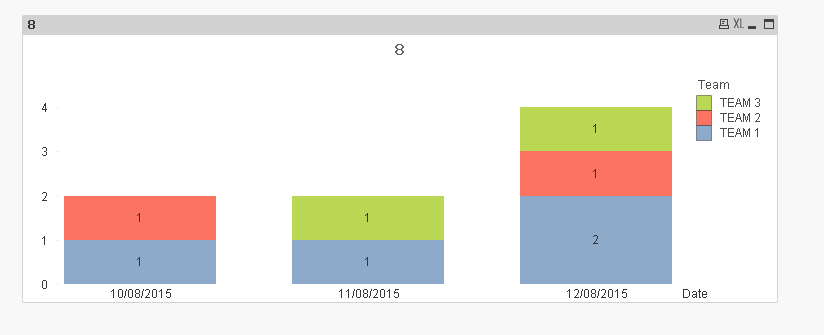
I want to display the number of Assets raised per day. So in this example it would be 2 on the 10th, 2 on the 11th, and 4 on the 12th.
That part is fine. But I also want to break down each column into a respective team. So for example, the bar graph column for the 12th would show the number of Assets raised to be 4, with 2 from TEAM 1, 1 from both TEAM 2 / TEAM 3, each in a different colour.
| Asset | Team | Date |
|---|---|---|
| ABC | TEAM 1 | 10/08/2015 |
| XYZ | TEAM 2 | 10/08/2015 |
| 123 | TEAM 3 | 11/08/2015 |
| 456 | TEAM 1 | 11/08/2015 |
| 789 | TEAM 1 | 12/08/2015 |
| ABC | TEAM 2 | 12/08/2015 |
| XYZ | TEAM 3 | 12/08/2015 |
| 123 | TEAM 1 | 12/08/2015 |
Any help would be much appreciated.
Thanks!
Tristan
- Tags:
- new_to_qlikview
Accepted Solutions
- Mark as New
- Bookmark
- Subscribe
- Mute
- Subscribe to RSS Feed
- Permalink
- Report Inappropriate Content
- Mark as New
- Bookmark
- Subscribe
- Mute
- Subscribe to RSS Feed
- Permalink
- Report Inappropriate Content
May be this:
Add Date as your first dimension and Team as your second dimension and do count(Asset) as Expression.
- Mark as New
- Bookmark
- Subscribe
- Mute
- Subscribe to RSS Feed
- Permalink
- Report Inappropriate Content
Hi Tristan,
PFA example.
HTH - Andy
- Mark as New
- Bookmark
- Subscribe
- Mute
- Subscribe to RSS Feed
- Permalink
- Report Inappropriate Content
This?
- Mark as New
- Bookmark
- Subscribe
- Mute
- Subscribe to RSS Feed
- Permalink
- Report Inappropriate Content
Check attachment is it what you want ?
- Mark as New
- Bookmark
- Subscribe
- Mute
- Subscribe to RSS Feed
- Permalink
- Report Inappropriate Content
Hi thanks for the examples, they're really helpful. Not 100% what I was after but they'll all still come in useful.
Much appreciated!
- Mark as New
- Bookmark
- Subscribe
- Mute
- Subscribe to RSS Feed
- Permalink
- Report Inappropriate Content
Hi Andrew, thanks very much, spot on with Sunny's above!
Cheers
Tristan
- Mark as New
- Bookmark
- Subscribe
- Mute
- Subscribe to RSS Feed
- Permalink
- Report Inappropriate Content
Thank you Sunny, that's perfect!
Kind regards,
Tristan