Unlock a world of possibilities! Login now and discover the exclusive benefits awaiting you.
- Qlik Community
- :
- All Forums
- :
- QlikView App Dev
- :
- Re: Display text values on status chart (Bar, Gaug...
- Subscribe to RSS Feed
- Mark Topic as New
- Mark Topic as Read
- Float this Topic for Current User
- Bookmark
- Subscribe
- Mute
- Printer Friendly Page
- Mark as New
- Bookmark
- Subscribe
- Mute
- Subscribe to RSS Feed
- Permalink
- Report Inappropriate Content
Display text values on status chart (Bar, Gauge or Block or ???)
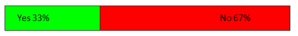
The image above is a mock up from PowerPoint. I can get the chart to work in a Block Chart, Gauge or Bar Chart, but I can't get the text to do what I want. I would like to see the values and the expression label in the chart.
Any suggestions are appreciated. I am guessing the answer is simple and I am just missing it.
I would also like to keep the green on the left and the red on the right if possible.
Thanks in advance for your help.
Accepted Solutions
- Mark as New
- Bookmark
- Subscribe
- Mute
- Subscribe to RSS Feed
- Permalink
- Report Inappropriate Content
Hi,
one solution could be a stacked bar chart like:
hope this helps
regards
Marco
- Mark as New
- Bookmark
- Subscribe
- Mute
- Subscribe to RSS Feed
- Permalink
- Report Inappropriate Content
Hi,
i would use the text in chart option. You can add an expression
='Yes'&Sum(Value)
You can then use Ctrl+shift to re position
Mark
- Mark as New
- Bookmark
- Subscribe
- Mute
- Subscribe to RSS Feed
- Permalink
- Report Inappropriate Content
Exactly! Thanks. I didn't think of looking for a box for the Text in Chart when using Ctrl+Shift.
- Mark as New
- Bookmark
- Subscribe
- Mute
- Subscribe to RSS Feed
- Permalink
- Report Inappropriate Content
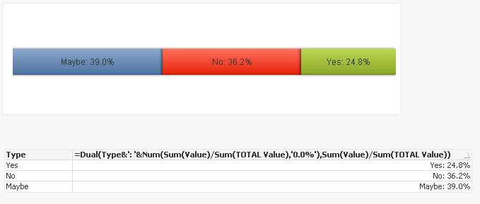
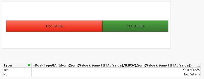
Okay, so that works pretty well. Even when I have a small about on the negative side it looks good.
Not so much when I add a third status type.
Looks good when it is even:

But uneven doesn't look great:

Maybe I didn't quite understand what you were describing.
- Mark as New
- Bookmark
- Subscribe
- Mute
- Subscribe to RSS Feed
- Permalink
- Report Inappropriate Content
Hi,
Yer that is what i was meaning like you say it isn't great once you start having more than two. I haven't found a good way of making them more dynamic, there isn't a set way or an easier option i am aware of.
Mark
- Mark as New
- Bookmark
- Subscribe
- Mute
- Subscribe to RSS Feed
- Permalink
- Report Inappropriate Content
Okay, thanks so much for your help.
- Mark as New
- Bookmark
- Subscribe
- Mute
- Subscribe to RSS Feed
- Permalink
- Report Inappropriate Content
Hi,
one solution could be a stacked bar chart like:
hope this helps
regards
Marco
- Mark as New
- Bookmark
- Subscribe
- Mute
- Subscribe to RSS Feed
- Permalink
- Report Inappropriate Content
Okay, I was trying a stacked bar chart, but I must not have had the settings quite right. That is exactly what I am looking for.
- Mark as New
- Bookmark
- Subscribe
- Mute
- Subscribe to RSS Feed
- Permalink
- Report Inappropriate Content
I tried three different options, both of your suggestions an a third one using a block chart. We picked the stacked bar with the text. I added Pop Up text for the sections that are too short for text and it works. Thanks!
- Mark as New
- Bookmark
- Subscribe
- Mute
- Subscribe to RSS Feed
- Permalink
- Report Inappropriate Content
you're welcome
regards
Marco