Unlock a world of possibilities! Login now and discover the exclusive benefits awaiting you.
- Qlik Community
- :
- All Forums
- :
- QlikView App Dev
- :
- Do do I rangesum with multiple dimensions?
- Subscribe to RSS Feed
- Mark Topic as New
- Mark Topic as Read
- Float this Topic for Current User
- Bookmark
- Subscribe
- Mute
- Printer Friendly Page
- Mark as New
- Bookmark
- Subscribe
- Mute
- Subscribe to RSS Feed
- Permalink
- Report Inappropriate Content
Do do I rangesum with multiple dimensions?
I have a dataset containing Year, Age, and Loss.
For example:
| Year | Age | Loss |
|---|---|---|
| 2007 | 2 | 50 |
| 2007 | 3 | 100 |
| 2009 | 6 | 25 |
| 2007 | 12 | 60 |
| 2008 | 15 | 70 |
| 2009 | 16 | 45 |
| 2010 | 18 | 65 |
And I want to create a line chart with Age on the x-axis and cumulative loss amount on the y-axis, and a separate line for each year.
So for 2007, age 1 would be 0, age 2 would be 50, age 3 would be 50 + 100 = 150, age 4 would be 150, ... age 12 would be 210, etc.
I created a line chart with Age as the first dimension and Year as the second. The expression is
RangeSum (above(sum(Loss),0,RowNo()))
But this doesn't result in the right figures. If I switch the chart to a table, the table looks like this:
| Age | Year | Loss |
|---|---|---|
| 2 | 2007 | 50 |
| 3 | 2007 | 150 |
| 6 | 2009 | 175 |
| 12 | 2007 | 235 |
| 15 | 2008 | 305 |
So I thought maybe it had something to do with sorting, so I sorted the data in my data model by year and then by age but this didn't fix the problem.
What would the correct expression be for this?
Thanks!
- « Previous Replies
-
- 1
- 2
- Next Replies »
Accepted Solutions
- Mark as New
- Bookmark
- Subscribe
- Mute
- Subscribe to RSS Feed
- Permalink
- Report Inappropriate Content
I think this should work out for you.
Script:
Table:
LOAD Year as Year1,
Age,
Loss
FROM
[data.xlsx]
(ooxml, embedded labels);
FinalTable:
LOAD Loss,
Year1 as Year,
Age,
AutoNumber(Age, Year1) as Key
Resident Table
Order By Year1, Age;
DROP Table Table;
- Mark as New
- Bookmark
- Subscribe
- Mute
- Subscribe to RSS Feed
- Permalink
- Report Inappropriate Content
Try this:
RangeSum(Above(TOTAL Sum(Loss), 0, RowNo(TOTAL)))
- Mark as New
- Bookmark
- Subscribe
- Mute
- Subscribe to RSS Feed
- Permalink
- Report Inappropriate Content
Sunny,
Thank you for the response but this doesn't quite work either. It look like this results in a cumulative loss for all years combined.
- Mark as New
- Bookmark
- Subscribe
- Mute
- Subscribe to RSS Feed
- Permalink
- Report Inappropriate Content
Is there a sample you can provide (may be a qvw where you have been working on) so that we can also play around with it a little 
- Mark as New
- Bookmark
- Subscribe
- Mute
- Subscribe to RSS Feed
- Permalink
- Report Inappropriate Content
Sure, here you go:
- Mark as New
- Bookmark
- Subscribe
- Mute
- Subscribe to RSS Feed
- Permalink
- Report Inappropriate Content
Not sure if you have QV12 or not, but I can probably help you with a script solution for QV11.2 or before if you can confirm that one of these is what you are looking for.
- Mark as New
- Bookmark
- Subscribe
- Mute
- Subscribe to RSS Feed
- Permalink
- Report Inappropriate Content
I have QV 11.2
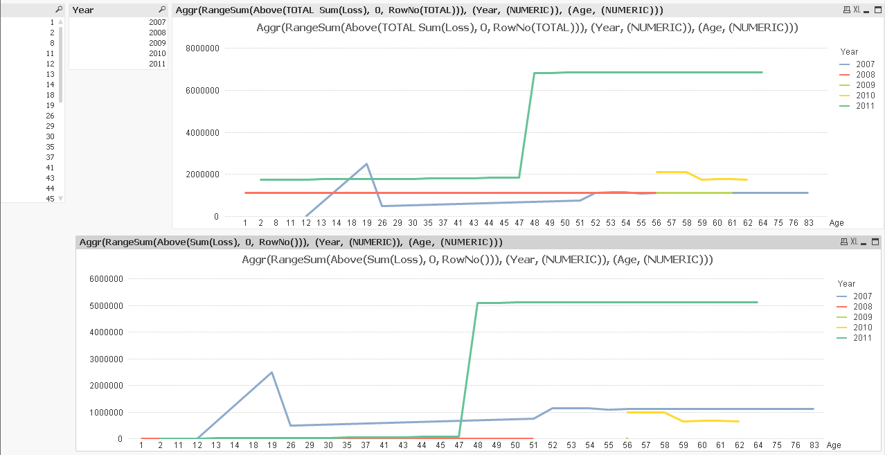
That second chart looks right. The values for 2008 don't look right in the first chart.
- Mark as New
- Bookmark
- Subscribe
- Mute
- Subscribe to RSS Feed
- Permalink
- Report Inappropriate Content
So here is what you need to do. On there first occurrence, sort by Year field first followed by age field. and then you can use this expression:
Aggr(RangeSum(Above(Sum(Loss), 0, RowNo())), Year, Age)
- Mark as New
- Bookmark
- Subscribe
- Mute
- Subscribe to RSS Feed
- Permalink
- Report Inappropriate Content
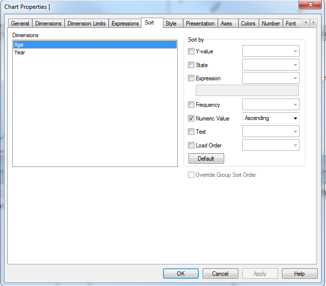
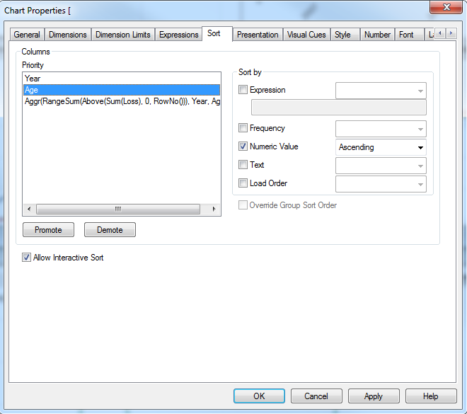
I'm not quite sure I understand what you mean when you say "On there first occurrence, sort by Year field first followed by age field." I went into chart properties and selected 'Sort' but I don't see an option to sort Year first and Age second.
If instead I change the chart to a straight table then it allows me to sort by Year and then Age.
Here's what it looks like when I have the chart set to a line chart:
And then here's a straight table:
- Mark as New
- Bookmark
- Subscribe
- Mute
- Subscribe to RSS Feed
- Permalink
- Report Inappropriate Content
This will be needed to be done in the script. Would you be able to provide this Excel file so that I can reload your qvw file?
C:\Users\A104028\Desktop\New Claims Tracking\CAD\Formula Test\data.xlsx
- « Previous Replies
-
- 1
- 2
- Next Replies »