Unlock a world of possibilities! Login now and discover the exclusive benefits awaiting you.
- Qlik Community
- :
- All Forums
- :
- QlikView App Dev
- :
- Does anyone understand how this attached Parallel ...
- Subscribe to RSS Feed
- Mark Topic as New
- Mark Topic as Read
- Float this Topic for Current User
- Bookmark
- Subscribe
- Mute
- Printer Friendly Page
- Mark as New
- Bookmark
- Subscribe
- Mute
- Subscribe to RSS Feed
- Permalink
- Report Inappropriate Content
Does anyone understand how this attached Parallel Coordinates chart works?
Hi !
Long time lurker, first time poster! Anyway, I'm really interested in creating a parallel coordinates chart in QlikView for exploratory data analysis of multivariate data. A coworker of mine tracked down the attached parallel coordinates chart off the web. It looks like an official QlikView demo for the insurance industry. However, I'm really struggling to understand how it works. The load script appears to be hidden, but perhaps that isn't important.
Specifically the expressions used for the dimensions and for the expressions themselves appear to be generic. Anyone understand how they work? And anyone know if generic expressions are required for a parallel coordinates chart? Any insight or advice is greatly appreciated.
Thanks!
Mike Carpenter
- « Previous Replies
-
- 1
- 2
- Next Replies »
- Mark as New
- Bookmark
- Subscribe
- Mute
- Subscribe to RSS Feed
- Permalink
- Report Inappropriate Content
Hi Sudeep,
Got it thanks a lot.
But what about the line percent ???
On what basis should we give the condition for line percent.
and can we display the line_percent values in the chart above each line???
Thanks in advance
Keerthi
- Mark as New
- Bookmark
- Subscribe
- Mute
- Subscribe to RSS Feed
- Permalink
- Report Inappropriate Content
Hi Sudeep,
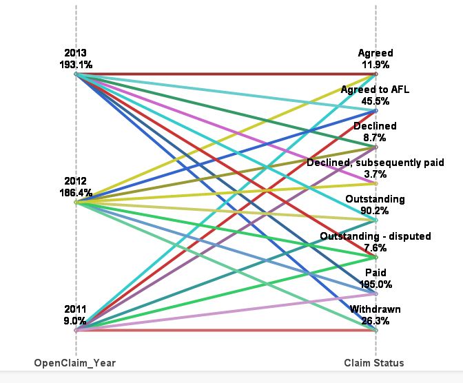
I have changed the expression for node_percent but when i select some fields i get the percentage showing more than 100. I have attached the screen shot.
node_percent :
=$(='(
aggr(
'&
concat('if($Field='&chr(39)&$Field&chr(39)&',1,0)*
count(total <['&$Field&']> ClaimID)
','
+
')
&', $Field, '&
concat('['&$Field&']',',')&')'
&'
)
/count(total ClaimID)
'
)
 @
@
- Mark as New
- Bookmark
- Subscribe
- Mute
- Subscribe to RSS Feed
- Permalink
- Report Inappropriate Content
Hi:
Thank you all for decrypting this geroglific.I'm starting to control it.
Has anyone exported it to Excel?
Does anybody knows what's in column B? pointers?
Thanks.
- Mark as New
- Bookmark
- Subscribe
- Mute
- Subscribe to RSS Feed
- Permalink
- Report Inappropriate Content
Hello Sudeep,
Thanks for sharing.
I am wondering if you know how to create the same chart with QlikSense?
Or do you know such extension for QlikSense?
Kind regards,
- « Previous Replies
-
- 1
- 2
- Next Replies »