Unlock a world of possibilities! Login now and discover the exclusive benefits awaiting you.
- Qlik Community
- :
- All Forums
- :
- QlikView App Dev
- :
- Dynamic Color Chart Caption
- Subscribe to RSS Feed
- Mark Topic as New
- Mark Topic as Read
- Float this Topic for Current User
- Bookmark
- Subscribe
- Mute
- Printer Friendly Page
- Mark as New
- Bookmark
- Subscribe
- Mute
- Subscribe to RSS Feed
- Permalink
- Report Inappropriate Content
Dynamic Color Chart Caption
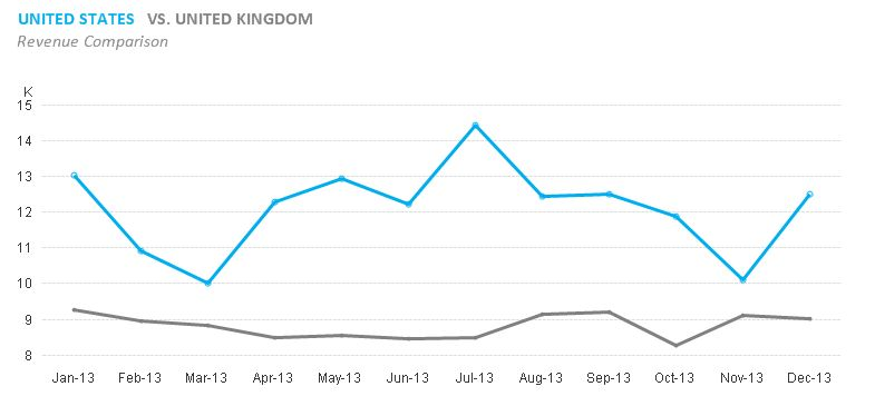
Hi all, I found this chart here - Line charts tricks: In-Chart Legend
I would like to know how to change the color of text in chart captions to match the lines... I was attempting to put my legend on my line charts like in the aforementioned post, but I could not get the function to work properly ( it was returning the max VALUE of my dimension, not replacing it with the text I wanted for a dynamic legend), so I've decided to maybe go this route, but can't seem to figure out how to accomplish this either..
Accepted Solutions
- Mark as New
- Bookmark
- Subscribe
- Mute
- Subscribe to RSS Feed
- Permalink
- Report Inappropriate Content
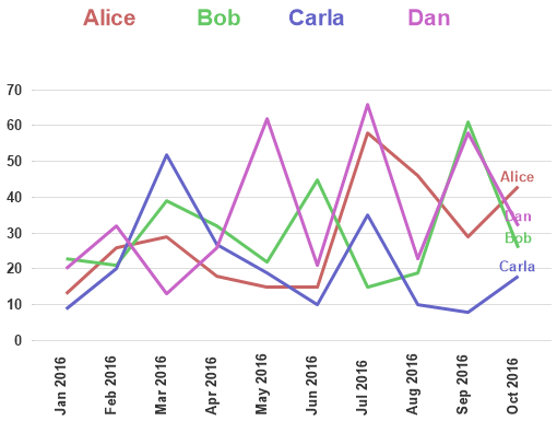
In the original post, rebeccad seems to indicate that it's a text box, and in context, I suspect that the two countries being compared are hardcoded as two separate expressions.
Here's something similar using an additional chart to be the legend, and Name as a dimension. Colors for each name are defined in script and used in both charts to be sure they stay in sync.
Edit: Added colored name at end of each line.
- Mark as New
- Bookmark
- Subscribe
- Mute
- Subscribe to RSS Feed
- Permalink
- Report Inappropriate Content
In the original post, rebeccad seems to indicate that it's a text box, and in context, I suspect that the two countries being compared are hardcoded as two separate expressions.
Here's something similar using an additional chart to be the legend, and Name as a dimension. Colors for each name are defined in script and used in both charts to be sure they stay in sync.
Edit: Added colored name at end of each line.