Unlock a world of possibilities! Login now and discover the exclusive benefits awaiting you.
- Qlik Community
- :
- All Forums
- :
- QlikView
- :
- Dynamic chart creation via script...
- Subscribe to RSS Feed
- Mark Topic as New
- Mark Topic as Read
- Float this Topic for Current User
- Bookmark
- Subscribe
- Mute
- Printer Friendly Page
- Mark as New
- Bookmark
- Subscribe
- Mute
- Subscribe to RSS Feed
- Permalink
- Report Inappropriate Content
Dynamic chart creation via script...
Hi...
I'm new to both QlikView & Qlik Sense, testing them out to see if they meet my needs. I'm leaning towards QlikView as it appears to have more scripting capabilities. However, I was wondering if it's possible to create multiple charts dynamically via script. So, using a really basic example, I would like to create a dynamic number of histograms, one per incoming field, showing the values and counts.
For example, if I have a flat file containing 37 fields, is it possible to loop through each of the fields and create 37 different chart histograms? Or could be 1 histogram per tab, with 37 tabs.
So, if I were to pseudocode it... (Yeah, I'm a SQL guy...)
Load file(s) into TABLE1

declare X integer
     , total_columns integer
     , field_name varchar

set X = 1
set total_columns = count(columns) from TABLE1

While X <= total_columns
  begin
    Set field_name = name(columnnumber(X))

    Create_chart [name: chart + string(X)
          , type: barchart
          , x_axis: columnnumber(X)
          , y_axis: count(*)
          , title: field_name
          , appearance: default]
    X = X + 1
  end

Auto-arrange page
Going forward, I would make this more complex depending on the incoming data type (e.g. do something different with dates), but I'm just trying to proof-of-concept this idea... I also understand that not every chart would be readable (e.g. a comments field), but I'd be OK with that.
Incoming files could contain hundreds of columns, so manually creating a chart for each column is impractical. And using VBScript with Excel would also not work, as I'm dealing with datasets with >1 million rows of data.
Thanks!
- Mark as New
- Bookmark
- Subscribe
- Mute
- Subscribe to RSS Feed
- Permalink
- Report Inappropriate Content
Hi,
instead of generating hundreds of charts you might as well create only one and select a specific field you want to analyse. Crosstable loading your table would give you one field of field names to select in while another field would hold all field values to create your chart with:
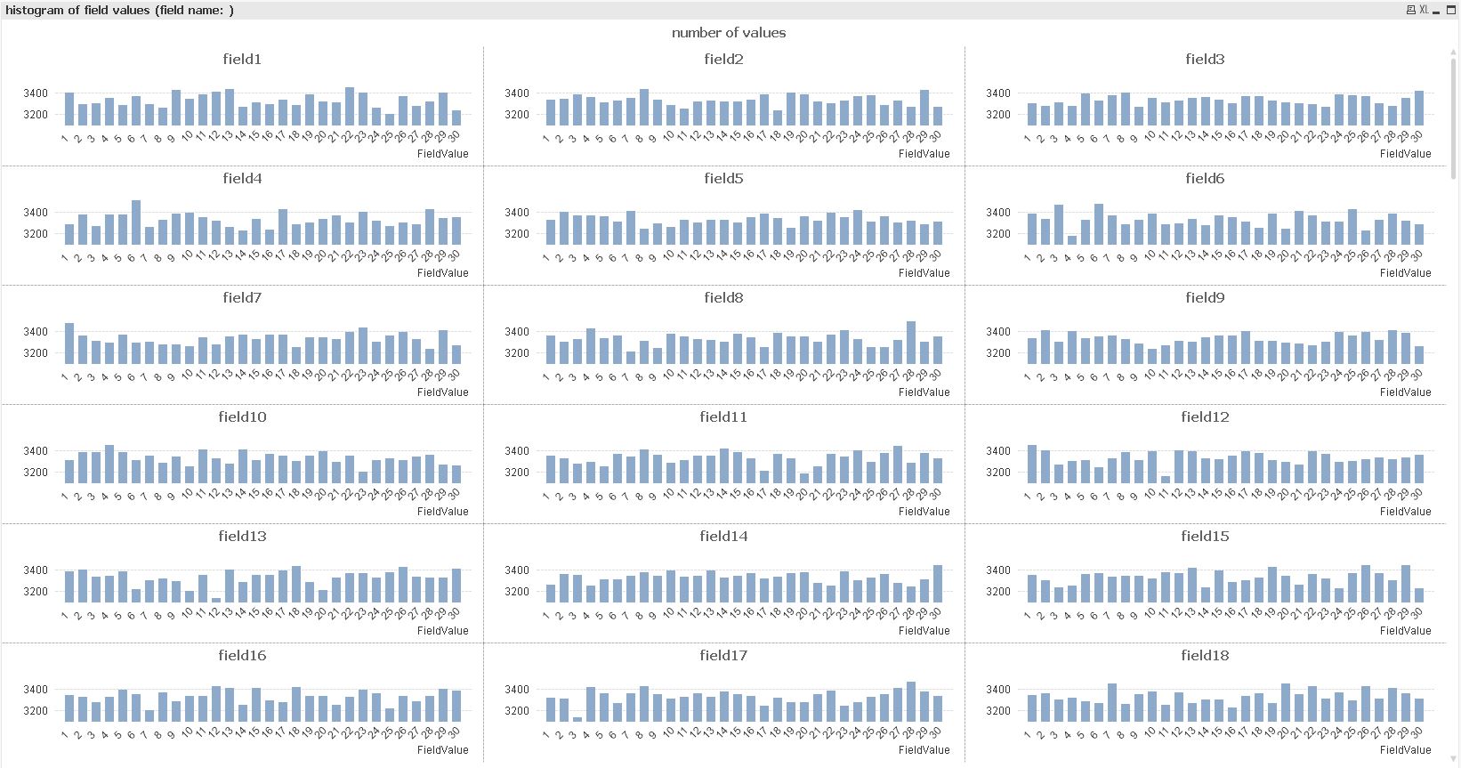
If one histogram at a time is not enough, you could use a trellis chart to present multiple histograms simultaneously:
Your script could be as short as:
CrossTable (FieldName, FieldValue)
LOAD 1, *
FROM  (txt, codepage is 1252, embedded labels, delimiter is ',', msq);
hope this helps
regards
Marco
- Mark as New
- Bookmark
- Subscribe
- Mute
- Subscribe to RSS Feed
- Permalink
- Report Inappropriate Content
Hi Marco...
First off, apologies for my delayed response. Anyway, I was able to get your solution partially working, which gets me closer to my goal!
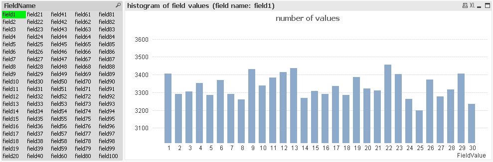
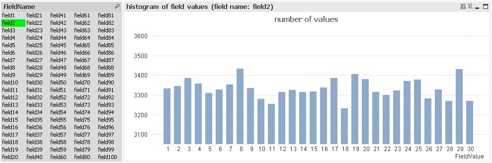
However, when applying your example to my data, each trellis chart's X-axis contains values from all fields, not just the ones applicable to that chart. In your sample, it looks like each field (field1 thru field100) contains the same values: 1-30. In my data, some columns are IDs, dates, strings, etc. So, when I used your sample file with my dataset, the trellis charts often had common X-axis label values, even if the value itself didn't appear in the raw data for that field (e.g. SOME_AMT shows an ID, a date, some number, etc.) Only when I select a specific value in FieldName, the chart shows me only that field's values--but then I'm limited to that one chart, which is what I'm trying to avoid...
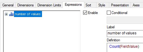
I assume there's some chart option that I haven't selected that would limit the X-axis values to that chart's FieldName? I tried chart Properties / Dimension Limits / [FieldValue] Restrict which values are displayed using the first expression (e.g. largest 10 values), but I found that just changed which entries appeared on the chart--but most of the charts still had the common X-axis values.
I'll append a screenshot in a little bit once I redact some parts.
One other question... Given this is a CrossTable (a cross-join?) I was curious to know how well this scales with larger datasets? QV was fluctuating between using 2-8GB RAM, all for a dataset that's only ~428,000 rows...
Thanks in advance for your help!
- Mark as New
- Bookmark
- Subscribe
- Mute
- Subscribe to RSS Feed
- Permalink
- Report Inappropriate Content
Here's what I'm seeing...
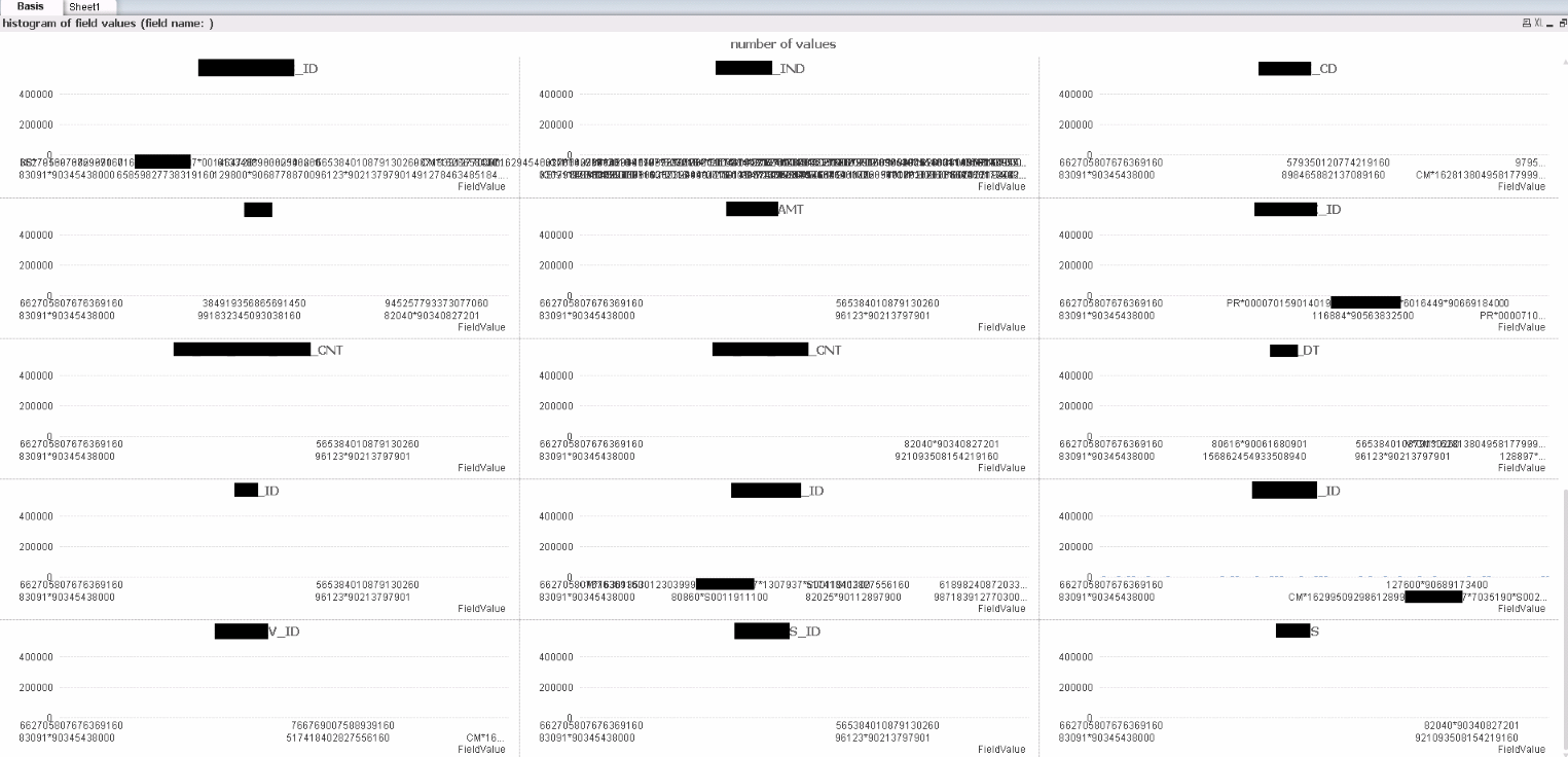
As you can see, there's duplication of the X-axis values in many of the fields, but not all. Some of these datatypes (e.g. xxx_DT or xxx_AMT) shouldn't have some values (e.g. an ID value).
Hoping there's a solution as I feel this gets me REALLY close to where I need to be!
Thanks...
- Mark as New
- Bookmark
- Subscribe
- Mute
- Subscribe to RSS Feed
- Permalink
- Report Inappropriate Content
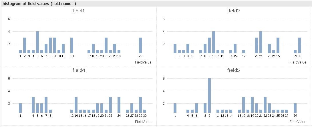
Hi,
using some reduced sample data with some different field values per field,

one solution might be:
As QlikView keeps trellis charts comparable, i.e. using common axes, I tried with suppressing the original dimension labels and showing "text on axis" instead:
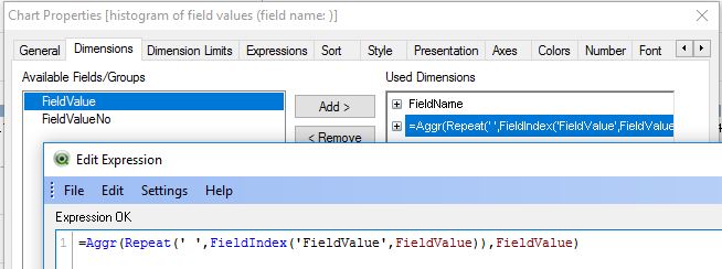
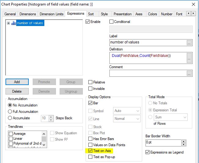

To even suppress the missing value spaces you could extend this solution with consecutive field value autonumbers per field:

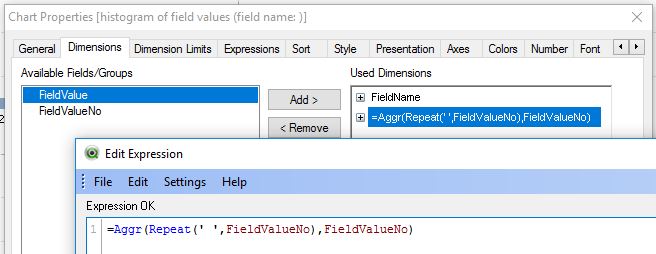
tabTemp:
First 40
LOAD *
FROM  (txt, codepage is 1252, embedded labels, delimiter is ',', msq);

tabTemp2:
CrossTable (FieldName, FieldValue)
LOAD 1, *
Resident tabTemp;

DROP Table tabTemp;

tabFieldValues:
LOAD FieldValue,
    FieldName,
    AutoNumber(FieldValue,FieldName) as FieldValueNo
Resident tabTemp2
Order By FieldValue;

DROP Table tabTemp2;
hope this helps
regards
Marco
- Mark as New
- Bookmark
- Subscribe
- Mute
- Subscribe to RSS Feed
- Permalink
- Report Inappropriate Content
Hi Marco...
I'll get to this tomorrow. However, I'm trying a parallel option - using a module to dynamically loop through the fields. That question is in a different reply on this question.
- Mark as New
- Bookmark
- Subscribe
- Mute
- Subscribe to RSS Feed
- Permalink
- Report Inappropriate Content
So, I'm trying a parallel option. One where I get the data via Edit Script, then using a module (hopefully) loop through all the field names & create one histogram per field.
However, I'm having difficulties getting the code to work. Specifically, I now realize that the "NoOfFields" function can only be called via Edit Script, and not in Edit Module (which returns a "Type mismatch: 'NoOfFields'" error). This leads me to believe that the "fieldName" function won't work in Edit Module... 
So, here's what I have in Edit Script:
RawData:

LOAD *
FROM
(txt, codepage is 1252, embedded labels, delimiter is '|', msq);

LOAD *
FROM
(txt, codepage is 1252, embedded labels, delimiter is '|', msq);


let fn_tot = NoOfFields("RawData");
And this is what I have in Edit Module:
Sub BarChart

' Check whether stored bar chart id exists in the sheet
set v = ActiveDocument.GetVariable("vVar1")
set s=ActiveDocument.ActiveSheet
for i=0 to s.NoOfSheetObjects-1
   if s.SheetObjects(i).GetObjectId =  v.GetContent.String then
   Msgbox "Bar chart already exists. Delete the existing one to create a new bar chart.."
   Exit Sub
   End if
next


For fn = 1 to fn_tot
    set fname = fieldName(fn, "RawData")
    Call  GenerateBarChart (fname)
next

'--ORIGINAL
    'Call  GenerateBarChart ("field1")
    'Call  GenerateBarChart ("field2")

End Sub

'======================================================================

Sub GenerateBarChart (FldNm)

Dim myChart
' Create a new Bar Chart
Set myChart = _
ActiveDocument.ActiveSheet().CreateBarChart()
' Reset the variable
set v = ActiveDocument.GetVariable("vVar1")
'---------------v.SetContent myChart.GetobjectId , true

' Add a dimension of Country to the new chart
myChart.AddDimension FldNm
' Add an expression
myChart.AddExpression "Count (Z)"
' Get the properties object

Dim cp
Set cp = myChart.GetProperties()
' Set the title of the dimension
cp.Dimensions(0).Title.v = "Script " & FldNm
' Set the Title-in-chart text
cp.ChartProperties.Title.Title.v = "ChartProperties " & FldNm
' Set the Window title
cp.GraphLayout.WindowTitle.v = "WindowTitle " & FldNm
' Set sort by Y-Value
cp.SortByYValue = -1
' Get the expression properties
Dim expr, exprvis
Set expr = cp.Expressions.Item(0).Item(0).Data.ExpressionData
Set exprvis = cp.Expressions.Item(0).Item(0).Data.ExpressionVisual
' Set the Expression label
exprvis.Label.v = "Label V " & FldNm
' Set the "Values on Data Point" option
exprvis.NumbersOnBars = -1
' Set the number format for the expression
exprvis.NumberPresentation.Dec = "."
exprvis.NumberPresentation.Fmt = "#,##0.00"
exprvis.NumberPresentation.nDec = 2
exprvis.NumberPresentation.Thou = ","
exprvis.NumberPresentation.Type = 11 'fixed
exprvis.NumberPresentation.UseThou = 1
' Apply the modified properties
myChart.SetProperties cp
End Sub
(Thanks to Macro generates chart but continously and I want once for the idea on the code!)
Basically, if I hardcode the field names (e.g. "ORIGINAL" section above), I get one chart per field, yet if I try to loop through all the fields, nothing happens. I'm guessing it's something simple and that I'm close...
- Mark as New
- Bookmark
- Subscribe
- Mute
- Subscribe to RSS Feed
- Permalink
- Report Inappropriate Content
Hi Marco...
Unfortunately, I've concluded that the CROSSTABLE approach probably won't work--it doesn't appear to scale well. When I loaded a full file (172 MB flat file source // 428k records * 39 columns) into your v2 attachment above, the issue with the charts & x-axis field names was still a problem. More appropriately, page rendering started giving me "Out of object memory" on the chart objects--despite having Win7 x64 and 16GB RAM. Going forward, I would likely need to load multiples of these files simultaneously & analyze all at once, hence needing a solution that can scale...
Any suggestions on how to approach this with code / "parallel option" below? I feel I'm close--all I really need is to figure out how to get the list of fields from a table ("RawData") that I can loop through, calling GenerateBarChart once per field...
Thanks for all your assistance!
- Mark as New
- Bookmark
- Subscribe
- Mute
- Subscribe to RSS Feed
- Permalink
- Report Inappropriate Content
Hi,
Is it possible to write something like dynamic run for 'Field1' to 'Filed100' as well as histogram change auto as a loop?
Thx,
James