Unlock a world of possibilities! Login now and discover the exclusive benefits awaiting you.
- Qlik Community
- :
- All Forums
- :
- QlikView App Dev
- :
- Excel Chart to Qlik Conversion
- Subscribe to RSS Feed
- Mark Topic as New
- Mark Topic as Read
- Float this Topic for Current User
- Bookmark
- Subscribe
- Mute
- Printer Friendly Page
- Mark as New
- Bookmark
- Subscribe
- Mute
- Subscribe to RSS Feed
- Permalink
- Report Inappropriate Content
Excel Chart to Qlik Conversion
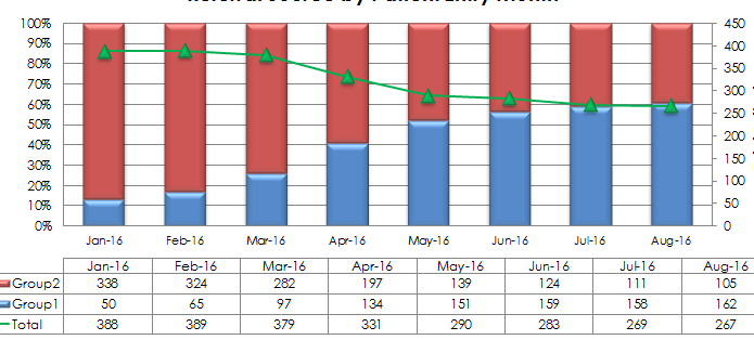
Been working at this for awhile can anyone help me convert this data?:
| Reporting Month | Jan-16 | Feb-16 | Mar-16 | Apr-16 | May-16 | Jun-16 | Jul-16 | Aug-16 |
| Group1 | 50 | 65 | 97 | 134 | 151 | 159 | 158 | 162 |
| Group2 | 338 | 324 | 282 | 197 | 139 | 124 | 111 | 105 |
Group1 =if(Source= 'X', count(PersonID))
Group2 =if(Source= 'Y', count(PersonID))
into this type of Excel chart (table not needed):
- Tags:
- qlikview_scripting
Accepted Solutions
- Mark as New
- Bookmark
- Subscribe
- Mute
- Subscribe to RSS Feed
- Permalink
- Report Inappropriate Content
Create a combi chart with three expressions.
- count({<Source={'X'}>}PersonID)/count(PersonID)
- count({<Source={'y'}>}PersonID)/count(PersonID)
- count(PersonID)
Give the first two expression Bar as Display option
Give the third expression Line and Symbol as Display option
On the Style tab set the Subtype setting to Stacked
On the Axes tab set the Position setting of the third expression to Right (Top) so it gets displayed on the secondary axis.
talk is cheap, supply exceeds demand
- Mark as New
- Bookmark
- Subscribe
- Mute
- Subscribe to RSS Feed
- Permalink
- Report Inappropriate Content
I was trying this, but was not able to get them to stack.
As a work around you have to turn it to a bar chart first - select stacked - then turn it to a combo chart...... weird
Thanks for your help.
Qlik looks way better than Excel