Unlock a world of possibilities! Login now and discover the exclusive benefits awaiting you.
- Qlik Community
- :
- All Forums
- :
- QlikView App Dev
- :
- Expression Background Color for Straight Tables
- Subscribe to RSS Feed
- Mark Topic as New
- Mark Topic as Read
- Float this Topic for Current User
- Bookmark
- Subscribe
- Mute
- Printer Friendly Page
- Mark as New
- Bookmark
- Subscribe
- Mute
- Subscribe to RSS Feed
- Permalink
- Report Inappropriate Content
Expression Background Color for Straight Tables
Hi everyone,
I'm fairly sure I am going about this in the hardest way possible, but my logic has me running into walls over and over. I've found a few threads that have helped me get to where I am currently, but can't seem to get past this point.
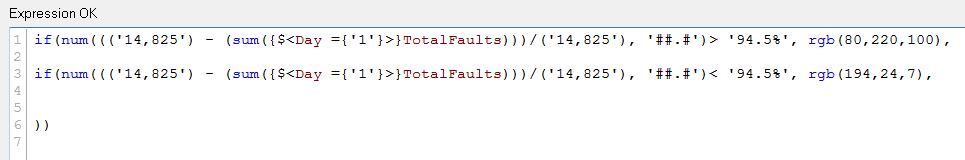
I have a straight table that I would like to have up 5 different colors to highlight the background based on various tiers of values. In the example shown, I have used an if\else statement to give me two highlights, green and red. I I know I can use the Visual Cues tab to highlight up to three different ranges. Ideas on how I can use the expression editor (or other route) to allow me to highlight 5 ranges of values in different colors? I thought I could structure the statements to allow for (LongEquationValue > 'x' and LongEquationValue <'y') to identify a range for each highlight color, but I may be doing something wrong (clearly) as it doesn't recognize the expression as 'OK'.
For context, each day of the month is a column where the sum of TotalFaults is calculated. You'll notice a set analysis statement indicating Day ={'1'} for the first of the month, {'2'} for the second, etc.
Thank you for any assistance!

- « Previous Replies
-
- 1
- 2
- Next Replies »
Accepted Solutions
- Mark as New
- Bookmark
- Subscribe
- Mute
- Subscribe to RSS Feed
- Permalink
- Report Inappropriate Content
Hi Chris,
All you need to do is nest your if statements with all the conditions in the one statement.
eg
if(expression >=0 and CYTD<1000, red(),
if(expression >=1000 and CYTD <10000, lightred(),
if(expression >=10000 and CYTD <20000, yellow(),
if(expression >=20000 and CYTD <50000, blue(),
Green()))))
Hope this helps
- Mark as New
- Bookmark
- Subscribe
- Mute
- Subscribe to RSS Feed
- Permalink
- Report Inappropriate Content
Lisa, I tried the nested ifs but had a typo. Looking at your script I saw my error. Thank you for your response!
- Mark as New
- Bookmark
- Subscribe
- Mute
- Subscribe to RSS Feed
- Permalink
- Report Inappropriate Content
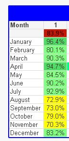
Wanna help with this one? I have the color set to red if the value in the cell is less than 61.5%. At the top I have an avg % of the values in the column. Any idea why it is red?
- Mark as New
- Bookmark
- Subscribe
- Mute
- Subscribe to RSS Feed
- Permalink
- Report Inappropriate Content
Sorry, I can't see the logic here
- Mark as New
- Bookmark
- Subscribe
- Mute
- Subscribe to RSS Feed
- Permalink
- Report Inappropriate Content
stalwar1? Can you lend me some insight as to why the avg% at the top of the column would be red? here is the expression:

- Mark as New
- Bookmark
- Subscribe
- Mute
- Subscribe to RSS Feed
- Permalink
- Report Inappropriate Content
Can you add another expression in this same chart
num((('14.825') - (sum({$<Day = {'1'}>}TotalFaults)))/('14.825'), '##.#')
Make sure to have total mode set to 'Expression Total'
Paste back a screenshot with this information
- Mark as New
- Bookmark
- Subscribe
- Mute
- Subscribe to RSS Feed
- Permalink
- Report Inappropriate Content
Can you share the app perhaps?
- Mark as New
- Bookmark
- Subscribe
- Mute
- Subscribe to RSS Feed
- Permalink
- Report Inappropriate Content

-1925.7 is expression total. 83.9% is avg of rows.
- Mark as New
- Bookmark
- Subscribe
- Mute
- Subscribe to RSS Feed
- Permalink
- Report Inappropriate Content
So, I guess you need to change your expression in the if statement to this
Avg(Aggr((('14.825') - (sum({$<Day = {'1'}>}TotalFaults)))/('14.825'), Month))
and then try it out...
Also, remove num() functions from your if statement as they are not really doing anything within the if statement... (I try to avoid things which don't have any purpose)
- « Previous Replies
-
- 1
- 2
- Next Replies »