Unlock a world of possibilities! Login now and discover the exclusive benefits awaiting you.
- Qlik Community
- :
- All Forums
- :
- QlikView App Dev
- :
- Re: Extract a subset of data
- Subscribe to RSS Feed
- Mark Topic as New
- Mark Topic as Read
- Float this Topic for Current User
- Bookmark
- Subscribe
- Mute
- Printer Friendly Page
- Mark as New
- Bookmark
- Subscribe
- Mute
- Subscribe to RSS Feed
- Permalink
- Report Inappropriate Content
Extract a subset of data
Hy,
I'm new in Qlikview and for two days I'm trying to solve the following problem:
I have a table of transactions in a given period, containing customer's ID and transaction value. How can I extract from this data set the range in percentages of customers that have produced between X% and Y% of total sales, customers being ordered in descending order of total amount? I would like to know for example that between 80% and 90% of revenues contributed between 21% and 55% of customers.
Thx!
- Mark as New
- Bookmark
- Subscribe
- Mute
- Subscribe to RSS Feed
- Permalink
- Report Inappropriate Content
can you please explain in more better way
- Mark as New
- Bookmark
- Subscribe
- Mute
- Subscribe to RSS Feed
- Permalink
- Report Inappropriate Content
Sorry if I didn' t explain very clearly.
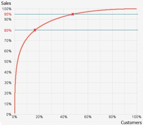
The problem can be represented as in the chart below. Considering that customers are in descending order depending on the total amount, I want to find the "X" values of the two points of intersection
The calculated dimenssion in this chart is:
Aggr(Rank(Sum({<CalendarYear = {$(=Max(CalendarYear))}>} SellerAmount)), SellerID)/ $(vCountSellers)
and the expression:
Sum({<CalendarYear = {$(=Max(CalendarYear))}>} SellerAmount)
where $(vCountSellers) represents the total count of customers.
- Mark as New
- Bookmark
- Subscribe
- Mute
- Subscribe to RSS Feed
- Permalink
- Report Inappropriate Content
I don't think it is possible with qlikview as there is probably no customers that are corresponding to these values of 80% and 95%.
If you know the mathematical formula of your line you can calculate it but QV doesn't provide any function to calculate this except for linear extrapolation (see function linest_* if you like)
regards
Stéphane
- Mark as New
- Bookmark
- Subscribe
- Mute
- Subscribe to RSS Feed
- Permalink
- Report Inappropriate Content
Thanks for your answer!
My goal is to identify those customers who are between the two limits. The first option would be to make a selection directly from the chart, but accuracy to identify exactly those customers who are between the two limits is quite low. The option that I agree is to associate the two limits with two input variables, but I fail to do filtering. I think I need an expression based on a variable (lower limit, upper limit) to calculate the rank of first customer that reaches it. The rank is calculated as:
Rank(Sum({<CalendarYear = {$(=Max(CalendarYear))}>} SellerAmount)), SellerID)
Of course, any other ideas are welcome!
- Mark as New
- Bookmark
- Subscribe
- Mute
- Subscribe to RSS Feed
- Permalink
- Report Inappropriate Content
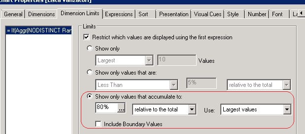
Have you tried to use the dimension limits ? I may be simpler than building a set analysis ?
It is not possible to use the dimension limits because you need two limits.
I think it is better to use a bar chart and to use text on axis to identify the customers.
If your limits change you ll be able to adjust your selection easily.
Please find an exemple attached.
Regards
Stéphane
- Mark as New
- Bookmark
- Subscribe
- Mute
- Subscribe to RSS Feed
- Permalink
- Report Inappropriate Content
Yes Stepahne, I've tried to use the dimension limits, but there is the possibility of introducing a single limit. I can get for example the first 95%, but can not get the range of 80%...95%. Or maybe I don't know how!

- Mark as New
- Bookmark
- Subscribe
- Mute
- Subscribe to RSS Feed
- Permalink
- Report Inappropriate Content
Please find a new application with a proposition.
regards
stephane
- Mark as New
- Bookmark
- Subscribe
- Mute
- Subscribe to RSS Feed
- Permalink
- Report Inappropriate Content
Thank You very munch Stephen for your help!
The application suggests very well the data that I need, but does not do what really interests me, i mean extracting the highlighted data from the chart. This is actually the real challenge! I need a list of all sellers and zooming with the mouse is out of order because it is about tens of thousands of records. On the other hand, using rangesum on so many records crashes the application. Is there a limitation in using rangesum function? This sh is already driving me crazy
Thank you again for helping me!
Cristian D.