Unlock a world of possibilities! Login now and discover the exclusive benefits awaiting you.
- Qlik Community
- :
- All Forums
- :
- QlikView App Dev
- :
- Re: Filter a dimension in a scatter chart when a s...
- Subscribe to RSS Feed
- Mark Topic as New
- Mark Topic as Read
- Float this Topic for Current User
- Bookmark
- Subscribe
- Mute
- Printer Friendly Page
- Mark as New
- Bookmark
- Subscribe
- Mute
- Subscribe to RSS Feed
- Permalink
- Report Inappropriate Content
Filter a dimension in a scatter chart when a selection is made
I have a scatter chart which uses countries as dimension, then I have Products sold in these countries and I want to show only certain group of countries when the users filters one particular product.
Something like:
Full list of countries: a,b,c,d,e,f,g
Full list of products: 1,2,3,4
So I want to show these countries depending on the chosen product:
Product:1, countries: a,d,e
Product:2, countries: a,b,c
Product:3, countries: d,f,g
Product:4, countries: c,d,e
No product selected, countries: show all
Any ideas?
Accepted Solutions
- Mark as New
- Bookmark
- Subscribe
- Mute
- Subscribe to RSS Feed
- Permalink
- Report Inappropriate Content
I think this might be easier if you load this predefined list as a table in your script
Table:
LOAD * INLINE [
    Product, PreferredCountry
    Product1, a
    Product1, b
    Product1, c
    Product2, b
    Product2, x
    Product2, z
    Product3, b
    Product3, d
    Product3, e
    Product3, f
    Product3, m
    Product3, p
    Product3, r
    Product3, s
    Product4, a
    Product4, c
    Product4, l
    Product4, o
    Product4, s
    Product4, u
    Product4, v
];
Where Product field should be connected to your Product field from your other table. and then an expression like this
If(GetSelectedCount(Product) = 0,
  Sum(Measure),
  Sum({<Country = p(PreferredCountry)>}Measure)
)- Mark as New
- Bookmark
- Subscribe
- Mute
- Subscribe to RSS Feed
- Permalink
- Report Inappropriate Content
This should be the default behavior within QlikView.... is it not? What do you see when you see Product 1 for example?
- Mark as New
- Bookmark
- Subscribe
- Mute
- Subscribe to RSS Feed
- Permalink
- Report Inappropriate Content
Hi Sunny, thanks for you answer
Maybe I need to elaborate a little more to make myself clear.
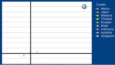
Going back to my example, let's say Product A is sold in 20 countries. So when I filter by Product A I will see 20 countries (bubbles) in the plot, that it is what I think you refer as "default behaviour". Since some of them make a very little contribution (let's say the bubble size is $$ of sales) I do not want to show them so I want to see 8 hand-picked countries out of the 20 that the dimension should be showing
This is what I have for one particular Product:
I do not want to see that long list of countries but 8 predefined countries (the same for all products, a predefined list out of the total list)
This is how it should look:
- Mark as New
- Bookmark
- Subscribe
- Mute
- Subscribe to RSS Feed
- Permalink
- Report Inappropriate Content
Do you want to see top 8 countries? or do you want to always see the same 8 countries regardless of which product you select?
- Mark as New
- Bookmark
- Subscribe
- Mute
- Subscribe to RSS Feed
- Permalink
- Report Inappropriate Content
A custom list of countries depending on the product I select. If I have 20 countries in total each product should have their own list of these countries.
For example:
Product1: countries a,b,c
Product2: countries b,x,z
Product3: countries b,d,e,f,m,p,r,s
Product4: countries a, c, l, o, s, u, v
Every Product will have a predefined list of countries to be shown.
No product or more than one product selected: show all countries
One product selected: show the predefined list of countries for that product
- Mark as New
- Bookmark
- Subscribe
- Mute
- Subscribe to RSS Feed
- Permalink
- Report Inappropriate Content
I think this might be easier if you load this predefined list as a table in your script
Table:
LOAD * INLINE [
    Product, PreferredCountry
    Product1, a
    Product1, b
    Product1, c
    Product2, b
    Product2, x
    Product2, z
    Product3, b
    Product3, d
    Product3, e
    Product3, f
    Product3, m
    Product3, p
    Product3, r
    Product3, s
    Product4, a
    Product4, c
    Product4, l
    Product4, o
    Product4, s
    Product4, u
    Product4, v
];
Where Product field should be connected to your Product field from your other table. and then an expression like this
If(GetSelectedCount(Product) = 0,
  Sum(Measure),
  Sum({<Country = p(PreferredCountry)>}Measure)
)- Mark as New
- Bookmark
- Subscribe
- Mute
- Subscribe to RSS Feed
- Permalink
- Report Inappropriate Content
Thanks Sunny, the way to structure the INLINE table + the use of p() in the set analysis expression did the trick!

