Unlock a world of possibilities! Login now and discover the exclusive benefits awaiting you.
- Qlik Community
- :
- All Forums
- :
- QlikView App Dev
- :
- Re: Find the maximum value in pivot table
- Subscribe to RSS Feed
- Mark Topic as New
- Mark Topic as Read
- Float this Topic for Current User
- Bookmark
- Subscribe
- Mute
- Printer Friendly Page
- Mark as New
- Bookmark
- Subscribe
- Mute
- Subscribe to RSS Feed
- Permalink
- Report Inappropriate Content
Find the maximum value in pivot table
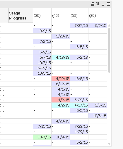
Hi, we chart our sales through a series of stages, 20, 40, 60, 80, and won/lost. The expression portion of the table looks like this:

I used the "AFTER()" function to set background colours, depending on the length of time the sale was in a particular stage. However, I have been asked to modify this to find the SINGLE stage for each customer (not shown, but they are the first dimension) where the sale has sat the longest, and set that background colour to red.For example, on the 11th row, I would subtract the 60 date from today, and since that's more than the difference between the 40 and 60 stage (6/8-4/29 << 10/14-6/8), I would just colour the 60 date red.
If there's only one stage shown, I need to set that to red.
Finally, if the sale has gone 'backwards' (e.g. 7th row above, where it went from 60 on May 2 to 20 on June 7), I need to set that to red.
The last part (backwards) is pretty easy, but how would I find the max in say, line 16 (4/2/15,4/17/15,5/6/15) succinctly? I guess I could do it with a ton of nested IF statements, but I was wondering if there was a more elegant way to do it.
Thanks for any assistance!
- Mark as New
- Bookmark
- Subscribe
- Mute
- Subscribe to RSS Feed
- Permalink
- Report Inappropriate Content
This is where you need Advanced Aggregation!
In order to find the Max value across all values in a row of a Pivot Table, you need to calculate your <formula> at the most detailed level (in your case, by Customer and Stage) and then find the Max value across these pre-aggregated values, aggregated by Customer. So, something like this should work:
AGGR( nodistinct
MAX(
AGGR( nodistinct
<formula>
,Customer, Stage)
)
, Customer)
You can learn more about Advanced Aggregation from my new book, QlikView Your Business, or by attending one of the future sessions of the Masters Summit for QlikView, where I teach Set Analysis and Advanced Aggregation.
cheers,
Oleg Troyansky
- Mark as New
- Bookmark
- Subscribe
- Mute
- Subscribe to RSS Feed
- Permalink
- Report Inappropriate Content
Hi Kevin,
Have you access to the script?
Maybe it will be easier to do your expressions in the charts if you have already calculated the time between a stage and the preceding one in the datamodel. So, then, with a simple set analysis you will be able to compare the duration with the max per individual.
Regards,
Vincent
- Mark as New
- Bookmark
- Subscribe
- Mute
- Subscribe to RSS Feed
- Permalink
- Report Inappropriate Content
As advised by @Vincent, (If you don't have access to Script)
Use a set analysis like {max()} to get the desired result
Sreeni
- Mark as New
- Bookmark
- Subscribe
- Mute
- Subscribe to RSS Feed
- Permalink
- Report Inappropriate Content
Max value can be found using rangemax, see if something like below can be replicated, not sure though, ![]()
Used experession - If(Column(1)=RangeMax(Column(1),Column(2),Column(3)),Red()) in the background color of first expression.
- Mark as New
- Bookmark
- Subscribe
- Mute
- Subscribe to RSS Feed
- Permalink
- Report Inappropriate Content
thanks, Oleg. I will give that a try. I didn't know you could nest AGGR functions.
I had tried aggr(Max(ChDate),Company, Stage) but that didn't work.
- Mark as New
- Bookmark
- Subscribe
- Mute
- Subscribe to RSS Feed
- Permalink
- Report Inappropriate Content
I'm going to try that, but is that a pivot table or a straight table?
I pivoted the "change date" in my table, so rather than use "col(1)", I guess I'll have to use "below()" functions.
But it's an interesting concept. Thanks!
- Mark as New
- Bookmark
- Subscribe
- Mute
- Subscribe to RSS Feed
- Permalink
- Report Inappropriate Content
I am trying to do that in my script but unfortunately, the sales progression is rarely linear; a sale will go from 20 to 40 to 60 back to 20, etc. I'm still struggling with how to calculate and identify those steps properly, and I need feedback from my internal customers on what they want to see.