Unlock a world of possibilities! Login now and discover the exclusive benefits awaiting you.
- Qlik Community
- :
- All Forums
- :
- QlikView App Dev
- :
- Forcing Line Chart to Start at the Beginning of X ...
- Subscribe to RSS Feed
- Mark Topic as New
- Mark Topic as Read
- Float this Topic for Current User
- Bookmark
- Subscribe
- Mute
- Printer Friendly Page
- Mark as New
- Bookmark
- Subscribe
- Mute
- Subscribe to RSS Feed
- Permalink
- Report Inappropriate Content
Forcing Line Chart to Start at the Beginning of X Axis
Hi All,
i want to ask on how to force a line (for all the lines) to start from the beginning of the X Axis?
below are the example of what i have now in QV:
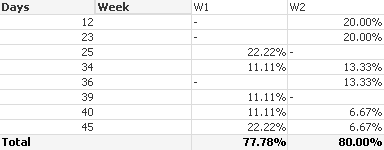
i turn the pivot table into line chart (i checked the Full Accumulation in the chart properties to make the percentage Accumulated each Days) :
as you can see the BLUE line (W1) will not start from Days "12" because in the actual data and also in the Pivot table "W1" does not have data for it.
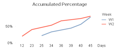
But the line chart that i am expecting is actually something like this :

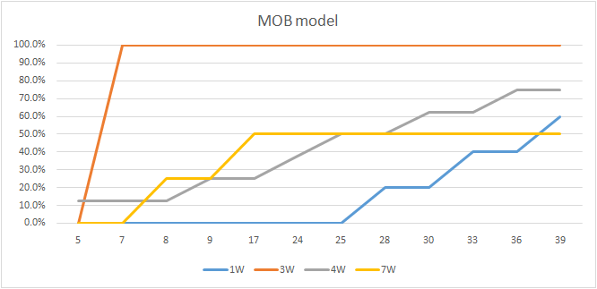
this is a chart created in Excel, and all the Lines started from the beginning of the X Axis (Days 5).
Because in Excel when the chart was created, it actually comes from a Pivot table that look like this :
| 1W | 3W | 4W | 7W | |
| 5 | 0.0% | 0.0% | 12.5% | 0.0% |
| 7 | 0.0% | 100.0% | 12.5% | 0.0% |
| 8 | 0.0% | 100.0% | 12.5% | 25.0% |
| 9 | 0.0% | 100.0% | 25.0% | 25.0% |
| 17 | 0.0% | 100.0% | 25.0% | 50.0% |
| 24 | 0.0% | 100.0% | 37.5% | 50.0% |
| 25 | 0.0% | 100.0% | 50.0% | 50.0% |
| 28 | 20.0% | 100.0% | 50.0% | 50.0% |
| 30 | 20.0% | 100.0% | 62.5% | 50.0% |
| 33 | 40.0% | 100.0% | 62.5% | 50.0% |
| 36 | 40.0% | 100.0% | 75.0% | 50.0% |
| 39 | 60.0% | 100.0% | 75.0% | 50.0% |
In Excel we can put "0" value for the cells that does not have data in a Pivot table, so the line chart will all start from Days "5" with 0% value.
Any idea on how we can do this in QV? maybe a work around in the data model or the chart expressions?
Attached is my QVW.
Thank you in advanced.
- Mark as New
- Bookmark
- Subscribe
- Mute
- Subscribe to RSS Feed
- Permalink
- Report Inappropriate Content
Hi,
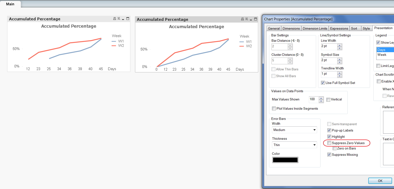
Uncheck Supress Zero values option in
Chart Properties -> Presentation tab.
Regards,
Jagan.
- Mark as New
- Bookmark
- Subscribe
- Mute
- Subscribe to RSS Feed
- Permalink
- Report Inappropriate Content
Have you tried this?
- Mark as New
- Bookmark
- Subscribe
- Mute
- Subscribe to RSS Feed
- Permalink
- Report Inappropriate Content
Hi Jagan & Chiranjeevi,
i have tried that option before, but it will show from days "0" value not from days "12" value in the X Axis, and also the BLUE line (W1) which only have data starting from days"25", will look like it has data from days"12" and Days"23".
Ok i have updated my data, i removed the Days "0" so the min value in the X Axis is Days "12" now and also i changed my set analysis to use Flag = "A" rather than Days>="0" like before.
So i am hoping i can get the BLUE line (W1) to be forced to start from Days "12" in the X Axis, and will show 0% value from Days 12 and 23, starting to show 28.57% Value on Days "25".
I Re-Attached my update QVW.
Thanks!
- Mark as New
- Bookmark
- Subscribe
- Mute
- Subscribe to RSS Feed
- Permalink
- Report Inappropriate Content
Hi,
Please find attached file, you can see the bubbles on lines, that the first value is on 23 and 25 for weeks, in between there are no values for example if you have 0% for 0 then 0 is plotted at that position, since you have values only for that day the value is shooting up from 0.
Hope this helps you.
Regards,
Jagan.
- Mark as New
- Bookmark
- Subscribe
- Mute
- Subscribe to RSS Feed
- Permalink
- Report Inappropriate Content
I have got by using two separate expressions.may be helpful for you.
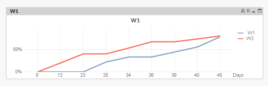
QVW is attached
- Mark as New
- Bookmark
- Subscribe
- Mute
- Subscribe to RSS Feed
- Permalink
- Report Inappropriate Content
Hi Chiranjeevi,
the chart you posted is exactly the result that i am expecting, but the only problem is if we need to create seperate expressions for each Week (W1, W2) it will be quite troublesome and not really good to be shown to customer, because in the real situation it could be alot of weeks let say 52 weeks in a year then we will need to create 52 expressions. If only
we can use just 1 expression to produce the chart.

Any more idea maybe?
Thanks alot though.
- Mark as New
- Bookmark
- Subscribe
- Mute
- Subscribe to RSS Feed
- Permalink
- Report Inappropriate Content
Hi Jagan,
totally understand your point, but the customer that i am facing with actually insisted that the chart should look like the one below :
so if the line, let say Yellow line does not have data for Days "5" and "7" it will be flat line in the 0.0%, only once it reached days"8" when it has value then the line will float / go-up to (for this example) 28%.\
because they will ask why the line is floating over than 0.0% although it has "0" value or no value.
thanks alot anyway.