Unlock a world of possibilities! Login now and discover the exclusive benefits awaiting you.
Announcements
FLASH SALE: Save $500! Use code FLASH2026 at checkout until Feb 14th at 11:59PM ET. Register Now!
- Qlik Community
- :
- All Forums
- :
- QlikView App Dev
- :
- Re: Forecasting Expression
Options
- Subscribe to RSS Feed
- Mark Topic as New
- Mark Topic as Read
- Float this Topic for Current User
- Bookmark
- Subscribe
- Mute
- Printer Friendly Page
Turn on suggestions
Auto-suggest helps you quickly narrow down your search results by suggesting possible matches as you type.
Showing results for
Not applicable
2016-07-12
05:01 PM
- Mark as New
- Bookmark
- Subscribe
- Mute
- Subscribe to RSS Feed
- Permalink
- Report Inappropriate Content
Forecasting Expression
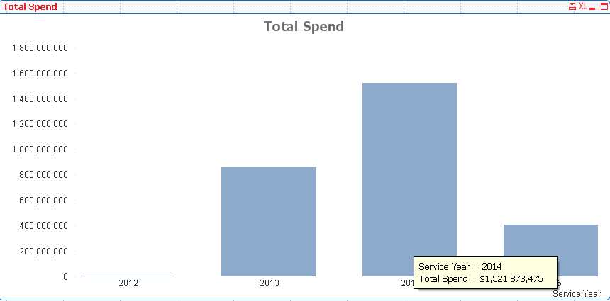
All, I have a simple bar chart with 4 years of data, and I want to add an additional 5 years of forecasting data. Any advice. This is just dummy data for a demo, so as long as I can show something that's fine.
Year = [Service Year]
Spend = Sum([Total Spend])
1,997 Views
1 Solution
Accepted Solutions
Not applicable
2016-07-13
05:01 PM
Author
- Mark as New
- Bookmark
- Subscribe
- Mute
- Subscribe to RSS Feed
- Permalink
- Report Inappropriate Content
Thanks all, but I found an alternative.
1,612 Views
4 Replies
MVP
2016-07-12
10:13 PM
- Mark as New
- Bookmark
- Subscribe
- Mute
- Subscribe to RSS Feed
- Permalink
- Report Inappropriate Content
What exactly are you aiming to do here? What is the plan, can you elaborate may be? and provide a sample?
1,612 Views
Not applicable
2016-07-13
12:26 AM
Author
- Mark as New
- Bookmark
- Subscribe
- Mute
- Subscribe to RSS Feed
- Permalink
- Report Inappropriate Content
Its complex when you need a accurate forecasting, but for demonstration, why not add a trend line on the graph? It seems easier! Just right click the chart to find it out!
1,612 Views
Specialist
2016-07-13
01:08 AM
- Mark as New
- Bookmark
- Subscribe
- Mute
- Subscribe to RSS Feed
- Permalink
- Report Inappropriate Content
1,612 Views
Not applicable
2016-07-13
05:01 PM
Author
- Mark as New
- Bookmark
- Subscribe
- Mute
- Subscribe to RSS Feed
- Permalink
- Report Inappropriate Content
Thanks all, but I found an alternative.
1,613 Views