Unlock a world of possibilities! Login now and discover the exclusive benefits awaiting you.
- Qlik Community
- :
- All Forums
- :
- QlikView App Dev
- :
- Graph Grouped Issue
- Subscribe to RSS Feed
- Mark Topic as New
- Mark Topic as Read
- Float this Topic for Current User
- Bookmark
- Subscribe
- Mute
- Printer Friendly Page
- Mark as New
- Bookmark
- Subscribe
- Mute
- Subscribe to RSS Feed
- Permalink
- Report Inappropriate Content
Graph Grouped Issue
Hello,
I have 1 Normal Graph. PFA
I attached 2 Graph's ..
1) Normal 2) Expected
- Mark as New
- Bookmark
- Subscribe
- Mute
- Subscribe to RSS Feed
- Permalink
- Report Inappropriate Content
I added two more columns to your spreadsheet, used a basis formula to compute those so should not be a problem implementing it..
I could achieve it partially, it is the group which is causing the problem.. if I just take year as dimension.. it is working properly.. but as soon as I take group in dimension.. it stops working..
- Mark as New
- Bookmark
- Subscribe
- Mute
- Subscribe to RSS Feed
- Permalink
- Report Inappropriate Content
the first chart works the way you want (but only year in dimension had to remove group to make it work).. pls select any year and check.. the second chart with group is not working..
- Mark as New
- Bookmark
- Subscribe
- Mute
- Subscribe to RSS Feed
- Permalink
- Report Inappropriate Content
The answer to your question is bellow this.
But let me remind you it's not quite what you have expected in the first place...
Regards,
MB
- Mark as New
- Bookmark
- Subscribe
- Mute
- Subscribe to RSS Feed
- Permalink
- Report Inappropriate Content
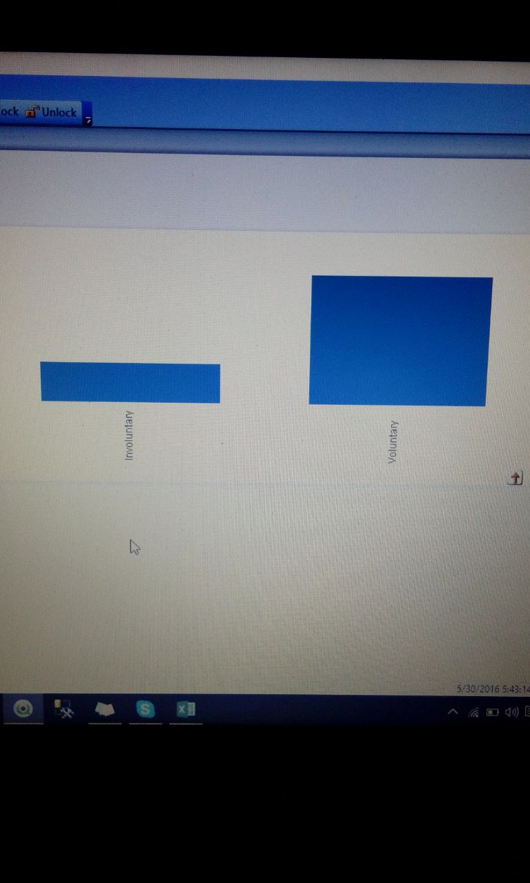
Is there any chance / option to rotate the chart like above ...!
- Mark as New
- Bookmark
- Subscribe
- Mute
- Subscribe to RSS Feed
- Permalink
- Report Inappropriate Content
Refer to the atached file:
Regards,
MB
- Mark as New
- Bookmark
- Subscribe
- Mute
- Subscribe to RSS Feed
- Permalink
- Report Inappropriate Content
Explanation:
Use Text Sort option in the properties of your bar chart, then change it from "A -> Z" to "Z -> A"
Regards,
MB
- Mark as New
- Bookmark
- Subscribe
- Mute
- Subscribe to RSS Feed
- Permalink
- Report Inappropriate Content
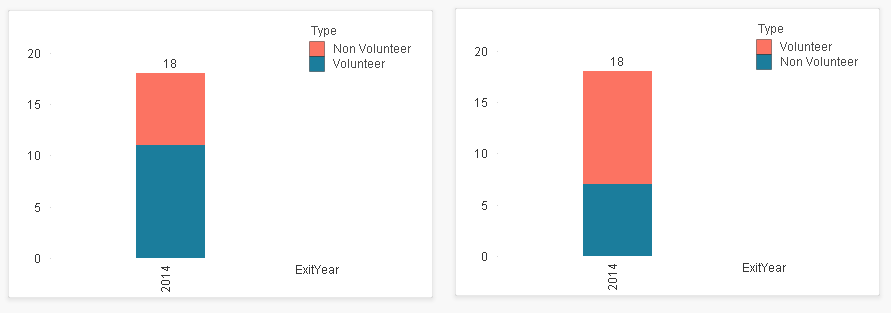
Miguel,
Please try to look my image and they try ...
- Mark as New
- Bookmark
- Subscribe
- Mute
- Subscribe to RSS Feed
- Permalink
- Report Inappropriate Content
I've looked to your image and my given qvw does that. See the image:
- Mark as New
- Bookmark
- Subscribe
- Mute
- Subscribe to RSS Feed
- Permalink
- Report Inappropriate Content
Just wanted to show how chart behaving incorrectly.. when used group as a dimension (I am not sure.. if it's a bug).. but the idea was to decide and implement solution per our priorities.. if we can live without the grouping then we can have a dimension which can show the year wise distribution of attrition and then when we click on it can see their distribution...
- Mark as New
- Bookmark
- Subscribe
- Mute
- Subscribe to RSS Feed
- Permalink
- Report Inappropriate Content
That is not a problem.
My requirement is like below ....jpg)