Unlock a world of possibilities! Login now and discover the exclusive benefits awaiting you.
- Qlik Community
- :
- All Forums
- :
- QlikView App Dev
- :
- Graph Question
- Subscribe to RSS Feed
- Mark Topic as New
- Mark Topic as Read
- Float this Topic for Current User
- Bookmark
- Subscribe
- Mute
- Printer Friendly Page
- Mark as New
- Bookmark
- Subscribe
- Mute
- Subscribe to RSS Feed
- Permalink
- Report Inappropriate Content
Graph Question
Hello,
I have a graph that has the dimension as date and the expression as a percentage for 4 different regions.
The graph shows the percentage on the Y-axis and the date on the X-axis. The different regions are represented by bars.
I want to make a graph that will list the regions on the X-axis, the percentage on the Y-axis and have the months represented by bars.
The data is coming from Excel. I am able to make this graph in excel with the information I have.
How would I put this in the chart maker for QlikView?
Thanks
- Tags:
- new_to_qlikview
Accepted Solutions
- Mark as New
- Bookmark
- Subscribe
- Mute
- Subscribe to RSS Feed
- Permalink
- Report Inappropriate Content
You need to load your data in differently....
Table:
Load * inline
[
ActionDate, Country, Percent
October, US,3%
October, Mexico,7%
October, Canada,3%
November, US,2%
November, Mexico,5%
November, Canada,4%
December, US,3%
December, Mexico,4%
December, Canada,3%
];
If you load it like that and make the first dimension country and the second action date and then set the expression to sum(percent) you should get the chart you are looking to make. See attached qvw
- Mark as New
- Bookmark
- Subscribe
- Mute
- Subscribe to RSS Feed
- Permalink
- Report Inappropriate Content
Can u attach sample application ?
If the issue is solved please mark the answer with Accept as Solution & like it.
If you want to go quickly, go alone. If you want to go far, go together.
- Mark as New
- Bookmark
- Subscribe
- Mute
- Subscribe to RSS Feed
- Permalink
- Report Inappropriate Content
Michael
On the Style tab of your Bar Chart Object try changing the Orientation to Horizontal. [Picture of bar going left to right]
Best Regards, Bill
- Mark as New
- Bookmark
- Subscribe
- Mute
- Subscribe to RSS Feed
- Permalink
- Report Inappropriate Content
Hi Michael,
Try to change the Vertical order horizontal in chart properties, otherwise when load data from excel inter change the row to column(use transform wizard). any share the sample document.
For Ex,
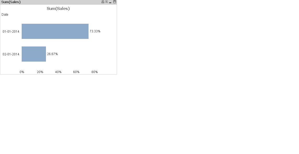
Dev01:
LOAD * Inline
[
Region,Date,Sales
South,01-01-2014,50
South,02-01-2014,60
North,01-01-2014,30
North,01-01-2014,40
East,01-01-2014,20
East,01-01-2014,10
West,01-01-2014,5
West,01-01-2014,10
];
Chart -> Properties->Style (Tab)->Orientation
(Expression Enable Relative check box)
Regards,
Raja
- Mark as New
- Bookmark
- Subscribe
- Mute
- Subscribe to RSS Feed
- Permalink
- Report Inappropriate Content
Here is my data:
| ActionDate | US | Mexico | Canada |
| October | 3% | 7% | 3% |
| November | 2% | 5% | 4% |
| December | 3% | 4% | 3% |
Here is how the graph comes out in QlikView
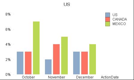
Here is how I want the Graph (pulled from Excel):
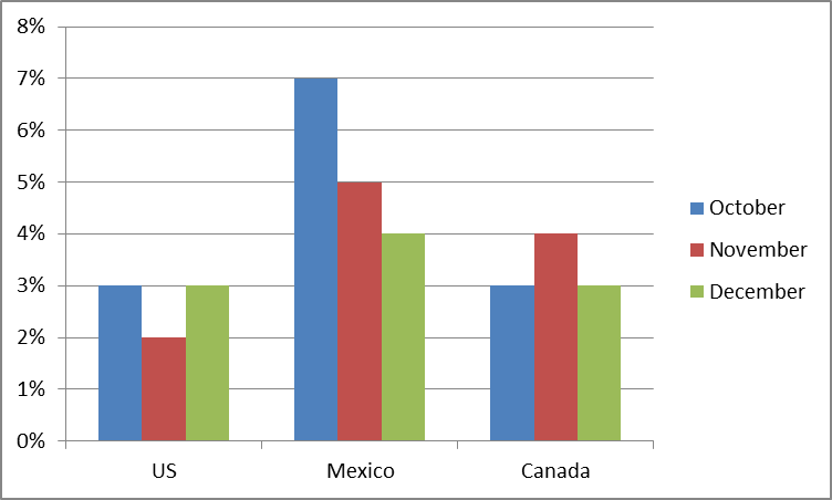
Thanks
- Mark as New
- Bookmark
- Subscribe
- Mute
- Subscribe to RSS Feed
- Permalink
- Report Inappropriate Content
Michael
Use Promote / Demote to change the order of your Dimensions in Dimension Tab of the Bar Chart Object.
Best Regards, Bill
- Mark as New
- Bookmark
- Subscribe
- Mute
- Subscribe to RSS Feed
- Permalink
- Report Inappropriate Content
just Promote the dimensions according to your view in dimension tab ....
- Mark as New
- Bookmark
- Subscribe
- Mute
- Subscribe to RSS Feed
- Permalink
- Report Inappropriate Content
Just change the dimensions order
- Mark as New
- Bookmark
- Subscribe
- Mute
- Subscribe to RSS Feed
- Permalink
- Report Inappropriate Content
You need to load your data in differently....
Table:
Load * inline
[
ActionDate, Country, Percent
October, US,3%
October, Mexico,7%
October, Canada,3%
November, US,2%
November, Mexico,5%
November, Canada,4%
December, US,3%
December, Mexico,4%
December, Canada,3%
];
If you load it like that and make the first dimension country and the second action date and then set the expression to sum(percent) you should get the chart you are looking to make. See attached qvw