Unlock a world of possibilities! Login now and discover the exclusive benefits awaiting you.
- Qlik Community
- :
- All Forums
- :
- QlikView App Dev
- :
- Re: Graph problem
- Subscribe to RSS Feed
- Mark Topic as New
- Mark Topic as Read
- Float this Topic for Current User
- Bookmark
- Subscribe
- Mute
- Printer Friendly Page
- Mark as New
- Bookmark
- Subscribe
- Mute
- Subscribe to RSS Feed
- Permalink
- Report Inappropriate Content
Graph problem
Hi,
I'm trying to make a chart with a color term.
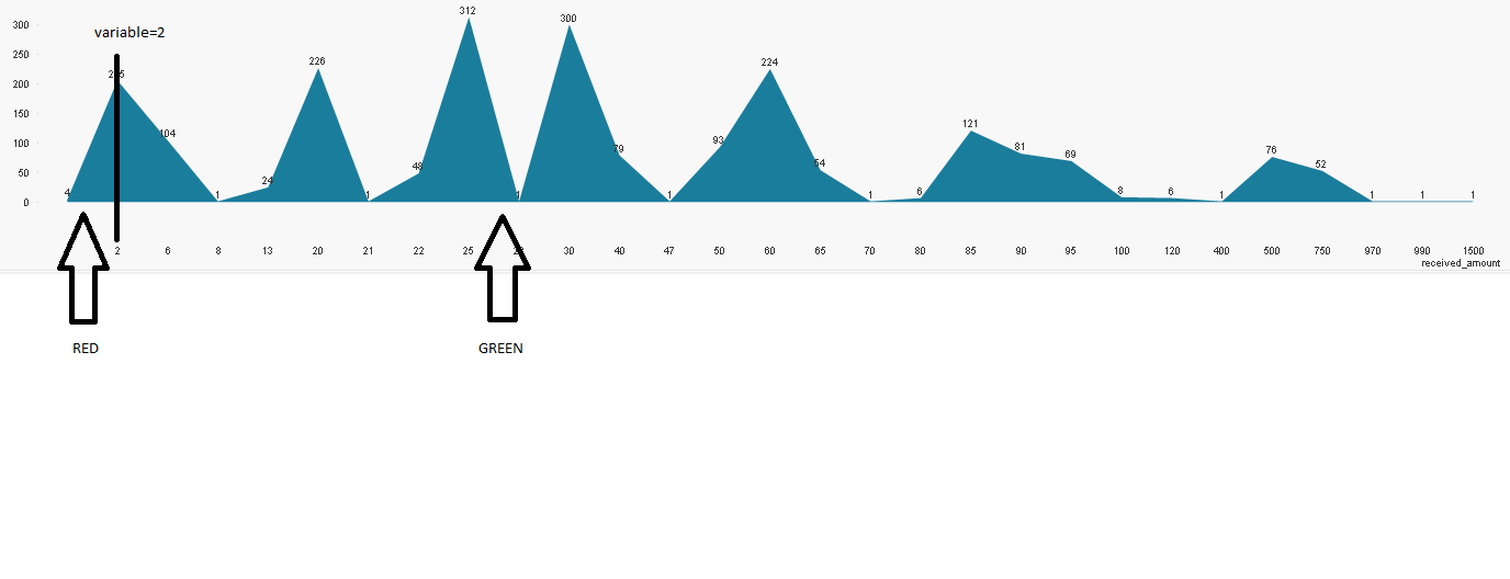
If the Dimension (It's actually a measure) is bigger than a number (exists in a variable) than green else red.
I'm trying to do this on this kind of Chart.
Thanks.
- « Previous Replies
-
- 1
- 2
- Next Replies »
Accepted Solutions
- Mark as New
- Bookmark
- Subscribe
- Mute
- Subscribe to RSS Feed
- Permalink
- Report Inappropriate Content
- Mark as New
- Bookmark
- Subscribe
- Mute
- Subscribe to RSS Feed
- Permalink
- Report Inappropriate Content
Hi Meitar,
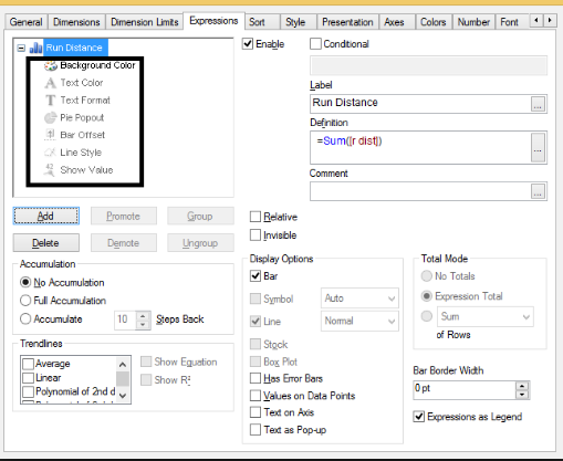
if you Expand expression then in Background color and Text Color write below expression
if (Variable name >2,red(),green())
Regards,
Bhargav
- Mark as New
- Bookmark
- Subscribe
- Mute
- Subscribe to RSS Feed
- Permalink
- Report Inappropriate Content
Hi
with this kind of graph, you can't do that
- Mark as New
- Bookmark
- Subscribe
- Mute
- Subscribe to RSS Feed
- Permalink
- Report Inappropriate Content
I tried that without a success.
- Mark as New
- Bookmark
- Subscribe
- Mute
- Subscribe to RSS Feed
- Permalink
- Report Inappropriate Content
I wish you wrong.
- Mark as New
- Bookmark
- Subscribe
- Mute
- Subscribe to RSS Feed
- Permalink
- Report Inappropriate Content
I already was truck on helping on another thread on qliksense, but it is the same.. one Guy was talking about modifying the css files of the graph..
Maybe it is possible with some tricks.. but not out of the box
- Mark as New
- Bookmark
- Subscribe
- Mute
- Subscribe to RSS Feed
- Permalink
- Report Inappropriate Content
I tried also by creating 2 graphs 1 with all the dimension and 1 with the dimension bigger than the variable.
After I will put the one with the less data on the one with all the data.
My problem is that I'm losing the proportion of x axes.
Maybe someone can assist please?
Thanks
- Mark as New
- Bookmark
- Subscribe
- Mute
- Subscribe to RSS Feed
- Permalink
- Report Inappropriate Content
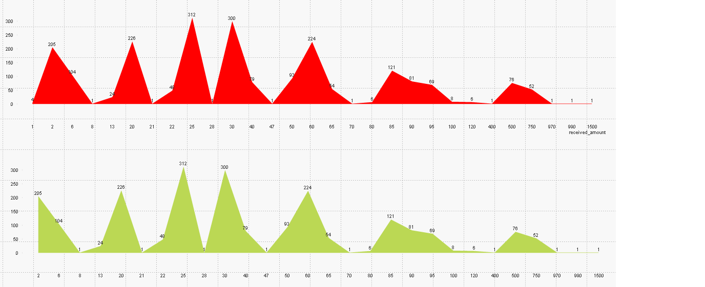
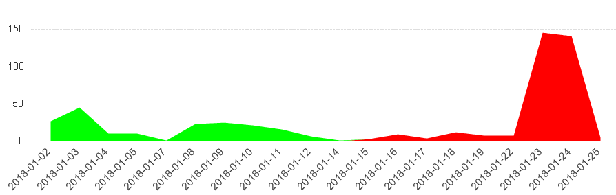
Hi,
I'll think it better to do 2 Expression.
1. sum({<received_amount={"<=$(=Variable)"}Your Expression)
backgroundcolor red
2. sum({<received_amount={">$(=Variable)"}Your Expression)
backgroundcolor green
- Mark as New
- Bookmark
- Subscribe
- Mute
- Subscribe to RSS Feed
- Permalink
- Report Inappropriate Content
like this
- Mark as New
- Bookmark
- Subscribe
- Mute
- Subscribe to RSS Feed
- Permalink
- Report Inappropriate Content
Thanks!
- « Previous Replies
-
- 1
- 2
- Next Replies »