Unlock a world of possibilities! Login now and discover the exclusive benefits awaiting you.
- Qlik Community
- :
- All Forums
- :
- QlikView App Dev
- :
- Grid Chart Data points format
- Subscribe to RSS Feed
- Mark Topic as New
- Mark Topic as Read
- Float this Topic for Current User
- Bookmark
- Subscribe
- Mute
- Printer Friendly Page
- Mark as New
- Bookmark
- Subscribe
- Mute
- Subscribe to RSS Feed
- Permalink
- Report Inappropriate Content
Grid Chart Data points format
Hi, Ive been struggling with this for a while and its really beginning to bug me so thanks to anyone who has the answer.
Currently I have a Gridchart chart with all my data points equal to 1 as i want them all to be the same size. however I would like them to be taller than they are wide. surely this is possible?
- Tags:
- new_to_qlikview
- « Previous Replies
-
- 1
- 2
- Next Replies »
- Mark as New
- Bookmark
- Subscribe
- Mute
- Subscribe to RSS Feed
- Permalink
- Report Inappropriate Content
Yes with a second dimension....
- Mark as New
- Bookmark
- Subscribe
- Mute
- Subscribe to RSS Feed
- Permalink
- Report Inappropriate Content
Thanks, I knew somebody would have the answer. How do I define this dimension to relate to the Height?
- Mark as New
- Bookmark
- Subscribe
- Mute
- Subscribe to RSS Feed
- Permalink
- Report Inappropriate Content
- Mark as New
- Bookmark
- Subscribe
- Mute
- Subscribe to RSS Feed
- Permalink
- Report Inappropriate Content
Hi, Do you mean you want each point on the map to be an ellipse instead of a circle? I don't think this is possible.
- Mark as New
- Bookmark
- Subscribe
- Mute
- Subscribe to RSS Feed
- Permalink
- Report Inappropriate Content
Pretty much yes, Or any other solution, the problem is that i Have lots of data points on the X axis but only 3 on the Y so the actual data points in the chart are barely visible.
- Mark as New
- Bookmark
- Subscribe
- Mute
- Subscribe to RSS Feed
- Permalink
- Report Inappropriate Content
Is it possible you could post a screenshot. Data Visualisation is my specialist area so I would be interested to work out a good solution for you.
- Mark as New
- Bookmark
- Subscribe
- Mute
- Subscribe to RSS Feed
- Permalink
- Report Inappropriate Content
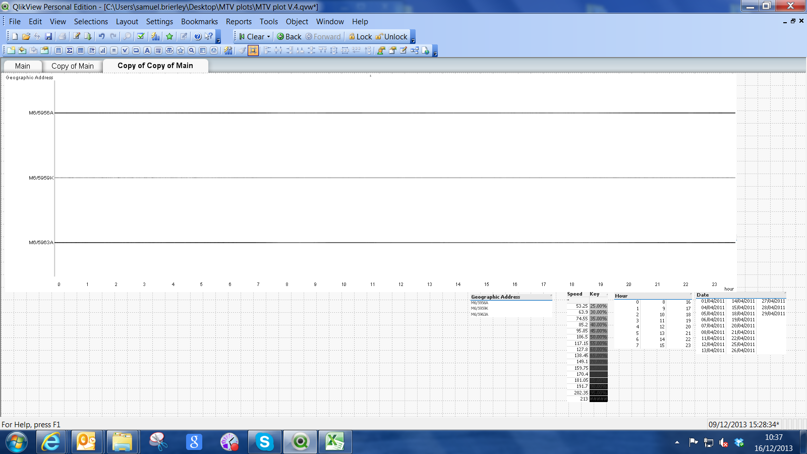
I have also given a dropbox link to my actual file, I understand if you dont want download it.
as you can see the data points are so incredibly thin and difficult to interpret.
- Mark as New
- Bookmark
- Subscribe
- Mute
- Subscribe to RSS Feed
- Permalink
- Report Inappropriate Content
the site doesnt seem to like the image, Its being moderated.
The dropbox link is the qvd file ive been working on, the third sheet is the most advanced. apologies if its abit messy, i like to get the information there first and then make it abit more presentable.
- Mark as New
- Bookmark
- Subscribe
- Mute
- Subscribe to RSS Feed
- Permalink
- Report Inappropriate Content
OK, I have a version of the file, though it only has two tabs. What is it you are trying to show with this chart? IS it average speed per Time at each of the three geographic locations?
- « Previous Replies
-
- 1
- 2
- Next Replies »