Unlock a world of possibilities! Login now and discover the exclusive benefits awaiting you.
- Qlik Community
- :
- All Forums
- :
- QlikView App Dev
- :
- Re: Grouping Results in a Bar Chart
- Subscribe to RSS Feed
- Mark Topic as New
- Mark Topic as Read
- Float this Topic for Current User
- Bookmark
- Subscribe
- Mute
- Printer Friendly Page
- Mark as New
- Bookmark
- Subscribe
- Mute
- Subscribe to RSS Feed
- Permalink
- Report Inappropriate Content
Grouping Results in a Bar Chart
Hello, need some help and ideas.
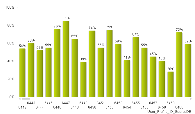
I currently have a set of results for each individual for the precentage of time they spend focuusing on tasks - this is the expression.
=Sum({$<Source_Key={1},Response_Level_1={'Focus'}>}Ans_Percent)/Sum({$<Source_Key={1}>} TOTAL<User_Profile_ID_SourceDB> Ans_Percent)
see chart below.
What I would like to be able to do is have a count of the results in a range e.g. count of people with a result of 0%-10%, 11%-20% and so on.
Presenting this back in a similar bar chart with percentage groups along the x axes and a count on the y axis
Thanks
Rob
- Tags:
- group_results
- Mark as New
- Bookmark
- Subscribe
- Mute
- Subscribe to RSS Feed
- Permalink
- Report Inappropriate Content
You can use class() function to achieve what you want.
Try class(yourExpression,10).
- Mark as New
- Bookmark
- Subscribe
- Mute
- Subscribe to RSS Feed
- Permalink
- Report Inappropriate Content
hope u will resolve it by doing in script level..not in UI
- Mark as New
- Bookmark
- Subscribe
- Mute
- Subscribe to RSS Feed
- Permalink
- Report Inappropriate Content
Hi Nikolaos, no that returned "no data" for the chart!
=Class(Sum({$<Source_Key={1},Response_Level_1={'Focus'}>}Ans_Percent)/Sum({$<Source_Key={1}>} TOTAL<User_Profile_ID_SourceDB> Ans_Percent),10)
- Mark as New
- Bookmark
- Subscribe
- Mute
- Subscribe to RSS Feed
- Permalink
- Report Inappropriate Content
Are you saying this will be impossible in UI assuming you mean the QV interface /expresions
- Mark as New
- Bookmark
- Subscribe
- Mute
- Subscribe to RSS Feed
- Permalink
- Report Inappropriate Content
I think I have a solution that can be translated to your data. I had biometric data and needed counts of people with optimal, borderline, and high values for things like cholesterol and whatever. So people with 0-199 cholesterol were counted up on a bar for Optimal, then people in borderline were counted up on a bar for Borderline, and so on. (I actually chucked set analysis at the bar chart so I could do company vs all companies and such too.)
First, in the script itself I had dual if statements for the stratifications. With your data this might look like
I can't tell which fields are what in your data because I don't write script like that just yet, but maybe you can reverse engineer my own example from below
CalculatedField: //first you'd want to use that formula on the existing fields to create the field you want to stratify in your barchart.
LOAD
UserId,
TestDate,
Year(TestDate as Year,
SUM(If({$<Source_Key={1},Response_Level_1={'Focus'}>}Ans_Percent)/Sum({$<Source_Key={1}>} TOTAL<User_Profile_ID_SourceDB> Ans_Percent) as [Focus Level]
FROM
BandedField:
LOAD *,
If([Focus Level]>=0 AND [Focus Level]<=0.1), Dual ('Focus 0-10%,1'),
... //fill in the other actual bands by copy/pasting and updating the values for the range as desired.
If([Focus Level]>0.895 AND [Focus Level]<=1), Dual ('Focus 90-100%,10'))))))))))) as [Banded Focus Level]
Resident CalculatedField;
Drop table CalculatedField;
Then in the bar graph your dimension is the banded field that you made [Banded Focus Level]. Your expression is =Count(Aggr(User_Profile_ID_SourceDB, Year])) (Pretty much whatever you had in your group by back in the script, but the time component should be no smaller than you want for your graph- if it is for the week, dont put days in your chart's aggr function.)
I think I got you 99% there, but it may be a little bit of trial and error and you may want to export a tablebox to excel and calculate results to check whether your chart is working right. If Users appear more than once and with different values, QV may discard their records. I have use functions like aggr(max(TestDate), field, field) and firstsortedvalue(BMI,-(TestDate*100000+BMI)) to make it grab most current or most current preferably non-0 value when conflicting records exist in a particular time grouping. Using Timestamp() function on your dates in your script will help the max() and firstsortedvalue() functions work a little better too. (Floor() willl increase conflicts and cause more discarding of records for same user on the same date.)
Here's an example chart with a piece of set analysis in it. (basically just stuck a {State1} and {State2} after the aggr( part of the expression for each state.
- Mark as New
- Bookmark
- Subscribe
- Mute
- Subscribe to RSS Feed
- Permalink
- Report Inappropriate Content
Hi Steve, this definitely sounds like a solution and the same approach I need to take.
Sadly I'm also not a programmer or writer of scripts but will be working with some other to see if we can put this together.
Much appreciate this direction.
Will post the result when I sort it out.
Thanks Rob
- Mark as New
- Bookmark
- Subscribe
- Mute
- Subscribe to RSS Feed
- Permalink
- Report Inappropriate Content
Thanks. On the dual if statements I realized I made a small syntax mistake on the part inside the Dual()
So: Dual ('Focus 0-10%,1'), should be Dual ('Focus 0-10%’,1), and so on //the part inside the parenthesis to the left of the comma is text in single quotation marks, and the part to the right is a number value you assign. You’d number the stratifications according to the order you want them to be sorted. Everything else in the script I wrote looks correct to me on second look. The part with your formula wasn’t tested by me- I just copy/pasted your formula. As you say though, the approach should work if it can be translated and if the formula that created the underlying field is sound.
Goodluck!