Unlock a world of possibilities! Login now and discover the exclusive benefits awaiting you.
- Qlik Community
- :
- All Forums
- :
- QlikView App Dev
- :
- Re: Grouping stacked bars with single dimension
- Subscribe to RSS Feed
- Mark Topic as New
- Mark Topic as Read
- Float this Topic for Current User
- Bookmark
- Subscribe
- Mute
- Printer Friendly Page
- Mark as New
- Bookmark
- Subscribe
- Mute
- Subscribe to RSS Feed
- Permalink
- Report Inappropriate Content
Grouping stacked bars with single dimension
Hello Everyone,
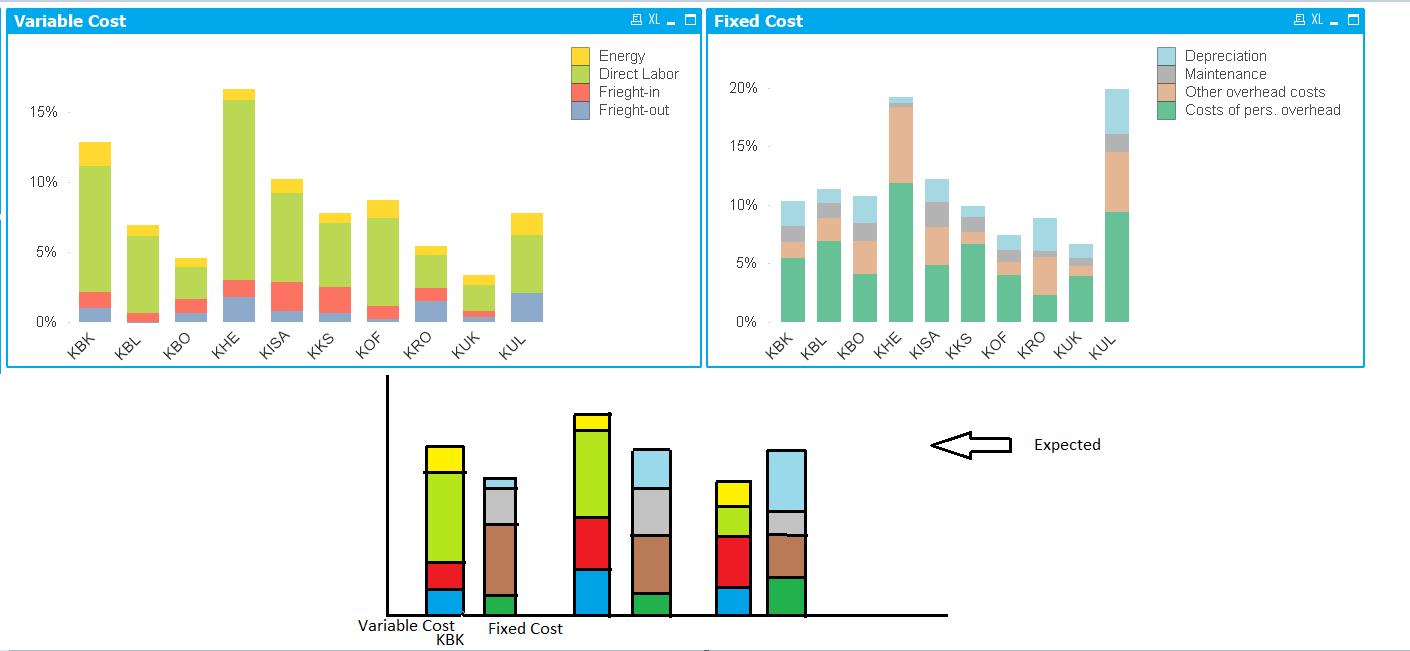
I would like to create a stacked bar which should also be grouped based on values in a particular field (F1 here). I have a field named F1 in my dashboard. 4 values in this field namely, "Freight-out", "Freight-in", "Direct labor", "Energy" come under Variable Cost. Similarly, another set of 4 values in this field namely, "Costs of pers. overhead", "Other overhead costs", "Maintenance (material & outside)", "Depreciation" come under Fixed Cost.
I have created two different stacked bars using set analysis in expressions to visualize "Variable Cost" and "Fixed Cost" as shown in the below screenshot. Now I would like to merge both of these graphs into one which is also shown in the screenshot.
How can I achieve this? Any help?
Also attaching the app.
Thank you.
- Mark as New
- Bookmark
- Subscribe
- Mute
- Subscribe to RSS Feed
- Permalink
- Report Inappropriate Content
Only solution i could think of now is to merge them by overlapping on each other.
Note:
1. the background of the above chart object should be transparent.
2. Export excel only works for the top chart unless another invisible table (which contains both chart contents) is created on top of the objects.
- Mark as New
- Bookmark
- Subscribe
- Mute
- Subscribe to RSS Feed
- Permalink
- Report Inappropriate Content
Hi Yuji,
Thanks for your response.
I had thought of this initially but I would like to avoid creating this kind of overlapping objects as they will not work as expected when there is some change in data later. Hence thought not a good solution in long run.
Any other suggestion?
Thank you.
- Mark as New
- Bookmark
- Subscribe
- Mute
- Subscribe to RSS Feed
- Permalink
- Report Inappropriate Content
Hi Apoorva,
Yes, you are right. the solution would be the last option and it is not really ideal as it is hard to maintain.
Unfortunately i cannot think of any other solutions but i am very interested in hearing from other experts.
Good luck.
Yuji
- Mark as New
- Bookmark
- Subscribe
- Mute
- Subscribe to RSS Feed
- Permalink
- Report Inappropriate Content
Anybody else got a chance to look into this topic?