Unlock a world of possibilities! Login now and discover the exclusive benefits awaiting you.
- Qlik Community
- :
- All Forums
- :
- QlikView App Dev
- :
- Help with chart
- Subscribe to RSS Feed
- Mark Topic as New
- Mark Topic as Read
- Float this Topic for Current User
- Bookmark
- Subscribe
- Mute
- Printer Friendly Page
- Mark as New
- Bookmark
- Subscribe
- Mute
- Subscribe to RSS Feed
- Permalink
- Report Inappropriate Content
Help with chart
Hi all,
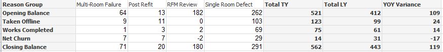
I am trying to create a straight /pivot table showing figures for this year (broken down by group) but also including a TOTAL column for last year then showing the variance between them both.
I have included a sample, cam anyone help with this? i am not sure if it can be achieved. I know i can do it in seperate chartts but i need it to go on a report and look good.
I was hoping for a result similar to the below.
Many thanks
- Mark as New
- Bookmark
- Subscribe
- Mute
- Subscribe to RSS Feed
- Permalink
- Report Inappropriate Content
Hi,
I think you could
1. concatenate the 3 expressions using the dimensionality() function to set the total value (ie if(dimensionality()=0, Expr1&' '&Expr2...)
2. use calculated fields
- Mark as New
- Bookmark
- Subscribe
- Mute
- Subscribe to RSS Feed
- Permalink
- Report Inappropriate Content
Hi, thanks for your reply. is it possible you could show me what you mean using the sample please?
- Mark as New
- Bookmark
- Subscribe
- Mute
- Subscribe to RSS Feed
- Permalink
- Report Inappropriate Content
You can fake it with three pivot tables and some text boxes.
talk is cheap, supply exceeds demand
- Mark as New
- Bookmark
- Subscribe
- Mute
- Subscribe to RSS Feed
- Permalink
- Report Inappropriate Content
Hi Gysbert,
I have already tried that. it looks really good in the qvw itself but when i create a report and position the objects on the page it doesnt print everything correctly.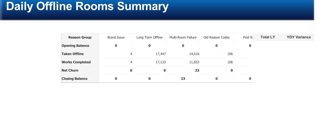
- Mark as New
- Bookmark
- Subscribe
- Mute
- Subscribe to RSS Feed
- Permalink
- Report Inappropriate Content
Take 2.
talk is cheap, supply exceeds demand
- Mark as New
- Bookmark
- Subscribe
- Mute
- Subscribe to RSS Feed
- Permalink
- Report Inappropriate Content
actually i dont think that will work either as it needs to be at date level not year, and all the dates are in the inline table which i think will be a lot of maintenance also.
there would need to be a record for every day of the year by reportingreasongroup by reporting group for a maximum of 2 years.
this seems to be harder than i thought 