Unlock a world of possibilities! Login now and discover the exclusive benefits awaiting you.
- Qlik Community
- :
- All Forums
- :
- QlikView App Dev
- :
- Re: Histogram Chart
- Subscribe to RSS Feed
- Mark Topic as New
- Mark Topic as Read
- Float this Topic for Current User
- Bookmark
- Subscribe
- Mute
- Printer Friendly Page
- Mark as New
- Bookmark
- Subscribe
- Mute
- Subscribe to RSS Feed
- Permalink
- Report Inappropriate Content
Histogram Chart
Hello all!
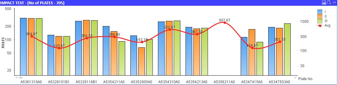
In my chart,I have 4 fields. J1, J2,J3 AND Avg(J1+J2+J3)(Graph-1).J1 ,2 and 3 are fetching from the database and Avg is calculated value.
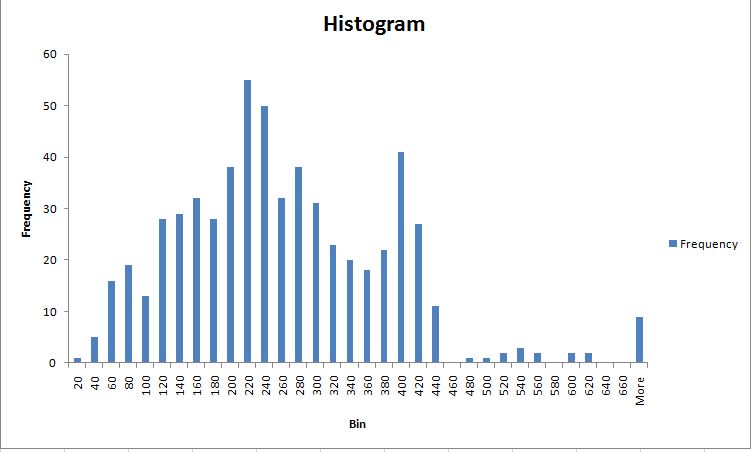
There's necessity of creating a histogram chart(in qlikview) for the avg values(created in excel Graph-2). How many no of samples have been there for a particular avg range(say between 20-40 ,40-60). Range was not a problem.
Not getting any idea to implement.
Anyone have any idea please help.
.
Accepted Solutions
- Mark as New
- Bookmark
- Subscribe
- Mute
- Subscribe to RSS Feed
- Permalink
- Report Inappropriate Content
Maybe have a look at
Maybe like using a calculated dimension
=Round(Aggr( Avg(J1+J2+J3), RecordIDFIELD),20)
and as expression
=Count( RecordIDFIELD)
- Mark as New
- Bookmark
- Subscribe
- Mute
- Subscribe to RSS Feed
- Permalink
- Report Inappropriate Content
Maybe have a look at
Maybe like using a calculated dimension
=Round(Aggr( Avg(J1+J2+J3), RecordIDFIELD),20)
and as expression
=Count( RecordIDFIELD)
- Mark as New
- Bookmark
- Subscribe
- Mute
- Subscribe to RSS Feed
- Permalink
- Report Inappropriate Content
Hello Swuehl
This was really solved my issue.Now I got another problem. I am unable to do grouping in the graph. I want to give the user to choose the range and based on the selected range the graph'll shows the data for only selected fields. like this
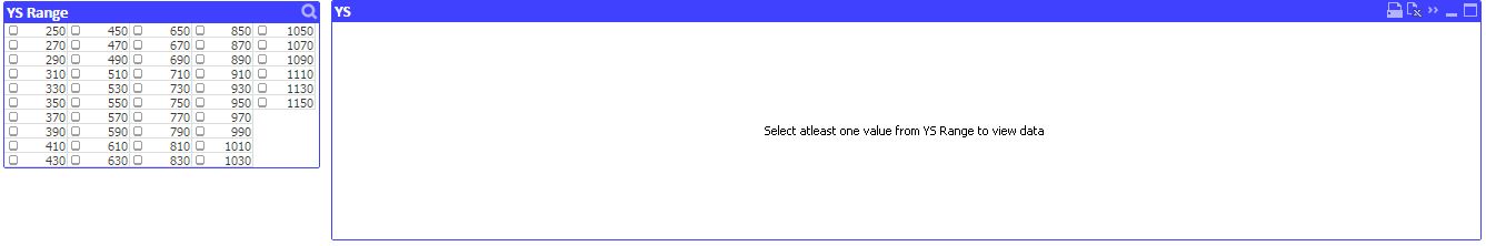
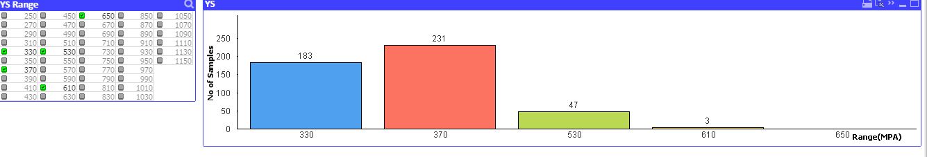
How do I implement the same in my histogram graph?
- Mark as New
- Bookmark
- Subscribe
- Mute
- Subscribe to RSS Feed
- Permalink
- Report Inappropriate Content
Try creating a list box with a field expression (from field drop down, select <expression>) like
=Aggr( Round(Aggr( Avg(J1+J2+J3), RecordIDFIELD),20), RecordIDFIELD)
- Mark as New
- Bookmark
- Subscribe
- Mute
- Subscribe to RSS Feed
- Permalink
- Report Inappropriate Content
Yah.. Thanks a Ton Mr.Swuehl.
Really we'll create wonders by using AGGR() function. Thanks a lot.