Unlock a world of possibilities! Login now and discover the exclusive benefits awaiting you.
- Qlik Community
- :
- All Forums
- :
- QlikView App Dev
- :
- Re: How can I do Dot plot in style of minitab i.e....
- Subscribe to RSS Feed
- Mark Topic as New
- Mark Topic as Read
- Float this Topic for Current User
- Bookmark
- Subscribe
- Mute
- Printer Friendly Page
- Mark as New
- Bookmark
- Subscribe
- Mute
- Subscribe to RSS Feed
- Permalink
- Report Inappropriate Content
How can I do Dot plot in style of minitab i.e. 1 dot for every occurance?
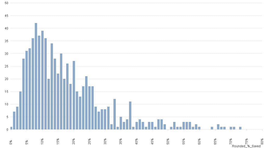
I have a data set which I want to display as a dot plot in a similar way to minitab - there is just 1 axis (% saved) and each row in my data set represents a different case with a different % saving rounded to nearest full %. I want to show this in Qlikview but nearest I have gotten is via a Bar Chart which shows the right shape, but unable to get this to represent the bar as dots i.e. for each instance the value occurs (don't worry about the fact that minitab representing 3 occurances per dot - I just need 1 dot per occurance).
The example in minitab is attached (as is my attempt to do via bar chart) Please can you advise if this is possible - and if so what chart I should I be using/how? 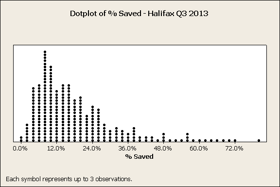
- Tags:
- dotplot
- Mark as New
- Bookmark
- Subscribe
- Mute
- Subscribe to RSS Feed
- Permalink
- Report Inappropriate Content
Hi Caroline,
I put together an example using a grid chart. For every % you have a value . That value will be graphed as a dot. You can then play with the scales.
I hope it helps.
JV
BI Experience | A place to share our Business Intelligence experiences
- Mark as New
- Bookmark
- Subscribe
- Mute
- Subscribe to RSS Feed
- Permalink
- Report Inappropriate Content
Hi Q L - if I try doing a Grid chart it says too few dimensions (as i am only using rounded % saved). Is there a way to get around this?
- Mark as New
- Bookmark
- Subscribe
- Mute
- Subscribe to RSS Feed
- Permalink
- Report Inappropriate Content
If you see my example, I put a 1 as expression , so you can do they same.
JV
- Mark as New
- Bookmark
- Subscribe
- Mute
- Subscribe to RSS Feed
- Permalink
- Report Inappropriate Content
A grid chart might work, but your bar chart is a far better solution. Why do you want the inferior visualisation?
talk is cheap, supply exceeds demand
- Mark as New
- Bookmark
- Subscribe
- Mute
- Subscribe to RSS Feed
- Permalink
- Report Inappropriate Content
something my boss wants!!
- Mark as New
- Bookmark
- Subscribe
- Mute
- Subscribe to RSS Feed
- Permalink
- Report Inappropriate Content
Educate him/her/it!! 
talk is cheap, supply exceeds demand