Unlock a world of possibilities! Login now and discover the exclusive benefits awaiting you.
- Qlik Community
- :
- All Forums
- :
- QlikView App Dev
- :
- Re: How can we get multiple colour heat map with i...
- Subscribe to RSS Feed
- Mark Topic as New
- Mark Topic as Read
- Float this Topic for Current User
- Bookmark
- Subscribe
- Mute
- Printer Friendly Page
- Mark as New
- Bookmark
- Subscribe
- Mute
- Subscribe to RSS Feed
- Permalink
- Report Inappropriate Content
How can we get multiple colour heat map with input box values (esp in Pivot tables)
Hi all,
Can you please help me to create Pivot table (Heat Map) with input box values.
Check below Pivot table:
| Pivot table | |||||
| Year | 2009 | ||||
| Month | Jan | Feb | Mar | Apr | |
| a | 20% | 40% | 80% | 75% | |
| b | 30% | 30% | 50% | 50% | |
| c | 40% | 20% | 75% | 80% | |
Input Box:
| Input Box | ||
| vGreen | = | 0.8 |
| vBlue | = | 0.5 |
| vRed | = | 0 |
vGreen should be >=0.8
vBlue should be >=0.5 <0.8
vRed should <0.5
Question: I've created three variables (vGreen, vBlue and vRed) and assigned them to input box to change the numbers manually. How can I change colours in Pivot table if numbers entered manually in Input Box.
Thanks for your help.
- Tags:
- new_to_qlikview
- Mark as New
- Bookmark
- Subscribe
- Mute
- Subscribe to RSS Feed
- Permalink
- Report Inappropriate Content
Hi,
Can you attach your sample app.
Satish.
- Mark as New
- Bookmark
- Subscribe
- Mute
- Subscribe to RSS Feed
- Permalink
- Report Inappropriate Content
Hi,
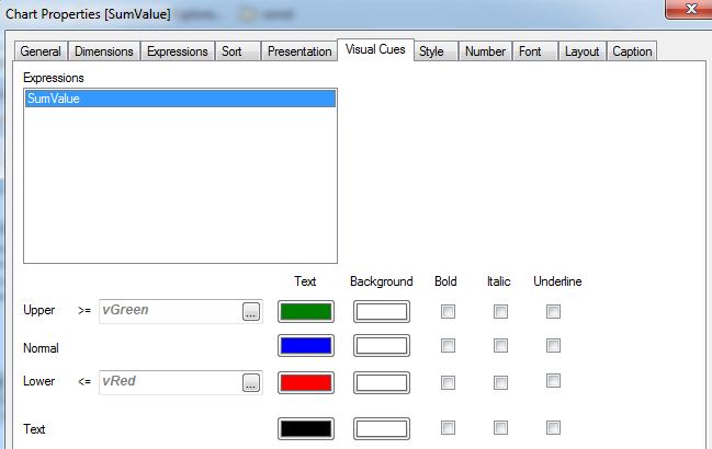
maybe like this?:

or


hope this helps
regards
Marco
- Mark as New
- Bookmark
- Subscribe
- Mute
- Subscribe to RSS Feed
- Permalink
- Report Inappropriate Content
Thanks Marco. Will check, hope this works......![]()
![]()
Regards,
Srinivasu
- Mark as New
- Bookmark
- Subscribe
- Mute
- Subscribe to RSS Feed
- Permalink
- Report Inappropriate Content
There is a great tutorial about Pivot Table heatmaps at qlikfreakDOTwordpressDOTcom/2014/03/09/heat-map/#more-29
Change DOT to . to get the URL! ![]()