Unlock a world of possibilities! Login now and discover the exclusive benefits awaiting you.
- Qlik Community
- :
- All Forums
- :
- QlikView App Dev
- :
- How do I chart the following Data with the followi...
- Subscribe to RSS Feed
- Mark Topic as New
- Mark Topic as Read
- Float this Topic for Current User
- Bookmark
- Subscribe
- Mute
- Printer Friendly Page
- Mark as New
- Bookmark
- Subscribe
- Mute
- Subscribe to RSS Feed
- Permalink
- Report Inappropriate Content
How do I chart the following Data with the following needs
Hi Have approx. 45000 user data. When I group them 10% based on the REWARDS , All Data are one sided.
COUNT(USER_ID)
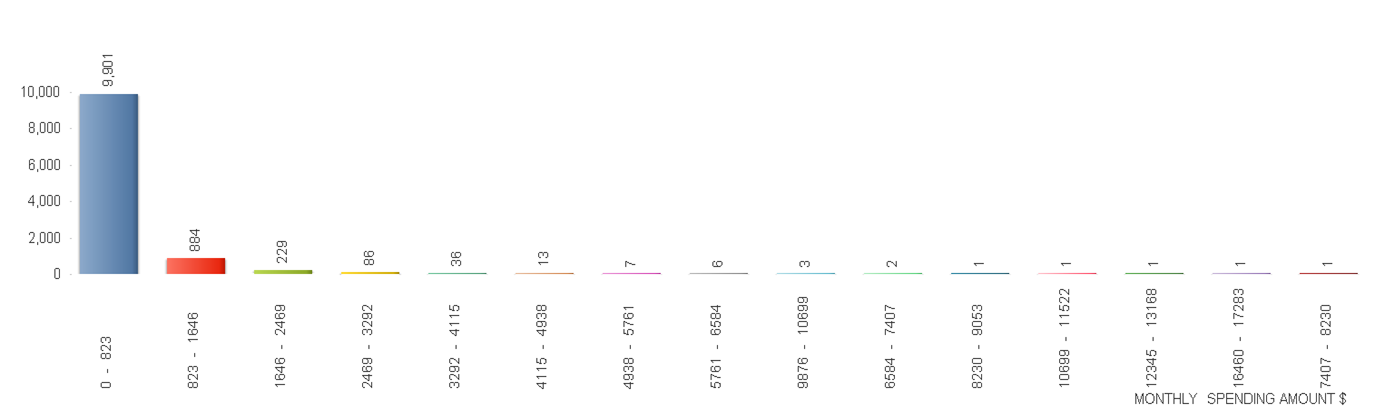
SUM(REWARDS)
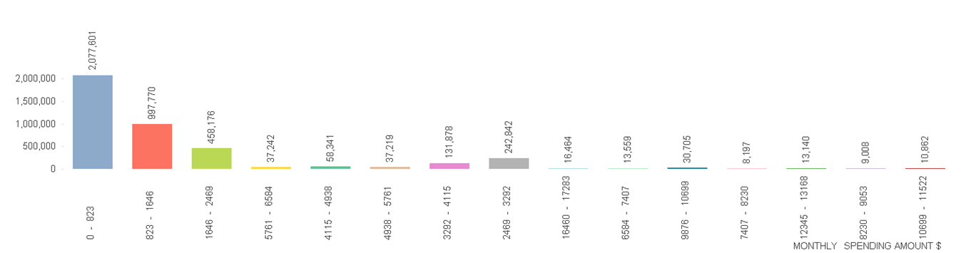
To simulate, I have created a Dummy Data.
I want to group the Users into 10% in one group. The challenge is to select 10% users based on the Field(REWARDS) I have highlighted the User group in different colour in excel file for easy understanding. How do I group users based on colour I marked?
Thank you
- Tags:
- new_to_qlikview
- Mark as New
- Bookmark
- Subscribe
- Mute
- Subscribe to RSS Feed
- Permalink
- Report Inappropriate Content
Hi,
I believe the way you do it, it would use the rule that you used to color in the file when importing data.

Rebeca
- Mark as New
- Bookmark
- Subscribe
- Mute
- Subscribe to RSS Feed
- Permalink
- Report Inappropriate Content
manually I can highlight and select. i.e I Sorted the REWARDS, then I took user count/10. Then I took firs 10% of users and highlight in one color and next 10% in another color ..so on.
I made an attempt (Refer to Variables.PNG) in previous thread.
I do not know how to select and map users in group of 10% but based on the REWARDS. Hope some qlikview experts around here can help..