Unlock a world of possibilities! Login now and discover the exclusive benefits awaiting you.
- Qlik Community
- :
- All Forums
- :
- QlikView App Dev
- :
- How do I set conditional colors for a chart based ...
Options
- Subscribe to RSS Feed
- Mark Topic as New
- Mark Topic as Read
- Float this Topic for Current User
- Bookmark
- Subscribe
- Mute
- Printer Friendly Page
Turn on suggestions
Auto-suggest helps you quickly narrow down your search results by suggesting possible matches as you type.
Showing results for
Not applicable
2016-04-11
08:22 AM
- Mark as New
- Bookmark
- Subscribe
- Mute
- Subscribe to RSS Feed
- Permalink
- Report Inappropriate Content
How do I set conditional colors for a chart based on Y-value?
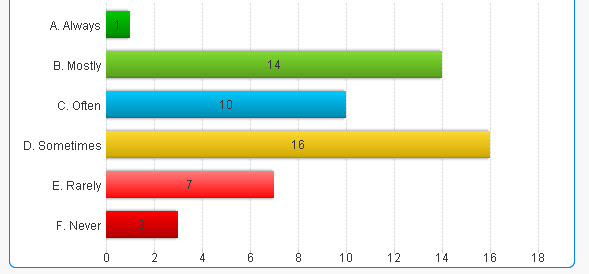
I am charting survey results (see image below). I want to maintain the color scheme below (green for best to red for worst). The issue is that some results sets are so small that there could be only 1 response, and if that is 'Never' then it appears as Green since that's the first color in my scheme.
How can I use conditional formatting so that 'Always' is set to Green, 'Never' is set to Red, etc?
All the examples I've seen here for conditional colors seem to be based on the values (count or sum).
Thanks

1,101 Views
- « Previous Replies
-
- 1
- 2
- Next Replies »
10 Replies
Not applicable
2016-04-12
09:07 AM
Author
- Mark as New
- Bookmark
- Subscribe
- Mute
- Subscribe to RSS Feed
- Permalink
- Report Inappropriate Content
Thanks Karla and Kumar!
78 Views
- « Previous Replies
-
- 1
- 2
- Next Replies »