Unlock a world of possibilities! Login now and discover the exclusive benefits awaiting you.
- Qlik Community
- :
- All Forums
- :
- QlikView App Dev
- :
- Re: How to Show Legend Horizontally
- Subscribe to RSS Feed
- Mark Topic as New
- Mark Topic as Read
- Float this Topic for Current User
- Bookmark
- Subscribe
- Mute
- Printer Friendly Page
- Mark as New
- Bookmark
- Subscribe
- Mute
- Subscribe to RSS Feed
- Permalink
- Report Inappropriate Content
How to Show Legend Horizontally
Hi,
Please see the image for my graph below. Is there a way to move the legend for the cost quartile to the top of the graph and display it horizontally?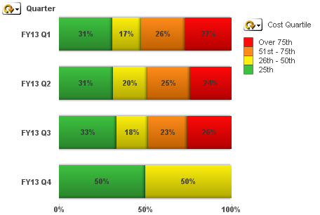
Thanks!
- Mark as New
- Bookmark
- Subscribe
- Mute
- Subscribe to RSS Feed
- Permalink
- Report Inappropriate Content
Hi,
yes, its possible. Select the chart and Press Ctrl & Shift keys, the legend area will be marked as box. Now, you just drop the box at top of the sheet. It should look horizontally. 
- Mark as New
- Bookmark
- Subscribe
- Mute
- Subscribe to RSS Feed
- Permalink
- Report Inappropriate Content
Thank you both for the help. It worked on some of my graphs, but not all of them.
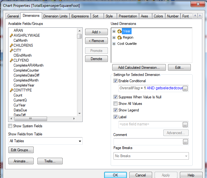
For instance, on some of my graphs I have both year and regional dimensions in them with mutually exclusive conditions on them. Here's a print screen to show you what I mean. I was not able to pull my legend up on this graph.
On the graphs where I just have one or the other (Year or Region) with no conditions I was able to pull the legend up to the top and flip it horizontally using the ctrl-shift trick. Do I have to do something special when there are conditional dimensions to make this work?