Unlock a world of possibilities! Login now and discover the exclusive benefits awaiting you.
- Qlik Community
- :
- All Forums
- :
- QlikView App Dev
- :
- How to Show Stacked Bar Chart as Percentage?
- Subscribe to RSS Feed
- Mark Topic as New
- Mark Topic as Read
- Float this Topic for Current User
- Bookmark
- Subscribe
- Mute
- Printer Friendly Page
- Mark as New
- Bookmark
- Subscribe
- Mute
- Subscribe to RSS Feed
- Permalink
- Report Inappropriate Content
How to Show Stacked Bar Chart as Percentage?
Hi all,
I'm trying to make a stacked bar chart that shows the "mixes" of certain items, relative to the whole. The graph below is 80% of the answer I want, but the percentages aren't all adding up to 100. It's showing percentages of the most recent data point.

Basically, I'd like all of the bars to be the same length, and show percentages in them. This way we can see how the "mixes" of these items change over time.
The expression is one used to calculate inventory whereby it counts Arrivals and subtracts Sales up until a certain date (I'm showing inventory).
COUNT({$<DateType={'Arrival'}>} OrderLineID) - COUNT({$<DateType={'Sale'}>} OrderLineID)
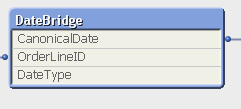
This links to a Date Bridge table that looks like the following:
I think I'm really close to achieving what I'm looking for, but I just need to know that one extra step.
Thank you very much for any and all help!
- « Previous Replies
-
- 1
- 2
- Next Replies »
- Mark as New
- Bookmark
- Subscribe
- Mute
- Subscribe to RSS Feed
- Permalink
- Report Inappropriate Content
In that case you can first try this expression without any scripting changes:
=(RangeSum(Above(TOTAL (Count({$<DateType={'Arrival'}>} OrderLineID)), 0, RowNo(TOTAL))) - RangeSum(Above(TOTAL (Count({$<DateType={'Sale'}>} OrderLineID)), 0, RowNo(TOTAL))))/
Sum(TOTAL <Date>Aggr(RangeSum(Above(TOTAL (Count({$<DateType={'Arrival'}>} OrderLineID)), 0, RowNo(TOTAL))) - RangeSum(Above(TOTAL (Count({$<DateType={'Sale'}>} OrderLineID)), 0, RowNo(TOTAL))), Date, Dim))
But in case it doesn't work, then you will need to sort Date in Ascending order.
- Mark as New
- Bookmark
- Subscribe
- Mute
- Subscribe to RSS Feed
- Permalink
- Report Inappropriate Content
Hi Sunny, I've implemented the above code as my expression, and it gave me the following results:

- « Previous Replies
-
- 1
- 2
- Next Replies »