Unlock a world of possibilities! Login now and discover the exclusive benefits awaiting you.
- Qlik Community
- :
- All Forums
- :
- QlikView App Dev
- :
- Re: How to add a "reference curve" instead of a "r...
- Subscribe to RSS Feed
- Mark Topic as New
- Mark Topic as Read
- Float this Topic for Current User
- Bookmark
- Subscribe
- Mute
- Printer Friendly Page
- Mark as New
- Bookmark
- Subscribe
- Mute
- Subscribe to RSS Feed
- Permalink
- Report Inappropriate Content
How to add a "reference curve" instead of a "reference line" ?
Good day,
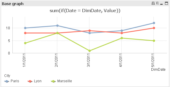
I have a chart that displays values by date and countries.
When I make my graph, I use the following dimensions :
- date
- coutry
and the following expression :
- sum(values)
This way, I have 1 line / country.
If I want to add in my graph another line (let's say the objectives), I only can add a reference line. But this line is "static": not driven by the dimension "date".
I would like to display in my graph 1 line / country and 1 line for the "objectives", but I don't want to :
- add a transparent graph over my first graph
- create in the load a temp table that contains a new dimension "country + objectives"
Do you have any idea ?
- Mark as New
- Bookmark
- Subscribe
- Mute
- Subscribe to RSS Feed
- Permalink
- Report Inappropriate Content
Hi Nicolas,
where does your objective data come from? I guess you have a table with (global) objectives per date? Do you use a master calendar or how is your data connected?
Would be best if you could post a small sample here.
Regards,
Stefan
- Mark as New
- Bookmark
- Subscribe
- Mute
- Subscribe to RSS Feed
- Permalink
- Report Inappropriate Content
My problem is very more complex than what I'm explaining, that's why the solution like "create a temp table in the script" or "use transparent graph" are not possible.
Here are my data:
Data:
LOAD * inline [
City, Date, Value
Paris, 1/1/2011, 10
Paris, 2/1/2011, 11
Paris, 3/1/2011, 8
Paris, 4/1/2011, 9
Paris, 5/1/2011, 12
Lyon, 1/1/2011, 8
Lyon, 2/1/2011, 8
Lyon, 3/1/2011, 9
Lyon, 4/1/2011, 8
Lyon, 5/1/2011, 10
Marseille, 1/1/2011, 4
Marseille, 2/1/2011, 8
Marseille, 3/1/2011, 1
Marseille, 4/1/2011, 6
Marseille, 5/1/2011, 5
];
Objectives:
LOAD * INLINE [
ObjType, ObjDate, ObjValue
Bad, 1/1/2011, 1
Bad, 2/1/2011, 1
Bad, 3/1/2011, 2
Bad, 4/1/2011, 3
Bad, 5/1/2011, 4
Good, 1/1/2011, 10
Good, 2/1/2011, 12
Good, 3/1/2011, 15
Good, 4/1/2011, 18
Good, 5/1/2011, 18
];
Here is the graph where I display the values by Date and by City:
If I create an invisible graph and display it on top, here is the result:
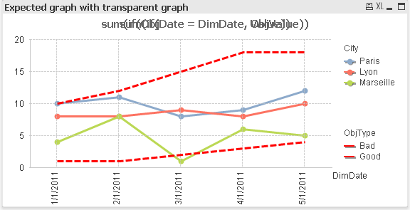
This is exactly what I want, but not with 2 graphs (because the scale must be dynamic).
I can't create a temp table that includes both datas, because in my real case, references have to be dynamic.
- Mark as New
- Bookmark
- Subscribe
- Mute
- Subscribe to RSS Feed
- Permalink
- Report Inappropriate Content
Maybe like this?
The poblem with the current solution is that you can't really use a line chart with two dimensions and more than one expression (well, you can, but look yourself).
So I created several expressions per bad / good and country. This is not really dynamic. One could get around this with an additional field with all cities and good / bad appended, thus creating a new dimension (Cities+GoodBad). Then check for the values in 1 expression.
Hope this helps,
Stefan
- Mark as New
- Bookmark
- Subscribe
- Mute
- Subscribe to RSS Feed
- Permalink
- Report Inappropriate Content
So, here is an example with a new dimension field containing all cities and the reference curves.
You said that you can't use something like your tmpTable approach, which would probably be the easiest and cleanest.
Are you sure that this is not possible?
Regards,
Stefan
- Mark as New
- Bookmark
- Subscribe
- Mute
- Subscribe to RSS Feed
- Permalink
- Report Inappropriate Content
Are you sure that this is not possible?
In my real application, I have a drill-down dimension, and I want to:
- display a line for every item in the level N
- display 1 line for the recap of the level N-1
- display 1 line for the recap of the level N-2
- ...
- display 1 line for the recap of the level 0
I have thousand of items, and the expression in level N is not the same as in the level N-1.
If I had to make a temp table, this would takes hours of loops to compute every possible values...