Unlock a world of possibilities! Login now and discover the exclusive benefits awaiting you.
- Qlik Community
- :
- All Forums
- :
- QlikView App Dev
- :
- Re: How to calculate month-on-month comparison?
Options
- Subscribe to RSS Feed
- Mark Topic as New
- Mark Topic as Read
- Float this Topic for Current User
- Bookmark
- Subscribe
- Mute
- Printer Friendly Page
Turn on suggestions
Auto-suggest helps you quickly narrow down your search results by suggesting possible matches as you type.
Showing results for
Not applicable
2014-06-23
05:07 AM
- Mark as New
- Bookmark
- Subscribe
- Mute
- Subscribe to RSS Feed
- Permalink
- Report Inappropriate Content
How to calculate month-on-month comparison?
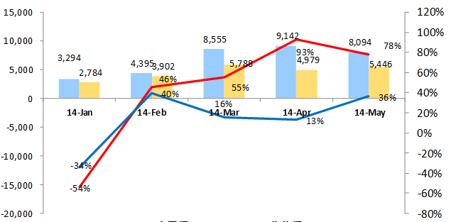
As we can see from the picture above,there are two columns and two lines in the chart.
I have already add two columns and the expressions are used as follows:
ADamount: sum({$<cal_month={"2014*"}>}[AD_amount])/1000
Receiveamount: sum({$<cal_month={"2014*"}>}[receiveamount])/1000
But how to add two lines as month-on-month comparison?
- « Previous Replies
-
- 1
- 2
- Next Replies »
10 Replies
Not applicable
2014-10-21
01:26 AM
Author
- Mark as New
- Bookmark
- Subscribe
- Mute
- Subscribe to RSS Feed
- Permalink
- Report Inappropriate Content
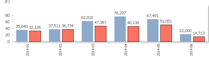
I'd like to share the chart,but it's one part of my report. I don't know how to spilt the chart from the whole report.
236 Views
- « Previous Replies
-
- 1
- 2
- Next Replies »