Unlock a world of possibilities! Login now and discover the exclusive benefits awaiting you.
- Qlik Community
- :
- All Forums
- :
- QlikView App Dev
- :
- How to create a Gantt chart using a Pivot table
- Subscribe to RSS Feed
- Mark Topic as New
- Mark Topic as Read
- Float this Topic for Current User
- Bookmark
- Subscribe
- Mute
- Printer Friendly Page
- Mark as New
- Bookmark
- Subscribe
- Mute
- Subscribe to RSS Feed
- Permalink
- Report Inappropriate Content
How to create a Gantt chart using a Pivot table
Hi,
I just wanted to share another example on how to create a Gantt chart in QlikView. To do this we can use some of QlikView's available resources as an alternative to the use of Extension Objects. In this case I have used a Pivot Table.
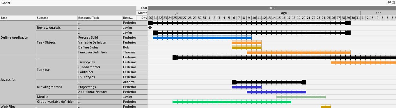
To create this chart I’ve used some example data (Excel file) that can be found on the zip file attached bellow. That file has several fields, enough to identify the tasks of a Project (such as ID, Start, End…).

In order to be able to pick the desired dates a master calendar has been used. Also, the IntervalMatch functionality has proved very useful by generating the dates between the start and end of the different tasks that the project has.
The Hierarchy functionality in the load script generates the different task levels.
There is something peculiar about the data I am using (Excel file). Colors for each task are specified in Hexadecimal format. So during the load script I converted them to RGB colors (color code used by QlikView).
After the data model has been completed a Pivot Table can be used to represent my Gantt chart. To make the chart stable, on the pivot table properties we need to uncheck the "allow pivoting" option. As dimensions we will have each task level, years months and days.
The expression is a bit different. First of all, I it's represented as an Image. That image is a png file (included in the zip file) with transparency that will let us see the background color of each cell.
The expression is as follows:
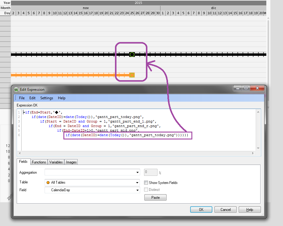
if(End=Start,'◆',
if(date(DateID)=date(Today()),'gantt_part_today.png',
if(Start = DateID and Group = 1,'gantt_part_end_l.png',
if(End = DateID and Group = 1,'gantt_part_end_r.png',
if(End-DateID+1>0,'gantt_part_mid.png',
if(date(DateID)=date(Today()),'gantt_part_today.png'))))))
The bacground color for each cell, is already stored in the data. So we just need to use it as a background color for our expression. In this case, if it is not a milestone, use the color value:
if(Mile =0, RGBColor)
That's all. The Pivot table now can be used as Gantt chart. I hope you find this example useful.
- « Previous Replies
-
- 1
- 2
- Next Replies »
- Mark as New
- Bookmark
- Subscribe
- Mute
- Subscribe to RSS Feed
- Permalink
- Report Inappropriate Content
You're welcome Allan.
Glad you like the sample!
- Mark as New
- Bookmark
- Subscribe
- Mute
- Subscribe to RSS Feed
- Permalink
- Report Inappropriate Content
I'd like to have this gantt chart identify "Today" and default to being scrolled over such that today is visible (I've a multi-year time span I'd like to display, and the user may need to scroll either direction). Is this possible?
BTW, thanks for the code sample!
- Mark as New
- Bookmark
- Subscribe
- Mute
- Subscribe to RSS Feed
- Permalink
- Report Inappropriate Content
Hi Rita,
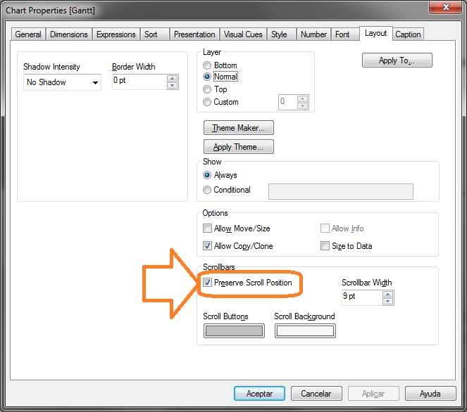
About the scroll position: There is no way of setting the scroll to a position using the object's properties, there is a partial solution to this using the "Preserve Scroll Position" option of the Layout tab on the object properties. At least this way the scroll position will be maintained while changing tabs or using the app.
About marking today's date, this is already set up on the example (the dates on the excel file are from 2014 so I have tested this changing the dates to more recent ones).
Today's date will be marked using an image (in this case a green circle). The effect should be the following:
I hope this helps!
- Mark as New
- Bookmark
- Subscribe
- Mute
- Subscribe to RSS Feed
- Permalink
- Report Inappropriate Content
Is there a reason that there line 2 and the last line are identical? if(date(DateID)=date(Today()),'gantt_part_today.png', Deleting either doesn't seem to have an affect.
- Mark as New
- Bookmark
- Subscribe
- Mute
- Subscribe to RSS Feed
- Permalink
- Report Inappropriate Content
Hi Jose,
This is awesome.
How do you get the year, month and day to show on the top row of the pivot table?
Regards
Clint
- Mark as New
- Bookmark
- Subscribe
- Mute
- Subscribe to RSS Feed
- Permalink
- Report Inappropriate Content
Hi,
Thank you!
Sorry it did take me a while to see this message. When you create a pivot table, just click and drag a header of a row or column and drop it into a row or a column. You will see a blue arrow while you do this.
- « Previous Replies
-
- 1
- 2
- Next Replies »