Unlock a world of possibilities! Login now and discover the exclusive benefits awaiting you.
- Qlik Community
- :
- All Forums
- :
- QlikView App Dev
- :
- Re: How to create similar viz in Qlikview
- Subscribe to RSS Feed
- Mark Topic as New
- Mark Topic as Read
- Float this Topic for Current User
- Bookmark
- Subscribe
- Mute
- Printer Friendly Page
- Mark as New
- Bookmark
- Subscribe
- Mute
- Subscribe to RSS Feed
- Permalink
- Report Inappropriate Content
How to create similar viz in Qlikview
HI Qlikkers,
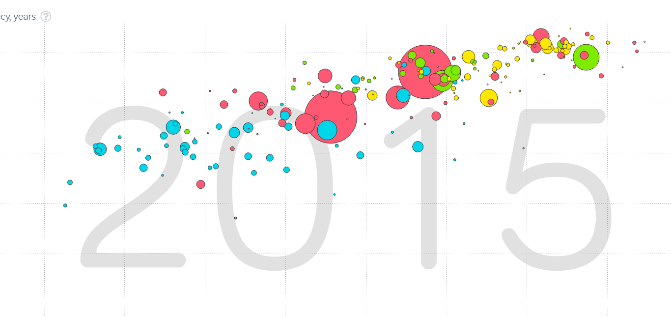
In memory of Hans Rosling I wanted to ask the community if we can create one of his Classic, Prolific Vizualization chart type. I have attached the image below. Any ideas or pointers would be magnificent 
Regards,
- Mark as New
- Bookmark
- Subscribe
- Mute
- Subscribe to RSS Feed
- Permalink
- Report Inappropriate Content
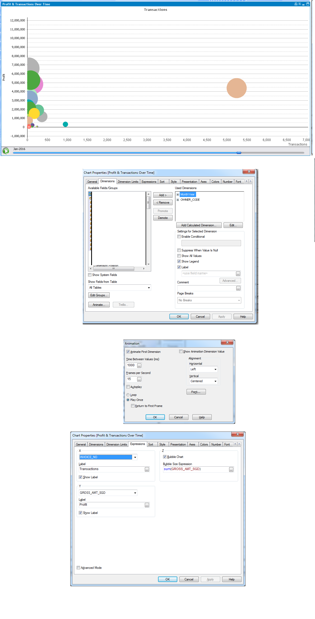
Use a scatter chart , make sure there are at least 1 dimension and 2 expressions, the 3rd express is for the size of the bubble chart. If you want to animate it over time, select animation in the dimension tab and make sure there is at least 2 dimensions. The first dimension is the dimension that you want to animate, it is probably dimension that is related to time.
I have attached screenshot for reference.
- Mark as New
- Bookmark
- Subscribe
- Mute
- Subscribe to RSS Feed
- Permalink
- Report Inappropriate Content
HI Tian Thanks for the reply. I was looking to see if it is possible to draw border around the circle as in the pic I posted.
- Mark as New
- Bookmark
- Subscribe
- Mute
- Subscribe to RSS Feed
- Permalink
- Report Inappropriate Content
Try checking them in Style tab..
If not found no worrys, in one or the othr way u can do it:
If its nt there then what u do is first create one scatter chart with bubble.
Then one more chart with same dimension and expression but in style choose the one with circum ference only. and in this chart, go to colors tab and then in frame background make it tranferent.
And 2nd chart try to overlap with 1st chart.I guess this will work out.
Basically u r repeating same chart on top of othr making it tranferent with different style..
But by default other better visual appeals r available.
Sachin
- Mark as New
- Bookmark
- Subscribe
- Mute
- Subscribe to RSS Feed
- Permalink
- Report Inappropriate Content
You need to play with the scatter chart color and Size expression to achieve the similar representation.
check this blogs once
- Mark as New
- Bookmark
- Subscribe
- Mute
- Subscribe to RSS Feed
- Permalink
- Report Inappropriate Content
Thanks guys. I will try these suggestions.
- Mark as New
- Bookmark
- Subscribe
- Mute
- Subscribe to RSS Feed
- Permalink
- Report Inappropriate Content
don't forget to mark the correct and helpful answers
- Mark as New
- Bookmark
- Subscribe
- Mute
- Subscribe to RSS Feed
- Permalink
- Report Inappropriate Content
Hi all,
I'm aware this is an old thread, but the Rosling Chart (as I now refer to it) is one of the views in my Instant Sense Application. You can find out more about it and see the chart working over a few sets of demo data here:
https://www.quickintelligence.co.uk/instant-qlik-sense-app/
You can also download the template app and populate it with your own data, giving you a fully featured application in just a few minutes.
Enjoy!
Steve