Unlock a world of possibilities! Login now and discover the exclusive benefits awaiting you.
- Qlik Community
- :
- All Forums
- :
- QlikView App Dev
- :
- Re: How to create this Chart?
- Subscribe to RSS Feed
- Mark Topic as New
- Mark Topic as Read
- Float this Topic for Current User
- Bookmark
- Subscribe
- Mute
- Printer Friendly Page
- Mark as New
- Bookmark
- Subscribe
- Mute
- Subscribe to RSS Feed
- Permalink
- Report Inappropriate Content
How to create this Chart?
Hi
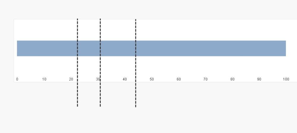
I'd like to create the chart in the image file attached. How is it possible?
1.) No overlaying allowed, shall be done in 1 single chart object only.
2.) I tried with stacked bar charts and gauge bar chart.
3.) I have experimented with free text elements ("Aktuelle Aktienquote") and position lines. My main problem is how to create the position lines exactly as displayed in the image.
Thank you and kind regards!
Marcel
- Mark as New
- Bookmark
- Subscribe
- Mute
- Subscribe to RSS Feed
- Permalink
- Report Inappropriate Content
are the values on the line known in advance? can we propose several lines with the option show hide ? no ?
Taoufiq ZARRA
"Please LIKE posts and "Accept as Solution" if the provided solution is helpful "
(you can mark up to 3 "solutions") 😉
- Mark as New
- Bookmark
- Subscribe
- Mute
- Subscribe to RSS Feed
- Permalink
- Report Inappropriate Content
Hi Taoufiq
thank you for your answer.
All values are know in advance.
How will you position your lines, as line chart positions (horizontal, vertical) cannot be dynamically set.
Well, I said that only 1 single chart should be used, and line charts are additional charts...
Best - Marcel
- Mark as New
- Bookmark
- Subscribe
- Mute
- Subscribe to RSS Feed
- Permalink
- Report Inappropriate Content
Personally I've been thinking of adding several lines and displaying them according to the value of a variable.
Taoufiq ZARRA
"Please LIKE posts and "Accept as Solution" if the provided solution is helpful "
(you can mark up to 3 "solutions") 😉
- Mark as New
- Bookmark
- Subscribe
- Mute
- Subscribe to RSS Feed
- Permalink
- Report Inappropriate Content
Hi
How do you position the lines "according to a variable"? I do not manage to set the horizontal position with a variable, only static values are allowed in the relevant line object field.
However, the requirement to use 1 single object only is not fulfilled by using line objects.
Best - Marcel
- Mark as New
- Bookmark
- Subscribe
- Mute
- Subscribe to RSS Feed
- Permalink
- Report Inappropriate Content
Hi Marcel,
I'm just thinking out loud,
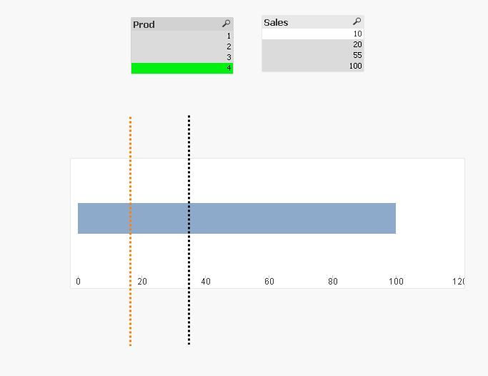
I was thinking of adding several lines for example
since the bar from 0 to 100 is fixed.
one I'll put it on 10, another on 20 ....
and then add variables show hide according to the values
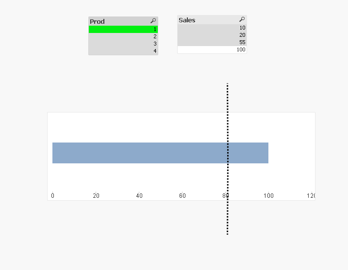
for example in the example in PJ, if you select values in the field Prod, lines are displayed.
it's just a reflection, I don't know if it can help.
Taoufiq ZARRA
"Please LIKE posts and "Accept as Solution" if the provided solution is helpful "
(you can mark up to 3 "solutions") 😉
- Mark as New
- Bookmark
- Subscribe
- Mute
- Subscribe to RSS Feed
- Permalink
- Report Inappropriate Content
If you check the continuous option for the dimension axis (Chart Properties | Axes), then you can add vertical reference lines (Chart Properties | Presentation | Reference Lines). Select the Continuous X option. You can add and display a label as well.
And that's all in one object - but it does require the x-axis to be a continuous numeric value.
- Mark as New
- Bookmark
- Subscribe
- Mute
- Subscribe to RSS Feed
- Permalink
- Report Inappropriate Content
Thanks @jonathandienst
I completely forgot Reference Lines
Taoufiq ZARRA
"Please LIKE posts and "Accept as Solution" if the provided solution is helpful "
(you can mark up to 3 "solutions") 😉
- Mark as New
- Bookmark
- Subscribe
- Mute
- Subscribe to RSS Feed
- Permalink
- Report Inappropriate Content
Hi
thank you, I know about the reference lines (I call them "position lines"). Unfortunately, it is not possible to display them exactly as in my image attached (part within the bar chart, and part either above or below the chart).
Thank you!
Marcel


