Unlock a world of possibilities! Login now and discover the exclusive benefits awaiting you.
- Qlik Community
- :
- All Forums
- :
- QlikView App Dev
- :
- How to display different values of a list box in G...
- Subscribe to RSS Feed
- Mark Topic as New
- Mark Topic as Read
- Float this Topic for Current User
- Bookmark
- Subscribe
- Mute
- Printer Friendly Page
- Mark as New
- Bookmark
- Subscribe
- Mute
- Subscribe to RSS Feed
- Permalink
- Report Inappropriate Content
How to display different values of a list box in Google map?
Problem Statement:
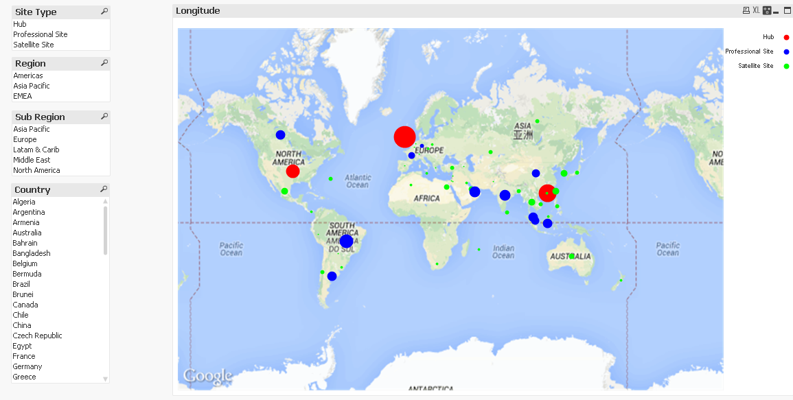
I have attached Map which i have generated using Google Map API v3 in Qlik V11 personal edition using scattered chart. The spheres are depicting products ex. ProductA, ProductB, ProductC etc etc.. I have a field which list all the products, my requirement is that if i select ProductA, ProductB the same should be displayed in Google map and there should be a classification between ProductA, ProductB shown in the map by differing colors / symbols. How to achieve this feature ? Can you please shed some hints in this regard.
Many Thanks.
Thanks,
Vivek Kumar
- Tags:
- new_to_qlikview
- « Previous Replies
-
- 1
- 2
- Next Replies »
- Mark as New
- Bookmark
- Subscribe
- Mute
- Subscribe to RSS Feed
- Permalink
- Report Inappropriate Content
Any luck on this??
- Mark as New
- Bookmark
- Subscribe
- Mute
- Subscribe to RSS Feed
- Permalink
- Report Inappropriate Content
You can use the 'background color' property of the first expression to dynamically change the colors of the dots based on another dimensions' value. Attached is an example. I also mocked up a legend which is actually a seperate combo chart that display colored symbols and placed strategically in the top right corner.
does this get you closer ?
- Mark as New
- Bookmark
- Subscribe
- Mute
- Subscribe to RSS Feed
- Permalink
- Report Inappropriate Content
Jonathan,
You are very motivating. I don't have the licensed version of Qlik. Can we achieve this using trial version. I am evaluating Qlik functionalities to be used for the creation of dashboard of a large i Bank.
Thanks
Vivek
- Mark as New
- Bookmark
- Subscribe
- Mute
- Subscribe to RSS Feed
- Permalink
- Report Inappropriate Content
You can do it but it will be manual as you copy/paste the load script code and then build the chart and insert all the expressions.
I exported all the expressions. its a tab delimitted file which descibes where the expression fits in the chart. its a scatter chart.
see how you go.
i suggest documenting your result so others can quickly build a google maps sample from scratch using the personal edition.
i also included the load script. i believe the load script creates the needed variables.
- « Previous Replies
-
- 1
- 2
- Next Replies »