Unlock a world of possibilities! Login now and discover the exclusive benefits awaiting you.
- Qlik Community
- :
- All Forums
- :
- QlikView App Dev
- :
- How to display graph data labels in percentage for...
- Subscribe to RSS Feed
- Mark Topic as New
- Mark Topic as Read
- Float this Topic for Current User
- Bookmark
- Subscribe
- Mute
- Printer Friendly Page
- Mark as New
- Bookmark
- Subscribe
- Mute
- Subscribe to RSS Feed
- Permalink
- Report Inappropriate Content
How to display graph data labels in percentage format
Hi All,
I have put up a bar graph with three dimensions and measure is count (member)
Female 1245
Mlae 1254
Unknown 12
For the above data set i have plotted bar graph. But i need the data labels to be in percentage. How should i do it.
- « Previous Replies
-
- 1
- 2
- Next Replies »
- Mark as New
- Bookmark
- Subscribe
- Mute
- Subscribe to RSS Feed
- Permalink
- Report Inappropriate Content
Sorry, I am not into QlikSense,, Hope someone will help you out,,,
- Mark as New
- Bookmark
- Subscribe
- Mute
- Subscribe to RSS Feed
- Permalink
- Report Inappropriate Content
Hi,
Please find here.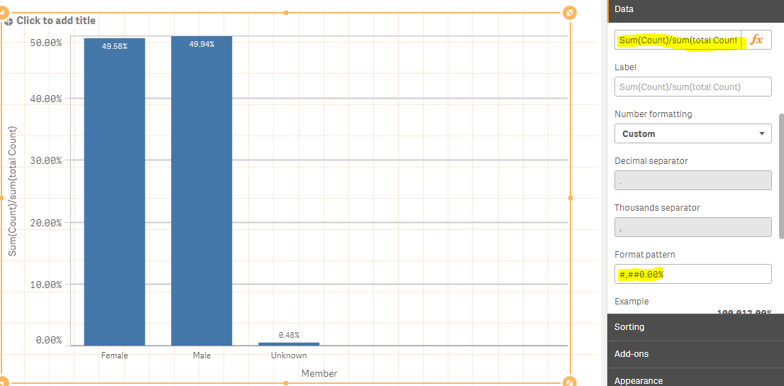
Thanks,
Vignesh U.
- Mark as New
- Bookmark
- Subscribe
- Mute
- Subscribe to RSS Feed
- Permalink
- Report Inappropriate Content
Hi,
I have tried with a simple inline load of your data 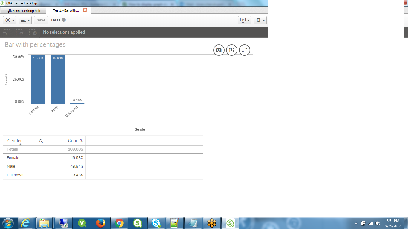
- Mark as New
- Bookmark
- Subscribe
- Mute
- Subscribe to RSS Feed
- Permalink
- Report Inappropriate Content
Is this what you want
- Mark as New
- Bookmark
- Subscribe
- Mute
- Subscribe to RSS Feed
- Permalink
- Report Inappropriate Content
Hi Kiran,
Exactly this is what i wanted. Can you share the screenshots of measure you used
Regards,
Avinash
- Mark as New
- Bookmark
- Subscribe
- Mute
- Subscribe to RSS Feed
- Permalink
- Report Inappropriate Content
Hi Avinash,
Is the expression (Sum(count)/Sum(total count)) not working as measure for you?
Thanks,
Vignesh U.
- Mark as New
- Bookmark
- Subscribe
- Mute
- Subscribe to RSS Feed
- Permalink
- Report Inappropriate Content
Hi
I have used an Inline load, taking
Gender, Count
as columns and in the expression I have used
Sum(Count)/Sum(total Count) and change the format to Number and Select the one which is showing percentage with 2 decimal points.
- Mark as New
- Bookmark
- Subscribe
- Mute
- Subscribe to RSS Feed
- Permalink
- Report Inappropriate Content
Let me know the expression how your are calculating the count so that we can say the expressions for your scenario
- « Previous Replies
-
- 1
- 2
- Next Replies »