Unlock a world of possibilities! Login now and discover the exclusive benefits awaiting you.
- Qlik Community
- :
- All Forums
- :
- QlikView App Dev
- :
- Re: How to enable "Block Borders" on Block Chart
- Subscribe to RSS Feed
- Mark Topic as New
- Mark Topic as Read
- Float this Topic for Current User
- Bookmark
- Subscribe
- Mute
- Printer Friendly Page
- Mark as New
- Bookmark
- Subscribe
- Mute
- Subscribe to RSS Feed
- Permalink
- Report Inappropriate Content
How to enable "Block Borders" on Block Chart
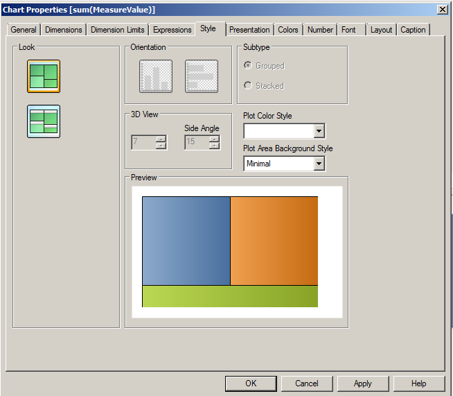
Why are these disabled (see screenshot?)

The help says:
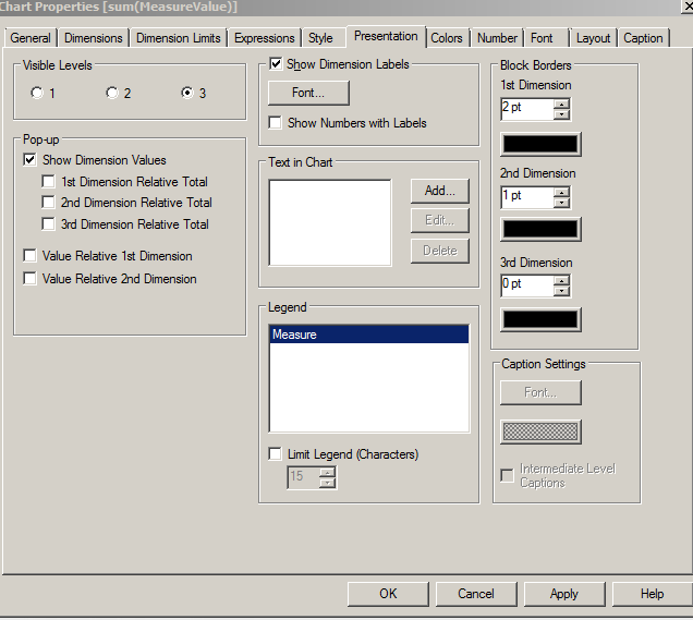
In the Block Borders group you can set the width and color of the borders drawn around the blocks on the three different dimension levels. Block borders are not applicable when the caption style of block charts is used.
But I don't know what is "caption style" of block charts?
Accepted Solutions
- Mark as New
- Bookmark
- Subscribe
- Mute
- Subscribe to RSS Feed
- Permalink
- Report Inappropriate Content
you would change the style on the style tab to enable the borders. The lower style which you have selected has grey captions.
- Mark as New
- Bookmark
- Subscribe
- Mute
- Subscribe to RSS Feed
- Permalink
- Report Inappropriate Content
you would change the style on the style tab to enable the borders. The lower style which you have selected has grey captions.
- Mark as New
- Bookmark
- Subscribe
- Mute
- Subscribe to RSS Feed
- Permalink
- Report Inappropriate Content
In ur screenshot ur using the second style,In that sytle block brodars are in disable ,if u use the first style u can change the border colors and in that u have to remove the tick mark in intermediate level captions.
- Mark as New
- Bookmark
- Subscribe
- Mute
- Subscribe to RSS Feed
- Permalink
- Report Inappropriate Content
Jonathan Poole , if I use that style, can I still put text, aka some caption inside the smallest visible dimension?
I don't think so...
- It only seems to shows me the caption of the largest visible (not filtered) dimension:
- I think the user can only see such details in a popup (which I can customize, or use the prebuilt options...)
- And it's difficult to drill-down one-layer-at-a-time.
Basically I'm thinking this "border" style (i.e. non-captioned style) is harder-to-use. What are your thoughts? Anyone else able to use it effectively?
Thank you,
- Mark as New
- Bookmark
- Subscribe
- Mute
- Subscribe to RSS Feed
- Permalink
- Report Inappropriate Content
There is a pretty good implementation of it on a demo called 'Credit Risk Management' .
When you hit the link, hit the 'concentration analysis' tab. You'll notice a colormix function is used to define a color gradient to denote 'problem areas' and draw the users in. There is also a link called 'how to read this chart' which is just a hide/show text box (and a larger mostly white text box) that whites out the rest of the chart.
Not sure if this helps with the caption issue but it may help improve the chart's usage.
- Mark as New
- Bookmark
- Subscribe
- Mute
- Subscribe to RSS Feed
- Permalink
- Report Inappropriate Content
The link is: (Jonathan posted it at the bottom of his post; but mine points at the sheet he references)
I think it has the same "problem" I describe:
- It only seems to shows me the caption of the largest visible dimension; i.e. unless only one of the values from that dimension is picked.
- Even if you click and drag it only filters among the largest visible dimension;
- So it's hard to drill down via the chart itself (although using listboxes is perfectly fine; I just think it does not clearly communicate it is grouping by three nested dimensions in this layout)
But it looks pretty 