Unlock a world of possibilities! Login now and discover the exclusive benefits awaiting you.
- Qlik Community
- :
- All Forums
- :
- QlikView App Dev
- :
- Re: How to improve dimension labels?
- Subscribe to RSS Feed
- Mark Topic as New
- Mark Topic as Read
- Float this Topic for Current User
- Bookmark
- Subscribe
- Mute
- Printer Friendly Page
- Mark as New
- Bookmark
- Subscribe
- Mute
- Subscribe to RSS Feed
- Permalink
- Report Inappropriate Content
How to improve dimension labels?
Hi,
please take a look at the attached screenshot.
Is it possible to improve the dimension labels with wrapping, cutting or something like this? Looks not very professional at the moment.
Regards,
- PS -
Accepted Solutions
- Mark as New
- Bookmark
- Subscribe
- Mute
- Subscribe to RSS Feed
- Permalink
- Report Inappropriate Content
Yes,
You should try to Presentation tab.. limit legend character..
also Axes tab to change the orientation.
HTH
Sushil
- Mark as New
- Bookmark
- Subscribe
- Mute
- Subscribe to RSS Feed
- Permalink
- Report Inappropriate Content
Yes,
You should try to Presentation tab.. limit legend character..
also Axes tab to change the orientation.
HTH
Sushil
- Mark as New
- Bookmark
- Subscribe
- Mute
- Subscribe to RSS Feed
- Permalink
- Report Inappropriate Content
hi
chart --> prpperties-->Axes-->select field --> dimension Axes (/ check on this radio button)
also in presentation tab , style tab change style
see attachement
Regards
vishwaranjan
- Mark as New
- Bookmark
- Subscribe
- Mute
- Subscribe to RSS Feed
- Permalink
- Report Inappropriate Content
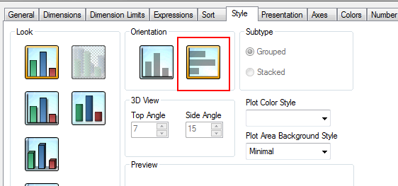
sometimes changing the orientation of the chart can prove to be a better result, especially when dimension labels are needed to show the data the correct way

- Mark as New
- Bookmark
- Subscribe
- Mute
- Subscribe to RSS Feed
- Permalink
- Report Inappropriate Content
Thank you for the quick replies!
Limit legend characters did the trick.
I thought it wouldn't affect the dimension labels.
Thanks and Greets,
- PS -
- Mark as New
- Bookmark
- Subscribe
- Mute
- Subscribe to RSS Feed
- Permalink
- Report Inappropriate Content
By the way the orientation should stay as shown on my screenshot. Some of the Labels have 200+ characters. A change of the orientation doesn't really improve this.