Unlock a world of possibilities! Login now and discover the exclusive benefits awaiting you.
- Qlik Community
- :
- All Forums
- :
- QlikView App Dev
- :
- Re: How to make an axis continuous?
- Subscribe to RSS Feed
- Mark Topic as New
- Mark Topic as Read
- Float this Topic for Current User
- Bookmark
- Subscribe
- Mute
- Printer Friendly Page
- Mark as New
- Bookmark
- Subscribe
- Mute
- Subscribe to RSS Feed
- Permalink
- Report Inappropriate Content
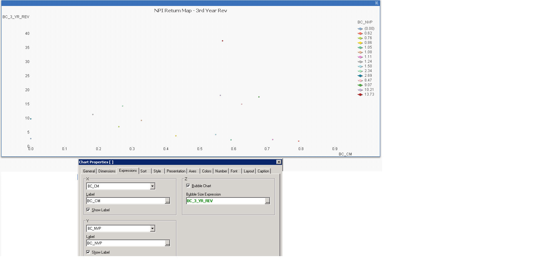
How to make an axis continuous?
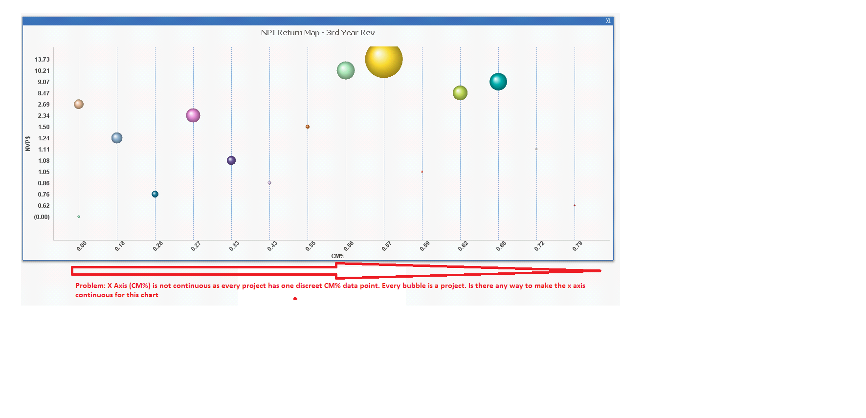
Hi, I have a chart where x axis is CM%. Now as every project has one data point for CM%, so x axis shows up as discrete. Is there any way to make it continuous. Pic below and attached as more information.
- Mark as New
- Bookmark
- Subscribe
- Mute
- Subscribe to RSS Feed
- Permalink
- Report Inappropriate Content
Should be possible (if I understood your problem correctly).
Have you tried with a scatter chart? Please check attached sample.
- Mark as New
- Bookmark
- Subscribe
- Mute
- Subscribe to RSS Feed
- Permalink
- Report Inappropriate Content
Thanks for your reply Swuehi. Looks like this is it but I for some reason i am seeing different Y axis then I specifying. Please note that in attached screenshot
- I am specifying y axia as NVP but I am getting Revenue as axis instead on NVP
- I am specifying bubble size as Revenue but Revenue is showing up as dimension and not bubble size.
Do you have any idea why would that happen?