Unlock a world of possibilities! Login now and discover the exclusive benefits awaiting you.
- Qlik Community
- :
- All Forums
- :
- QlikView App Dev
- :
- How to plot a line chart with Multiple Y Axis valu...
- Subscribe to RSS Feed
- Mark Topic as New
- Mark Topic as Read
- Float this Topic for Current User
- Bookmark
- Subscribe
- Mute
- Printer Friendly Page
- Mark as New
- Bookmark
- Subscribe
- Mute
- Subscribe to RSS Feed
- Permalink
- Report Inappropriate Content
How to plot a line chart with Multiple Y Axis values for the same X-Axis Value
Hi,
I have a requirement where I have to plot multiple values on Y Axis for a single X Axis value. This is for a line chart. Please let me know how is this possible ? If not possible by line chart then what other chart I should use ?
I am attaching the sample data too.
I will really appreciate your help.
Regards
Ajay
- « Previous Replies
-
- 1
- 2
- Next Replies »
- Mark as New
- Bookmark
- Subscribe
- Mute
- Subscribe to RSS Feed
- Permalink
- Report Inappropriate Content
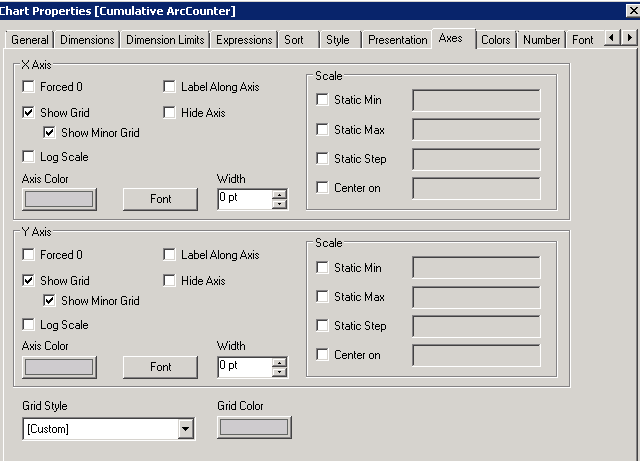
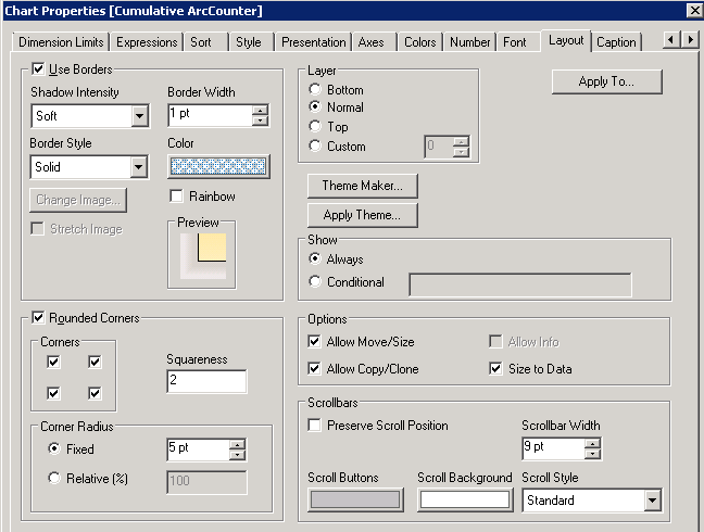
Uncheck "Force Zero" on axis tab.
Regards
Marco
- Mark as New
- Bookmark
- Subscribe
- Mute
- Subscribe to RSS Feed
- Permalink
- Report Inappropriate Content
Another option might be a scatter chart
LOAD Date#(BEAM_Arcrate_Arccounter.date) as BEAM_Arcrate_Arccounter.date,
RowNo() as RowID,
1 as ID,
BEAM_Arcrate_Arccounter.cumulative_arc_rate
FROM
(biff, embedded labels, table is Sheet1$);
Dimensions:
RowID
ID
Expressions:
=Sum (BEAM_Arcrate_Arccounter.date)
=Sum ([BEAM_Arcrate_Arccounter.cumulative_arc_rate])
Choose Lines&Symbols representation on presentation tab

- Mark as New
- Bookmark
- Subscribe
- Mute
- Subscribe to RSS Feed
- Permalink
- Report Inappropriate Content
Thanks Marco,
I am almost there. But it is showing in reverse order .
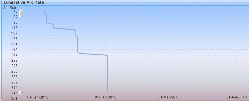
And if I sort descending then it shows like this
- Mark as New
- Bookmark
- Subscribe
- Mute
- Subscribe to RSS Feed
- Permalink
- Report Inappropriate Content
Thanks Swuehl,
I will give it a shot .
- Mark as New
- Bookmark
- Subscribe
- Mute
- Subscribe to RSS Feed
- Permalink
- Report Inappropriate Content
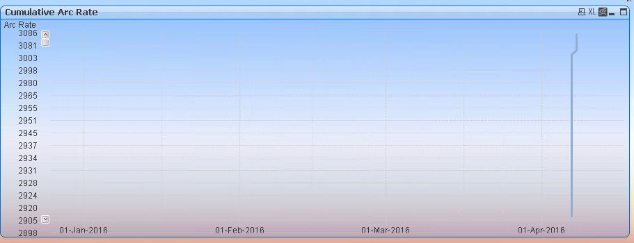
Thanks Stefan,
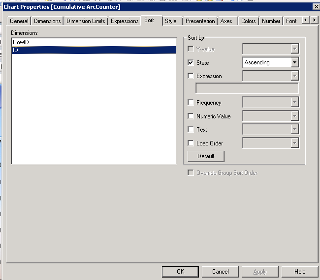
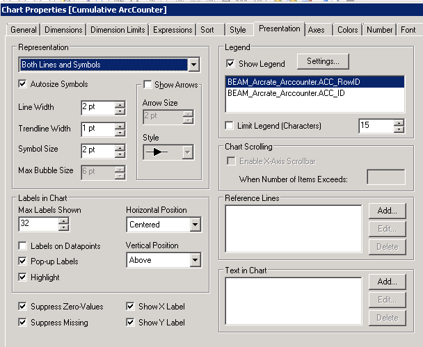
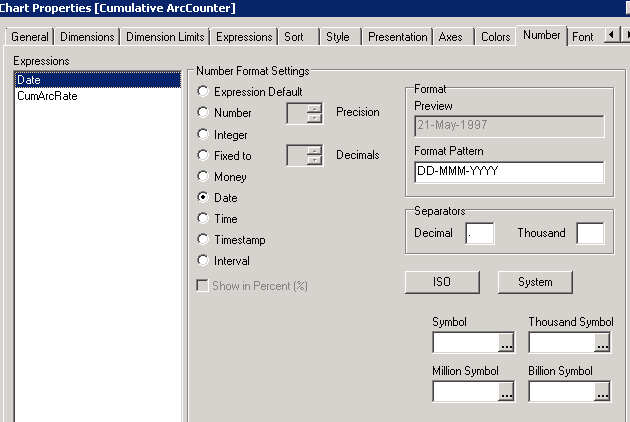
I get a single line and the dates don't make any sense. I am doing something wrong because you are clearly able to get the chart.
I am attaching screenshots of other settings too.
- Mark as New
- Bookmark
- Subscribe
- Mute
- Subscribe to RSS Feed
- Permalink
- Report Inappropriate Content
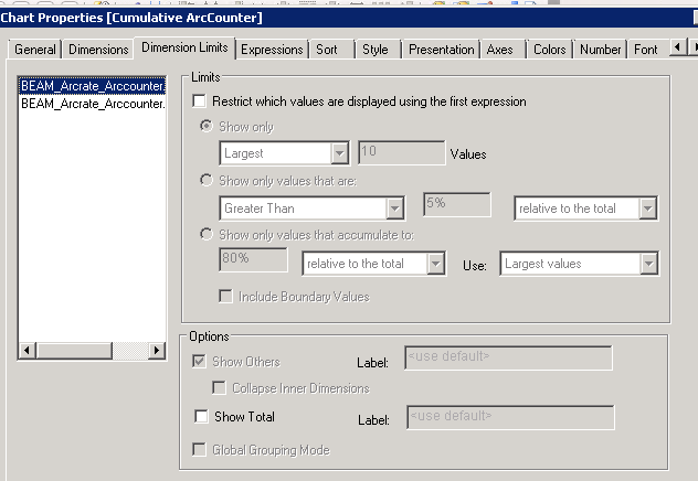
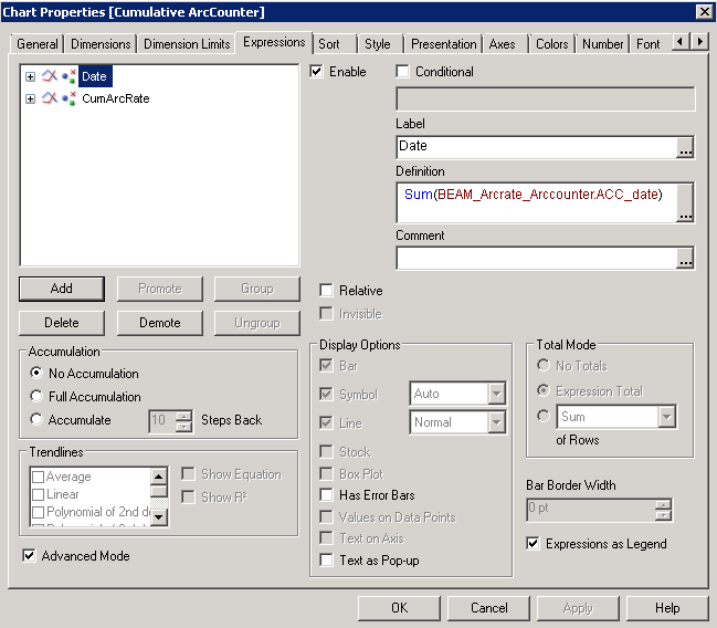
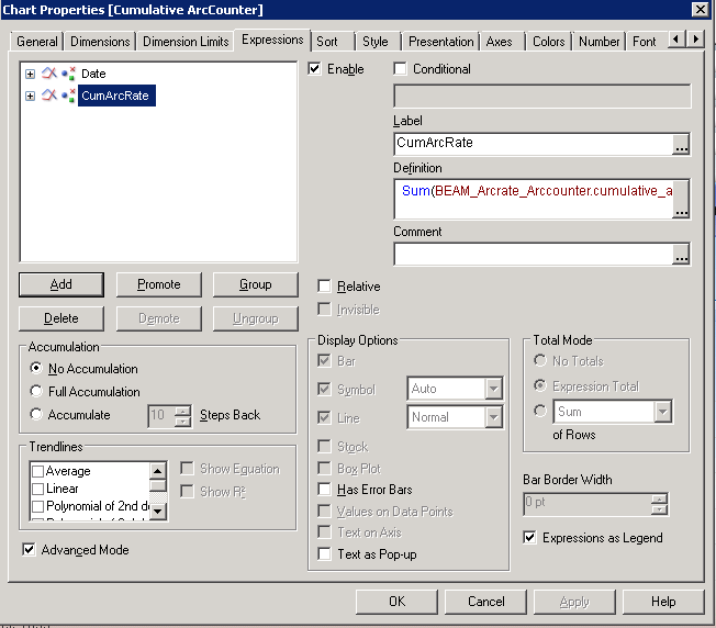
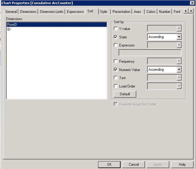
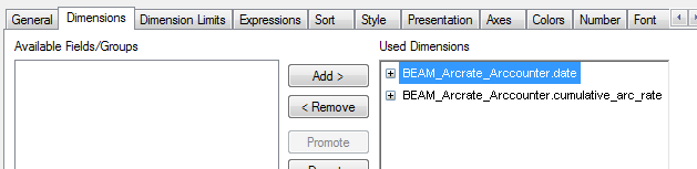
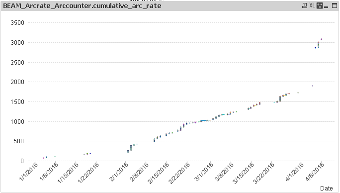
Hi Ajay,
Here is another way to plot all the values, add both fields as dimensions, this will plot by date and keep separated all the data points:
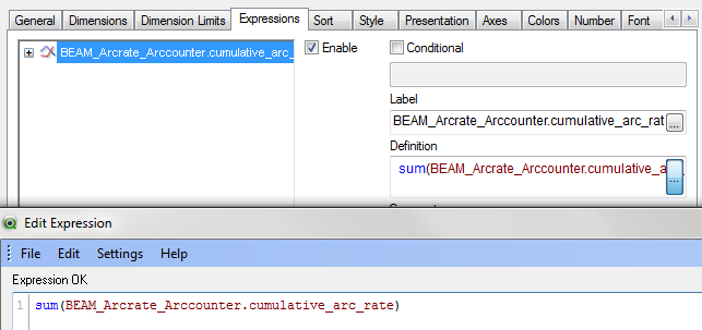
Next in your expression, add the sum of all cumulative_arc_rate:
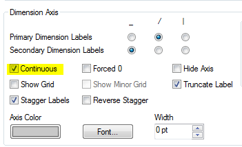
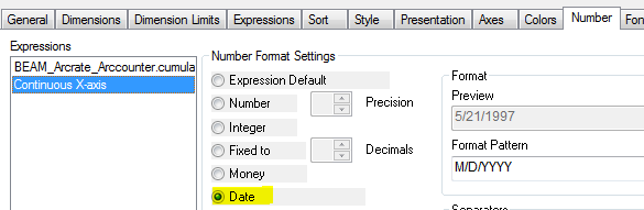
In axis tab select contiguous
And in number select Date format for Continuous X-axis
This will produce the following output:
Regards,
-- Karla
- Mark as New
- Bookmark
- Subscribe
- Mute
- Subscribe to RSS Feed
- Permalink
- Report Inappropriate Content
Hi Marco,
I was missing the setting "Continuous" . Once I checked it I got the chart :-).
Thanks a lot for all your help.
Appreciate it.
Ajay
- Mark as New
- Bookmark
- Subscribe
- Mute
- Subscribe to RSS Feed
- Permalink
- Report Inappropriate Content
Thanks Karla Appreciate it. I will try that option too.
- Mark as New
- Bookmark
- Subscribe
- Mute
- Subscribe to RSS Feed
- Permalink
- Report Inappropriate Content
Just a follow up to the scatter chart:
You need to take care that your dates are interpreted as such, having a numeric representation.
Your Excel file shows text values, AFAIR.
That's why I've used
LOAD Date#(BEAM_Arcrate_Arccounter.date) as BEAM_Arcrate_Arccounter.date,
in my LOAD script (or using your format code:
LOAD Date#(BEAM_Arcrate_Arccounter.date,'YYYY-MM-DD') as BEAM_Arcrate_Arccounter.date,
I assume that's your issue.
See also:
- « Previous Replies
-
- 1
- 2
- Next Replies »