Unlock a world of possibilities! Login now and discover the exclusive benefits awaiting you.
- Qlik Community
- :
- All Forums
- :
- QlikView App Dev
- :
- How to plot two point data series on a single scat...
- Subscribe to RSS Feed
- Mark Topic as New
- Mark Topic as Read
- Float this Topic for Current User
- Bookmark
- Subscribe
- Mute
- Printer Friendly Page
- Mark as New
- Bookmark
- Subscribe
- Mute
- Subscribe to RSS Feed
- Permalink
- Report Inappropriate Content
How to plot two point data series on a single scatter chart
Hello expert users,
I'm pretty new to Qlikview, And I need to plot Two data series on a scatter chart as symbols.
data series are defined with set analysis on a bookmark.
serie 1 : margin in X and Sales in Y for all sales of current selection ; 1 point for each invoice
serie 2 : margin in X and Sales in Y for all sales of a bookmark of selection, let's say {BM04}
For that, I have defined 2 dimensions : Invoice Number and Customer
I have selected data of serie 2 in bookmark BM04, that is in fact the complete set of data, but could be a fist selection of key account customers;
current selection is a part of BM04;
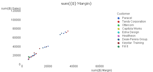
serie 1 is plotted with 2 expressions : sum({$} Margin) and sum({$} Sales)
Data are sorted on customer by frequency : descending to separate points of each customer...

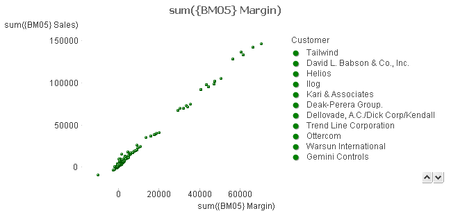
serie 2 is plotted with following 2 expressions : sum({BM04} Margin) and sum({BM04} sales) ;
 to see difference graphically, one can put a specific background colour on first expression : green()

unfortunately, it is impossible to plot those 2 data series together, points are not plotted together, why ??

if both expressions of serie 1 are disabled, serie 2 is plotted correctly,
same if I disable serie 2 , serie 1 is plotted correctly.
Has someone already experimented such a problem , and is there a solution to get this plot correct ?
I add the complete file as exercise for showing the problem and find a solution
thank you for your help
Cyril
- Mark as New
- Bookmark
- Subscribe
- Mute
- Subscribe to RSS Feed
- Permalink
- Report Inappropriate Content
hello,
Is anybody able to help me on this very interesting question ?
In the meantime I have found a colleague who helped me and found a workaround on this problem :
make 2 scatter charts with respectively the first and second set of data,
make so that pictures have same size, and axes have the same scale , and put the first over the second
enable "colour" transparency of the one that is above.....
and it is done.... not so nice, and I've not yet tried to plot these graphs...
Cyril
- Mark as New
- Bookmark
- Subscribe
- Mute
- Subscribe to RSS Feed
- Permalink
- Report Inappropriate Content
Hello community,
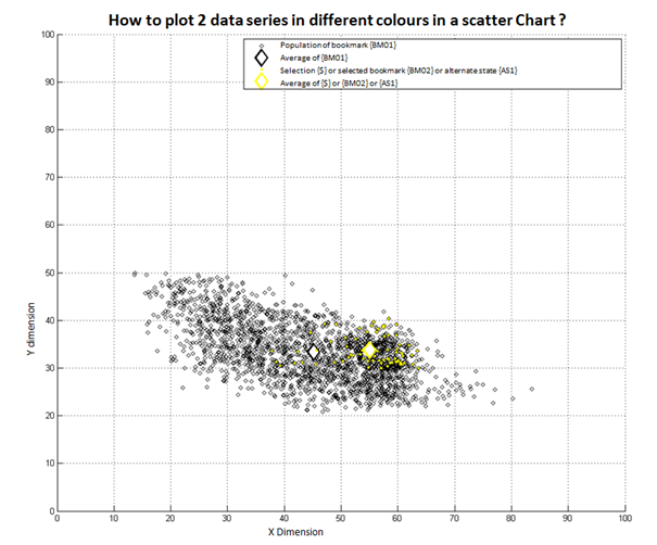
I've worked out an example picture of what I wish to obtain,

I would like to compare the following data :
- basis is a population we have in a bookmark for example {BM01}
- plot a mark of average point of this population
- compare in a different colour (here in yellow) an other selection of population, that can be a part included in {BM01} or a completely outside. It can be the current selection {$}, or another bookmark {BM02} or an alternate state {AS1}
Do you see a way to plot such a picture in Qlikview ?