Unlock a world of possibilities! Login now and discover the exclusive benefits awaiting you.
- Qlik Community
- :
- All Forums
- :
- QlikView App Dev
- :
- How to reduce number of text on value points
- Subscribe to RSS Feed
- Mark Topic as New
- Mark Topic as Read
- Float this Topic for Current User
- Bookmark
- Subscribe
- Mute
- Printer Friendly Page
- Mark as New
- Bookmark
- Subscribe
- Mute
- Subscribe to RSS Feed
- Permalink
- Report Inappropriate Content
How to reduce number of text on value points

Hello,
I have this graph - Is it possible to reduce the number of labels. And maybe set a static value at 95%??
Can anyone help
Thnak you
- « Previous Replies
-
- 1
- 2
- Next Replies »
Accepted Solutions
- Mark as New
- Bookmark
- Subscribe
- Mute
- Subscribe to RSS Feed
- Permalink
- Report Inappropriate Content
I used rank, and then i showed only values based on min and max rank
- Mark as New
- Bookmark
- Subscribe
- Mute
- Subscribe to RSS Feed
- Permalink
- Report Inappropriate Content
Hi,
May be like this.
Please find the attachment.
Regards
ASHFAQ
- Mark as New
- Bookmark
- Subscribe
- Mute
- Subscribe to RSS Feed
- Permalink
- Report Inappropriate Content
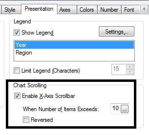
Go to chart properties >> Presentation >> Chart Scrolling >> Enable x-Axis scrolling >> and write 10-15 for display of bars
See the snap

- Mark as New
- Bookmark
- Subscribe
- Mute
- Subscribe to RSS Feed
- Permalink
- Report Inappropriate Content
I mean the procent on the line graph. I have many values on the line graph I want to reduce this number
- Mark as New
- Bookmark
- Subscribe
- Mute
- Subscribe to RSS Feed
- Permalink
- Report Inappropriate Content
I mean the procent values on the line graph.
- Mark as New
- Bookmark
- Subscribe
- Mute
- Subscribe to RSS Feed
- Permalink
- Report Inappropriate Content
Hi Thomas,
Your values gets truncated because they reach the top of the chart. You can set a static max of the Y axes a little bit higher than 100% (like 105% or 108%). This will free up some space at the top of the chart. To prevent QlikView from showing this > 100% scale, set the statis step to a value higher than your static max value - 100. For example: static max = 108 > 108 - 100 = 8, set the static step to 20.
Cheers,
Michiel
- Mark as New
- Bookmark
- Subscribe
- Mute
- Subscribe to RSS Feed
- Permalink
- Report Inappropriate Content
Have you tried using: 1. Dimension Limits for a percentage above/below threshold, 2. Expression > Value on Data points > conformed to an expression?
- Mark as New
- Bookmark
- Subscribe
- Mute
- Subscribe to RSS Feed
- Permalink
- Report Inappropriate Content
Hi,
Above 36 days probability is too low to be shown. You can group all >36 with this formula for dimension :
if(DaysSinceLastBuy>36, dual('>36',37), DaysSinceLastBuy)
This will make your graph look better. You can group (or exclude) further along these lines.
Hope it helps
- Mark as New
- Bookmark
- Subscribe
- Mute
- Subscribe to RSS Feed
- Permalink
- Report Inappropriate Content
Hi Thomas,
can you upload an example with data?
- Ralf
- Mark as New
- Bookmark
- Subscribe
- Mute
- Subscribe to RSS Feed
- Permalink
- Report Inappropriate Content
hi Ralph - Document attaced now.
- « Previous Replies
-
- 1
- 2
- Next Replies »