Unlock a world of possibilities! Login now and discover the exclusive benefits awaiting you.
- Qlik Community
- :
- All Forums
- :
- QlikView App Dev
- :
- How to shade in empty boxes under Pivot Table
Options
- Subscribe to RSS Feed
- Mark Topic as New
- Mark Topic as Read
- Float this Topic for Current User
- Bookmark
- Subscribe
- Mute
- Printer Friendly Page
Turn on suggestions
Auto-suggest helps you quickly narrow down your search results by suggesting possible matches as you type.
Showing results for
Not applicable
2017-08-09
12:49 PM
- Mark as New
- Bookmark
- Subscribe
- Mute
- Subscribe to RSS Feed
- Permalink
- Report Inappropriate Content
How to shade in empty boxes under Pivot Table
Hey Guys,
I have a request from my company to create a pivot table to do comparative analysis between two dates. Currently I am getting the data right but not able to shade in missing values under the data point. I posted some screenshots to help better understand the problem.
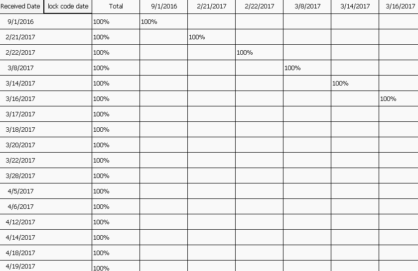
This is what my table looks like currently. I want every value under 100% to be shaded in gray.
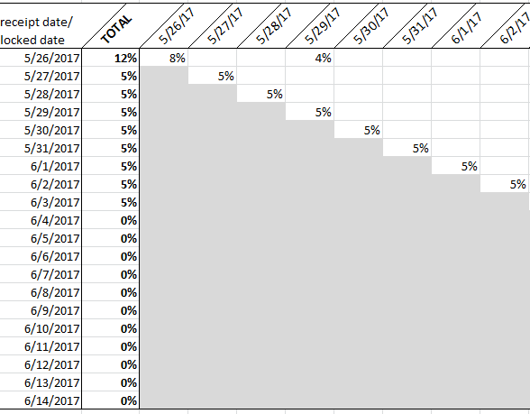
This is my end goal. Any one have any ideas on how to accomplish this in qlik? Any insight would be very helpful
731 Views
2 Replies
Employee
2017-08-09
03:32 PM
- Mark as New
- Bookmark
- Subscribe
- Mute
- Subscribe to RSS Feed
- Permalink
- Report Inappropriate Content
could you post your qvw?
656 Views
Not applicable
2017-08-09
04:41 PM
Author
- Mark as New
- Bookmark
- Subscribe
- Mute
- Subscribe to RSS Feed
- Permalink
- Report Inappropriate Content
Hey Anjos I've added a test qvw with the data and the test excel file.
656 Views