Unlock a world of possibilities! Login now and discover the exclusive benefits awaiting you.
- Qlik Community
- :
- All Forums
- :
- QlikView App Dev
- :
- How to show different Units like $ as cost,Man hou...
Options
- Subscribe to RSS Feed
- Mark Topic as New
- Mark Topic as Read
- Float this Topic for Current User
- Bookmark
- Subscribe
- Mute
- Printer Friendly Page
Turn on suggestions
Auto-suggest helps you quickly narrow down your search results by suggesting possible matches as you type.
Showing results for
Not applicable
2011-12-13
03:21 AM
- Mark as New
- Bookmark
- Subscribe
- Mute
- Subscribe to RSS Feed
- Permalink
- Report Inappropriate Content
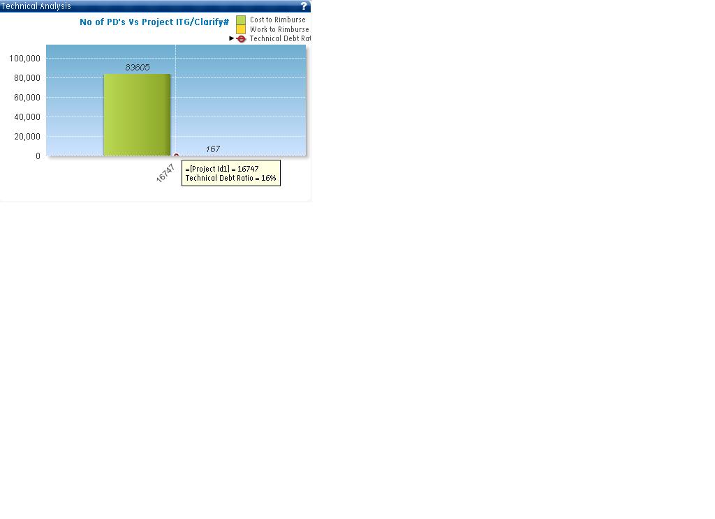
How to show different Units like $ as cost,Man hour, Ratio as % in a Bar or Combo chart
Hi All,
I need to show cost,man hour and ratio in a single chart bar/combo chart.
I created one chart and attaching its image. But due to different units data is not plotted in a correct way or we can say this is not the correct way to show the data.
Also sharing the data with you for better understanding:
| Project Id1 | Build Date1 | DebtRatio | CostToReimburse $ | WorkToReimburse |
| 16752 | 4/22/2010 | 34.30% | 1336255 | 2673 |
| 16747 | 2/22/2011 | 15.90% | 83,605 | 167 |
| 13924 | 4/20/2010 | 17.00% | 519 | 1 |
| 16749 | 4/22/2010 | 17.00% | 519 | 1 |
| 13923 | 4/20/2010 | 20.20% | 38,960 | 78 |
| 13928 | 4/20/2010 | 25.50% | 81,308 | 163 |
| 16748 | 4/22/2010 | 20.00% | 38,710 | 77 |
| 16,753 | 4/22/2010 | 26.00% | 83,308 | 167 |
Please help me on this how in can be shown in a better way. Don't want to use table charts.
Thanks in Advance,
431 Views
1 Reply
Partner - Champion III
2011-12-13
05:04 AM
- Mark as New
- Bookmark
- Subscribe
- Mute
- Subscribe to RSS Feed
- Permalink
- Report Inappropriate Content
Hi
You can use the second axis in
Chart Properties -> Axes-> Position Left(Bottom) for one expression and Right(Top) for another expression.
Hope this helps you.
Regards,
Jagan.
250 Views