Unlock a world of possibilities! Login now and discover the exclusive benefits awaiting you.
- Qlik Community
- :
- All Forums
- :
- QlikView App Dev
- :
- Re: How to stop my labels being over a chart
- Subscribe to RSS Feed
- Mark Topic as New
- Mark Topic as Read
- Float this Topic for Current User
- Bookmark
- Subscribe
- Mute
- Printer Friendly Page
- Mark as New
- Bookmark
- Subscribe
- Mute
- Subscribe to RSS Feed
- Permalink
- Report Inappropriate Content
How to stop my labels being over a chart
Hi everybody,
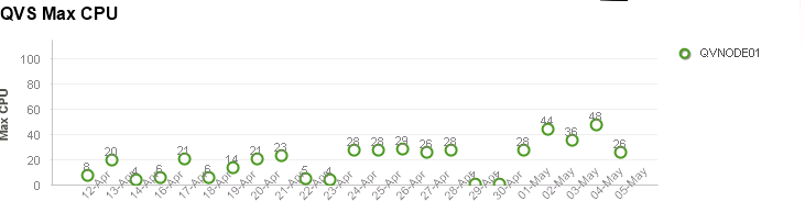
I have the problem that my x axis labels are over my chart. How can I change this configutation?
Thanks a lot.
Accepted Solutions
- Mark as New
- Bookmark
- Subscribe
- Mute
- Subscribe to RSS Feed
- Permalink
- Report Inappropriate Content
Make sure the chart is selected, press ctrl and shift together, the different areas in the chart will get a red border. While holding ctrl+shift, Using the mouse you can now resize these areas. Make the plot area smaller by dragging it up from the bottom.
- Mark as New
- Bookmark
- Subscribe
- Mute
- Subscribe to RSS Feed
- Permalink
- Report Inappropriate Content
The chart is too small for the label to fit in. So please try to resize the chart and it will be perfect. If needed, in 'Axes' tab you can check 'Truncate Label' and see if it is helpful.
- Mark as New
- Bookmark
- Subscribe
- Mute
- Subscribe to RSS Feed
- Permalink
- Report Inappropriate Content
Make sure the chart is selected, press ctrl and shift together, the different areas in the chart will get a red border. While holding ctrl+shift, Using the mouse you can now resize these areas. Make the plot area smaller by dragging it up from the bottom.