Unlock a world of possibilities! Login now and discover the exclusive benefits awaiting you.
- Qlik Community
- :
- All Forums
- :
- QlikView App Dev
- :
- Issue with the Color Coding
- Subscribe to RSS Feed
- Mark Topic as New
- Mark Topic as Read
- Float this Topic for Current User
- Bookmark
- Subscribe
- Mute
- Printer Friendly Page
- Mark as New
- Bookmark
- Subscribe
- Mute
- Subscribe to RSS Feed
- Permalink
- Report Inappropriate Content
Issue with the Color Coding
Hi Folks,
PFA the files for your reference. The issue I have here is with the color coding and I really find it strange. Following are the scenarios I am encountering and I don't know its one of those Qlik quirks or it should definitely be my coding.
When I am trying to create a bar chart with 2 dimensions (Grade & Subject) and trying to display the max ID (expression) on each Grade,Subject combination based on their latest ID(Ignore the date reported field only the ID tells the latest on a record) , I am able to pull the latest ID(data value is also displayed on the top of each bar) and display it but the color coding is not working.
Scenario 1:
When the expr is aggr(max(ID), Grade,Subject,Status) I can the color coding perfectly but when the expr is excluding the Status in the aggregation part meaning when the expr is aggr(max(ID), Grade,Subject) I am unable to the see the same color coding when the max ID is displayed.
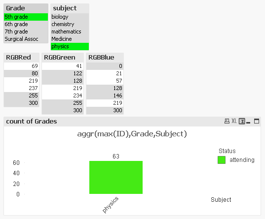
ex: Choose 5th grade, Physics (Expr = aggr(max(ID), Grade,Subject,Status) )
You can see the data value 63 which is the max ID with the red bar and when I change the expr to aggr(max(ID), Grade,Subject) the max ID value is stored but not the color (its green now). I am really confused why it doesnt show the same color.
Scenario 2:
Same thing applies to the values
Grade = Surgical Assoc
Subject = Medicine
Max ID = 1860 (this is right when the (expr = aggr(max(ID), Grade,Subject,Status) )
color = Not Met color (Red)
when the expr = aggr(max(ID), Grade,Subject)
Grade = Surgical Assoc
Subject = Medicine
expected color = Not Met color (Red) but it picks up the Threshold color and I see the value as Threshold 
Could somebody help me with this issue.
- Tags:
- new_to_qlikview
- Mark as New
- Bookmark
- Subscribe
- Mute
- Subscribe to RSS Feed
- Permalink
- Report Inappropriate Content
Janakiraman,
Are you attempting to grab the combination of the colors from the three fields to populate the RGB in the chart expression > background color, or are you only interested in using RED if one of the items in the RGBRed listbox is selected? Big difference 
One note - the RGB values from RGBRed, ...Green, ...Blue are too high for RGB Values, as RGB coding is limited to 255,255,255 as a maximum (all white); whereas, RGB(0,0,0) = Black.
My immediate "guess" is that your background color logic is erroneous and the other is your RGB values are too high so it returns a null value.
Perhaps using an inline to associated RGBRed, etc. can look like this in your edit script:
Load * inline [
in,out
69,rgb(255,0,0)
...
41,rgb(0,255,0)
...
21,rgb(0,0,255)
...
];
...as an initial consideration.
Another consideration would be to try the colormix wizard (perhaps)?
-Greg
- Mark as New
- Bookmark
- Subscribe
- Mute
- Subscribe to RSS Feed
- Permalink
- Report Inappropriate Content
This is perfectly logical.
If you select 5th grad and physics, you have the following situation;
As you can see, you have several values possible in your RGB fields, which means that your color function
=rgb(only(RGBRed),only(RGBGreen),only(RGBBlue))
will evaluate to NULL. Then the color will be picked from the Colors tab in the object properties.
Further, you should not use Aggr here. See When should the Aggr() function NOT be used? And if you use it anyway, you should wrap it in an aggregation function, e.g. Max(Aggr(...))
HIC
- Mark as New
- Bookmark
- Subscribe
- Mute
- Subscribe to RSS Feed
- Permalink
- Report Inappropriate Content
Hi Henric,
Thanks for the reply. The color for attending is right but I am wondering why the status on the side of the chart still reads attending because it should choose the "unregistered" per the max ID. If not use aggr I am not sure whether the if function can help resolve this issue as I thought its more resource intensive.
Please advise.
- Mark as New
- Bookmark
- Subscribe
- Mute
- Subscribe to RSS Feed
- Permalink
- Report Inappropriate Content
I just did check the persistent colors check box and I think the problem is more with my expression as Henric has suggested not to use aggr(). I am trying to pick color of the status corresponding to the max ID based on the two dimension values.
- Mark as New
- Bookmark
- Subscribe
- Mute
- Subscribe to RSS Feed
- Permalink
- Report Inappropriate Content
That can happen if you have a mismatch between the dimensions in the Aggr() function and the ones in the chart. The Aggr() has Grade and Subject as dimensions, but the chart has Subject and Status.
But as I said, you shouldn't use Aggr() here. If I remove Aggr() and just use Max(ID) as expression, I get
which I think is correct. Or?
HIC
- Mark as New
- Bookmark
- Subscribe
- Mute
- Subscribe to RSS Feed
- Permalink
- Report Inappropriate Content
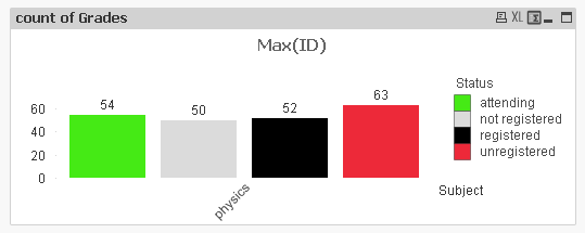
Yup the graph showing above is right but my need is that I wanna show a bar chart for a Subject,Status as Dimension with the max ID corresponding to the grouping of Grade and Subject.
In this above case I would like to see only the red bar with the value 63 (the other bars shouldn't show on the chart) on it while "Subject" is on the x-axis and "Max ID value" on the Y-axis with "Status" on the side of the chart with the appropriate Status color reference.
I hope I make sense there.
- Mark as New
- Bookmark
- Subscribe
- Mute
- Subscribe to RSS Feed
- Permalink
- Report Inappropriate Content
Hi Henrick,
I used a different approach. I used a Marker to flag those records with the max(ID) for a grade,subject combination by using a Resident table. Then used an expr in the bar chart
If(Marker=ID,ID,NULL()) and it worked fine. 🙂
[flag]:
LOAD
Grade,
Subject,
max(ID) as Marker Resident [Source] group by Grade,Subject;
[Source] - is the source excel data pull .
Tak
- Mark as New
- Bookmark
- Subscribe
- Mute
- Subscribe to RSS Feed
- Permalink
- Report Inappropriate Content
This is probably a much better approach.
The initial approach by just saying that you want a bar chart with Subject and Status as Dimensions and max ID per Grade and Subject doesn't make sense: The Aggr() function returns a three-column table - Max(ID), Grade and Subject - and then you try to group that by Subject and Status in the bar chart. This is theoretically not possible, since Status doesn't exist in the three-column table.
HIC