Unlock a world of possibilities! Login now and discover the exclusive benefits awaiting you.
- Qlik Community
- :
- All Forums
- :
- QlikView App Dev
- :
- Line Chart - Format Values on Data Points
- Subscribe to RSS Feed
- Mark Topic as New
- Mark Topic as Read
- Float this Topic for Current User
- Bookmark
- Subscribe
- Mute
- Printer Friendly Page
- Mark as New
- Bookmark
- Subscribe
- Mute
- Subscribe to RSS Feed
- Permalink
- Report Inappropriate Content
Line Chart - Format Values on Data Points
Hi All,
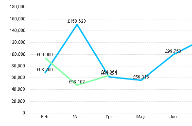
I have a line chart as per the below where I need to show the values on the data points. As you can see, the values can overlap and therefore become difficult/impossible to read.
Is there a better way of doing this? For example, a way to get the values to show under/on top of the lines? Or even a way to shorten the labels, for example changing '£150,623 to instead show '150k'? I've tried doing this by adding this into the expression in the 'Show Value' option within the expression, but no luck so far.
Any ideas gratefully received!

- Mark as New
- Bookmark
- Subscribe
- Mute
- Subscribe to RSS Feed
- Permalink
- Report Inappropriate Content
Hi Danielle
I too have struggled with this and don't think its possible at the moment to control where they fall, other than resizing the chart or adding a scrollbar to space the lines out a bit more.
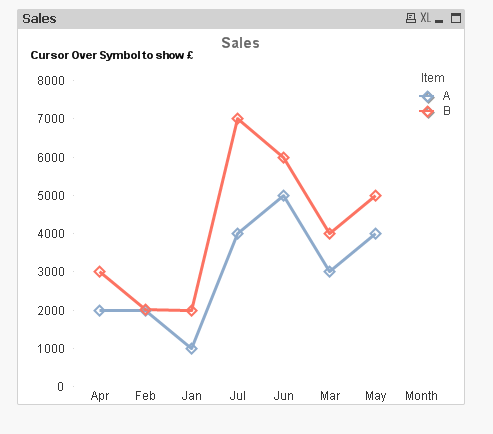
I ended up just using 'text as pop up' and added small symbols to guide the user where to hover their cursor. The resulting graph is tidier in the long run.
- Mark as New
- Bookmark
- Subscribe
- Mute
- Subscribe to RSS Feed
- Permalink
- Report Inappropriate Content
Hello,
Under Numbers in the chart properties you can set the Thousand symbol.
But I think you have to divide the value by 1,000, though.
I hope this helps.
- Mark as New
- Bookmark
- Subscribe
- Mute
- Subscribe to RSS Feed
- Permalink
- Report Inappropriate Content
Hi Danielle,
you could do something like this and y=use the cursor hover over to show the values:

See attachment:
- Mark as New
- Bookmark
- Subscribe
- Mute
- Subscribe to RSS Feed
- Permalink
- Report Inappropriate Content
Hi Tracy & Andrew,
Thanks for your helpful suggestions - think I may have to go down this route as it doesn't look like I can do what I intended to
- Mark as New
- Bookmark
- Subscribe
- Mute
- Subscribe to RSS Feed
- Permalink
- Report Inappropriate Content
No problem, there's no a perfect solution to you issue - Have a nice one ! ![]()
Andy
- Mark as New
- Bookmark
- Subscribe
- Mute
- Subscribe to RSS Feed
- Permalink
- Report Inappropriate Content
Hi Danielle,
I would suggest you to show one expression (line) values on line it self
and for another expression (line) show values on axis.
But this will be useful only if there are two expressions. Otherwise Tracy's solution will be another way to do.
--
Regards,
Prashant P Baste
- Mark as New
- Bookmark
- Subscribe
- Mute
- Subscribe to RSS Feed
- Permalink
- Report Inappropriate Content
may be u like this,
- Mark as New
- Bookmark
- Subscribe
- Mute
- Subscribe to RSS Feed
- Permalink
- Report Inappropriate Content
I am late to the game here, so this may be resolved already however this can be done by formatting the expression on the number tab. See below: