Unlock a world of possibilities! Login now and discover the exclusive benefits awaiting you.
- Qlik Community
- :
- All Forums
- :
- QlikView App Dev
- :
- Line Chart Help
- Subscribe to RSS Feed
- Mark Topic as New
- Mark Topic as Read
- Float this Topic for Current User
- Bookmark
- Subscribe
- Mute
- Printer Friendly Page
- Mark as New
- Bookmark
- Subscribe
- Mute
- Subscribe to RSS Feed
- Permalink
- Report Inappropriate Content
Line Chart Help
I have a table in excel that is being loaded into Qlikview and recreated as a pivot. I also wanted to make a line chart out of this, but for some reason get stumped on charts. I am also not sure it can be done with the data like this.

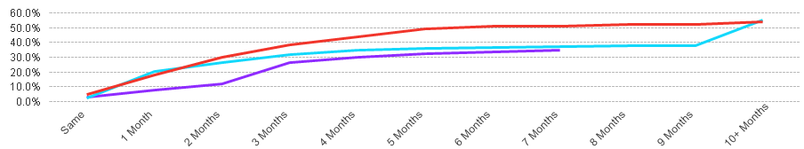
Month (1), 2, 3, etc are each a dimension in Qlikview. I would like all of these across the bottom of the chart with a trend line for each Bill Sys Cd. I also need each month to add to the previous month, so month 2 would show 4.5% and month 3 would show 9.6% and so on so it would like like the chart below. I think this is selecting full accumulation?
Any tips for this?
Accepted Solutions
- Mark as New
- Bookmark
- Subscribe
- Mute
- Subscribe to RSS Feed
- Permalink
- Report Inappropriate Content
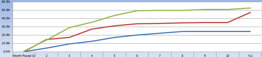
Is this what you are looking for?
- Mark as New
- Bookmark
- Subscribe
- Mute
- Subscribe to RSS Feed
- Permalink
- Report Inappropriate Content
Is this what you are looking for?
- Mark as New
- Bookmark
- Subscribe
- Mute
- Subscribe to RSS Feed
- Permalink
- Report Inappropriate Content
Yes, exactly what I am looking for. Thank you!
- Mark as New
- Bookmark
- Subscribe
- Mute
- Subscribe to RSS Feed
- Permalink
- Report Inappropriate Content
You are welcome
- Mark as New
- Bookmark
- Subscribe
- Mute
- Subscribe to RSS Feed
- Permalink
- Report Inappropriate Content
Good one
- Mark as New
- Bookmark
- Subscribe
- Mute
- Subscribe to RSS Feed
- Permalink
- Report Inappropriate Content
I have another question. Based on the sample data below, the purple line stops because the pivot is seeing month's 8-10 as missing values. Do you have any idea how I can ge these recognized as numberic 0's and if so, will the line continue with the full accumulation set? I've tried some If statements with IsNull(field) or leng(trim(field)) = 0 but nothing has worked so far.