Unlock a world of possibilities! Login now and discover the exclusive benefits awaiting you.
Announcements
FLASH SALE: Save $500! Use code FLASH2026 at checkout until Feb 14th at 11:59PM ET. Register Now!
- Qlik Community
- :
- All Forums
- :
- QlikView App Dev
- :
- Line Chart with Baseline
Options
- Subscribe to RSS Feed
- Mark Topic as New
- Mark Topic as Read
- Float this Topic for Current User
- Bookmark
- Subscribe
- Mute
- Printer Friendly Page
Turn on suggestions
Auto-suggest helps you quickly narrow down your search results by suggesting possible matches as you type.
Showing results for
Contributor III
2018-09-12
07:10 AM
- Mark as New
- Bookmark
- Subscribe
- Mute
- Subscribe to RSS Feed
- Permalink
- Report Inappropriate Content
Line Chart with Baseline
I have Projected Hours and Actual Hours fro each resource, project-wise, in my data model.
i want to create a chart like this:
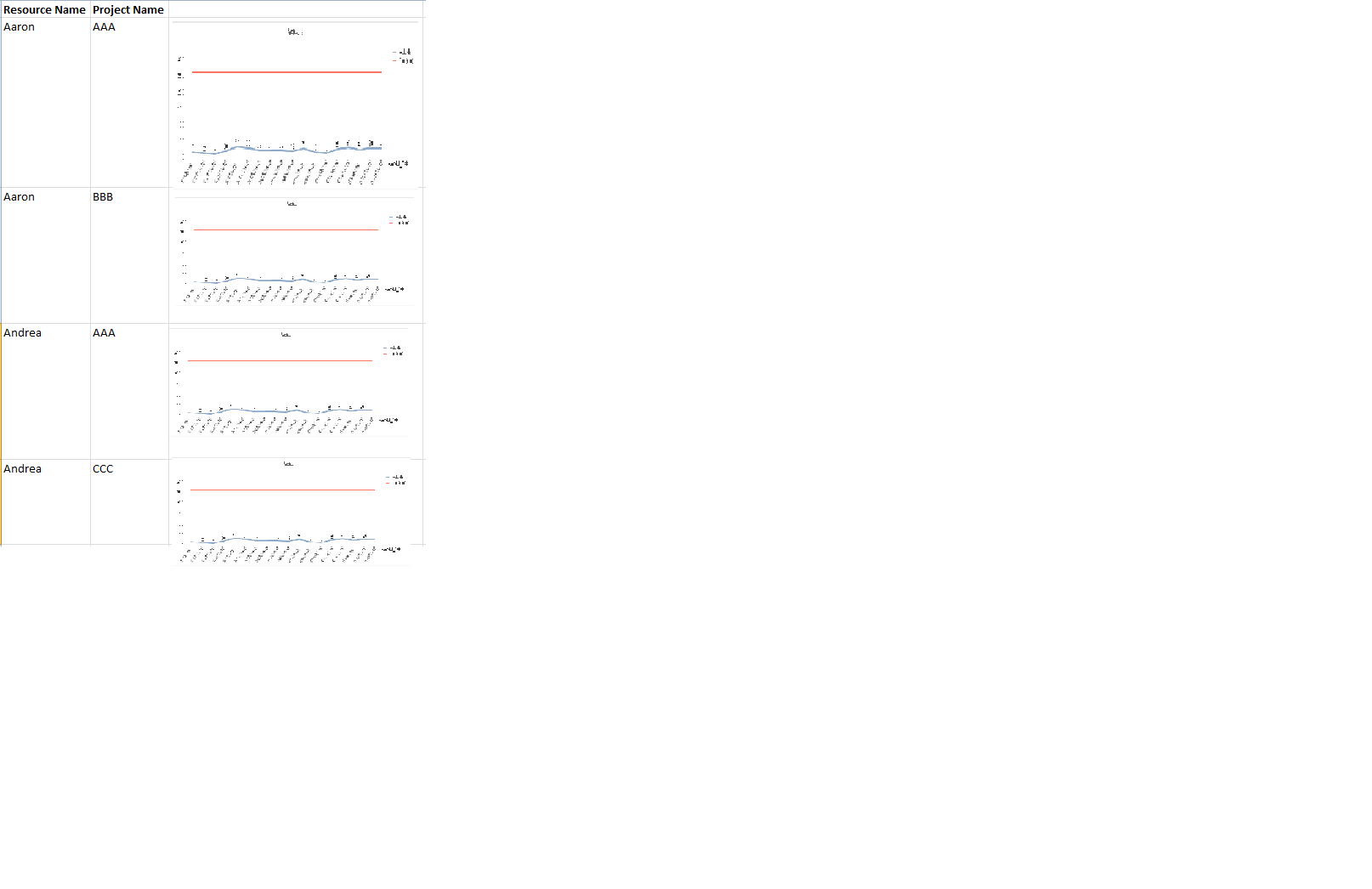
Basically I want to embed line charts in pivot table.
Dimension for the pivot chart will be Resource Name and Project Name. And in the expression i want a line chart like shown below for each resource-project.

816 Views
1 Reply
Anonymous
Not applicable
2018-09-12
07:17 AM
- Mark as New
- Bookmark
- Subscribe
- Mute
- Subscribe to RSS Feed
- Permalink
- Report Inappropriate Content
try the trellis Charts (in tab Dimension)
783 Views